Sidenav
The sidenav component provides a vertical navigation structure placed on the left side of the interface. It provides global access to navigation, branding, and user actions, ensuring consistency and orientation across products and applications.
It is part of the application layout, so it can only be used inside of it. Please check the DxcApplicationLayout documentation.
The sidenav component is designed to support efficient and intuitive navigation across the main sections of an application. Its vertical layout provides persistent access to navigation links, improving discoverability and reducing the steps needed to move between pages. It supports nested groups, collapsible sections, and the ability to highlight the active route, making it especially useful for applications with deep or complex navigation structures.
The next section gives an overview of the component's general anatomy. Each part mentioned here will be explained in more detail later in the document.
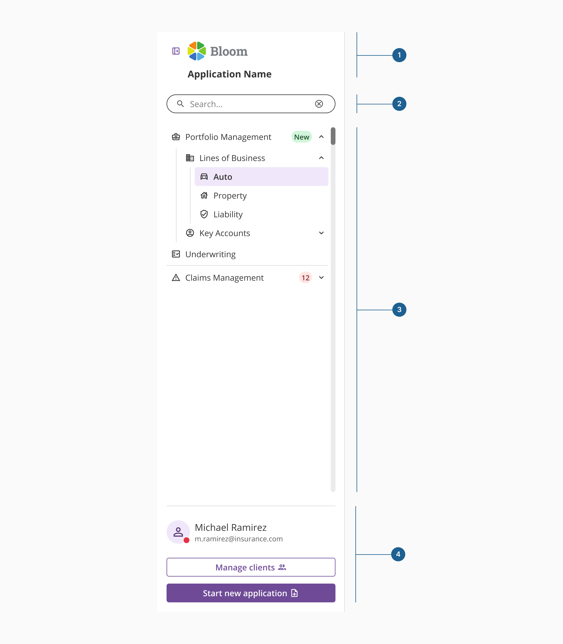
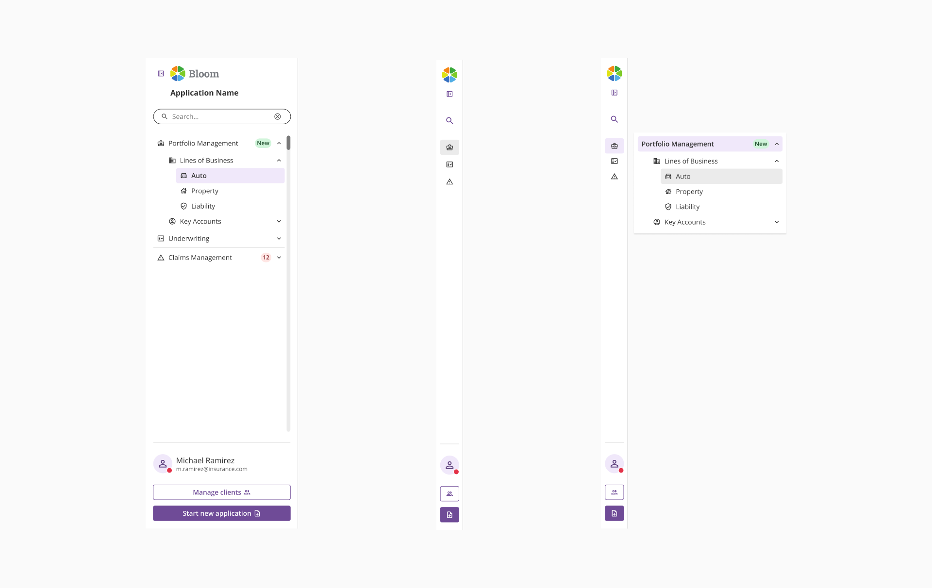
- 1.Branding:
- Contains collapse/expand toggle for the sidenav.
- If no global app header exists, this area will be used for logo and application name.
- 2.Top content:
- Space placed under the branding for contextual or utility actions that enhance the main navigation, such as a version selector, a searchbar to filter the navigation, status indicators, or small alerts.
- 3.Main navigation:
- The core navigation area, structured into sections and items.
- Each section can be expanded (showing children) or collapsed (hiding children).
- Only this area should be scrollable.
- 4.Bottom content:
- Space for secondary sections (navigation) and/or other common patterns (profile details, organization switcher, settings, or primary quick actions)
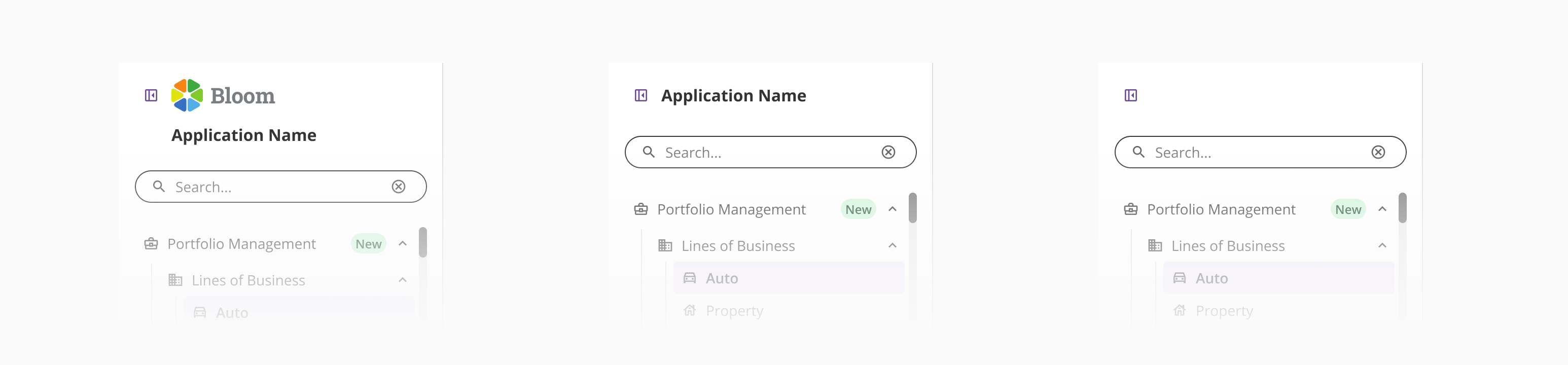
A small button allows users to collapse or expand the sidenav. This helps save space when the navigation is not in active use, especially in data-heavy or workspace-oriented layouts.
This area is used to display the product or organization's logo when no global app header is present. It provides brand recognition and visual consistency in layouts where the sidenav acts as the main navigation container.
Application name identifies the current product or application. When a header is present, the application name may appear either in the header or within the sidenav, depending on layout needs or hierarchy preferences.
Area located directly under the branding that provides space for contextual or utility elements that support the main navigation. It is intended for actions that help users interact with or filter the content of the sidenav.
Typical examples include a searchbar to filter navigation items, a version or environment selector, compact status indicators, or small alerts that inform users without disrupting navigation.
The content in this area should remain lightweight to avoid pushing the primary navigation too far down.
It is not intended for secondary navigation or profile-related actions, which belong to the bottom content area.
The Main navigation is the core area that structures and organizes access to the different sections of the application. It is composed of sections and items, allowing users to navigate efficiently through the product's main areas.
Each section can be expanded to display its child items or collapsed to hide them.
Each section can be expanded to display its child items or collapsed to hide them. The sidenav allows hierarchies of any depth, making it possible to organize content into structured, nested groups when needed. This can be helpful in large or complex applications, but most products work better when navigation is spread across multiple patterns instead of relying on deep nesting. Choose this approach carefully to avoid adding unnecessary complexity to the user experience.
Only this area should be scrollable, ensuring that other sidenav elements (such as branding, top content, or bottom content) remain fixed.
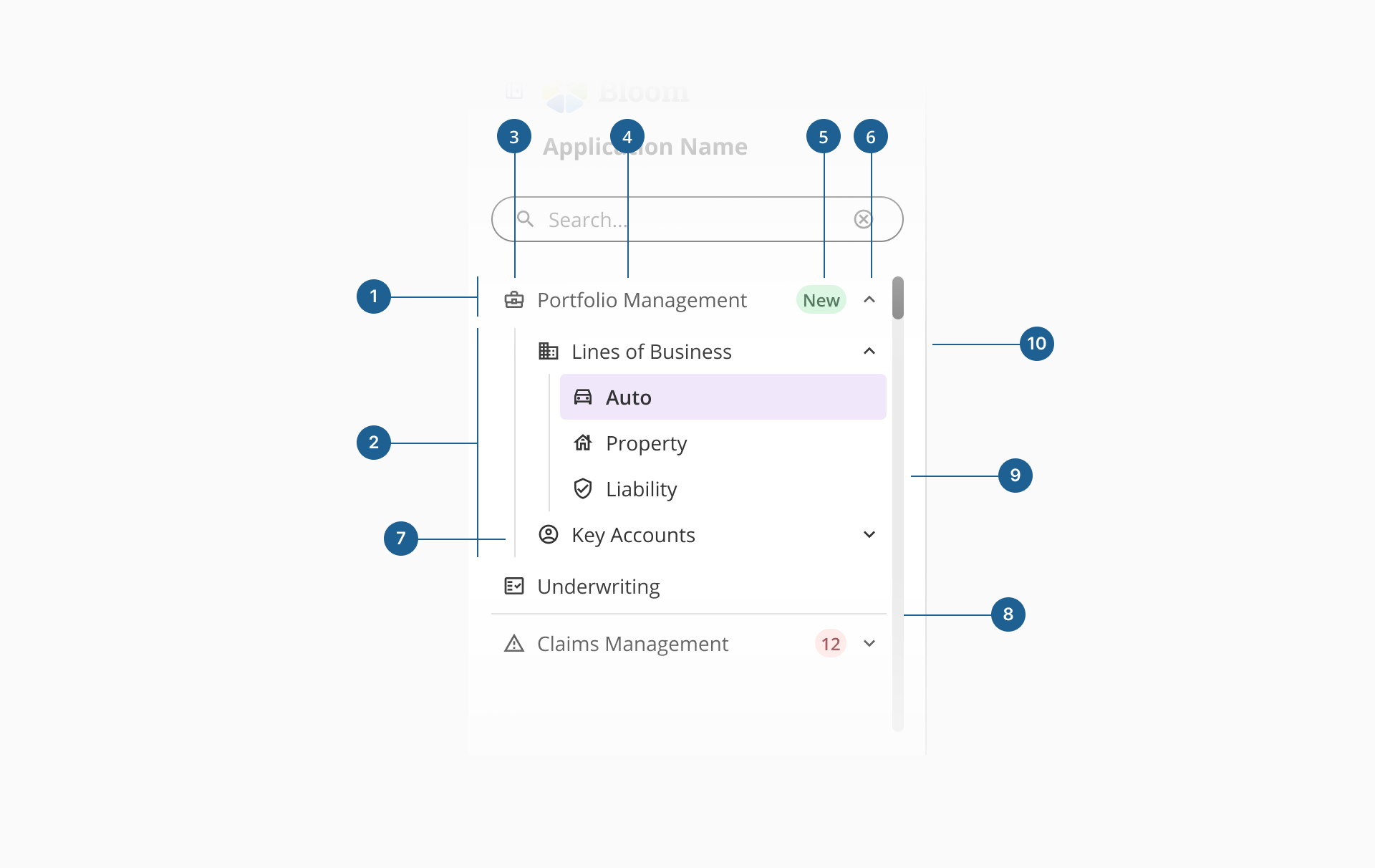
- 1.Menu item: Represents a single navigation entry that links to a page or feature within the application. It can act as a standalone item or as a parent containing nested items.
- 2.Menu group: A structural wrapper that groups related menu items under a shared category. It can be expanded or collapsed to reveal or hide its contents.
- 3.Icon: A leading visual symbol that helps users quickly identify the purpose of each item and improves scannability within the navigation list.
- 4.Label: The text name of the menu item. It should be short, descriptive, and consistent to clearly indicate the destination or function.
- 5.Badge: A small visual indicator used to display dynamic information such as notifications, updates, or item counts related to a menu entry.
- 6.Chevron (group indicator): Indicates that a menu item contains nested items. It rotates or changes direction to reflect the expanded or collapsed state of the group.
- 7.Group line: An optional vertical line that visually connects items within the same group, reinforcing hierarchy and relationships between parent and child items.
- 8.Divider: A horizontal separator used to visually distinguish different groups or sections within the sidenav, improving readability and organization.
- 9.Scroll bar: Appears when the content within the main navigation exceeds the available height. Only the main navigation area should scroll, keeping the top content and bottom content fixed.
- 10.Border: A thin visual line that defines the edge of the component and provides a clear separation between the sidenav and the main content area.
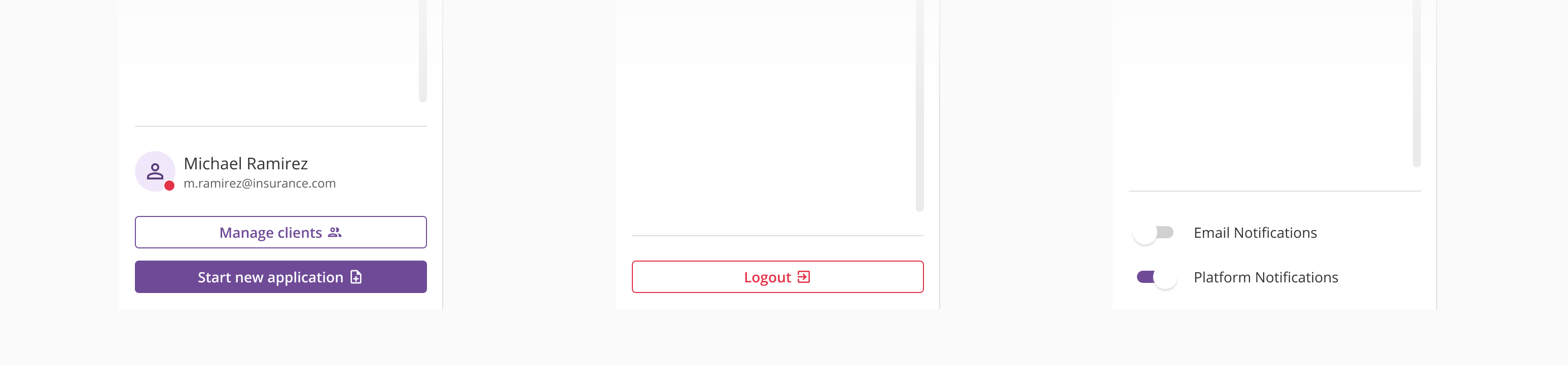
The bottom content area of the sidenav is reserved for secondary actions and persistent utilities that support the overall navigation experience. It commonly includes elements such as profile access, organization switchers, settings, or quick actions.
While its content is flexible and customizable, it should remain focused and minimal to avoid visual overload. Teams can adapt this area to their product needs, but it's recommended to follow predefined layout examples to maintain consistency, clarity, and usability across applications.
The sidenav component supports two main display modes — expanded and collapsed — allowing flexible adaptation to different layout needs and screen sizes.
In expanded mode, all navigation labels, icons, and hierarchy levels are fully visible, offering maximum clarity and discoverability. This mode is recommended when navigation is central to the workflow or when users frequently switch between sections.
In collapsed mode, the sidenav minimizes to a narrow vertical strip, displaying only icons and essential visual cues. This helps preserve workspace and focus on content while maintaining quick access to navigation. Collapsed mode is ideal for data-dense or content-heavy layouts where space efficiency is a priority.
While the collapsed mode maintains functional access to navigation, some scenarios may require specific handling to preserve usability and consistency:
- Missing icons on top-level items:
If navigation items at the first level do not include icons, a generic default icon is automatically applied. This ensures the collapsed view remains navigable and visually balanced. - Custom content:
When custom content at the top or bottom (such as searchbar, user details, CTAs, or quick actions) is present in the sidenav, it should be replaced in collapsed mode by a single icon button to prevent overloading the reduced space.
- Show branding only when the app lacks a global header: If there's already a global header, remove or minimize redundant branding to keep the sidenav clean and focused on navigation.
- Keep product or service names short, clear, and recognizable: Avoid long or redundant titles that visually compete with navigation items, ensuring the branding area remains clean and easy to scan.
- 1.Prioritize brevity and relevance: Limit the top content to elements that provide immediate contextual value, such as: filtering, quick actions, or lightweight system indicators.
- 2.Maintain visual and spatial balance: Keep the section visually unobtrusive by using compact components, consistent spacing, and minimal visual weight. This prevents the top content from pushing the main navigation downward and ensures users can access navigation items without unnecessary scrolling.
- 1.Organize by user goals, not internal structure: Group navigation items around what users want to achieve, not how teams or modules are organized internally.
- 2.Keep section names clear and concise: Ensure users can immediately understand where each section will take them by using short, direct labels that clearly describe their destination or purpose.
- 3.Use icons consistently for recognition: Each icon should reinforce the meaning of its label and be visually consistent across the entire navigation.
- 4.Limit nesting depth for clarity: Even though technically unlimited, stay within 2-3 levels to maintain a clear mental model of the app's structure.
- 1.Use the bottom content area for persistent, secondary actions: Ideal for items like profile access, organization switcher, theme toggle, or settings (actions not tied to a specific section).
- 2.Keep it simple and uncluttered: Limit the number of elements to maintain visual balance (it should complement navigation, not compete with it).