Data visualization
At Halstack, we believe that effective data visualization is crucial for transforming complex data into clear, actionable insights. Our principles focus on clarity, accuracy, accessibility, and interactivity. By adhering to these guidelines, you can create visual representations that are not only aesthetically pleasing, but also highly functional, ensuring that users can easily understand and interact with the data presented.
As we consider data visualization a tremendously dense and complex design pattern, we have decided to rely on external libraries. Our choices are Cloudscape or Recharts, depending on your team's needs and preferences.
Take into consideration that Cloudscape is a Design System with its own set of design tokens, such as colors, typography, and spacing. Recharts, on the other hand, is a charting library that provides a wide range of customizable chart types and components that can be tailored to fit your specific needs.
Cloudscape offers high-quality, adaptable, and user-friendly tools for creating clear and comprehensive data visualizations. This helps our users understand and analyze data effectively, facilitating informed decision-making.
Check out the different configuration options for Cloudscape charts.
- Amazon QuickSight dashboards are embedded in the application, and custom charts should match the look and feel of QuickSight and AWS interfaces.
- The application follows an AWS-style console or dashboard experience (operations, monitoring, administration, reporting).
- Maintaining a consistent user experience across Cloudscape components, QuickSight dashboards, tables, filters, and charts.
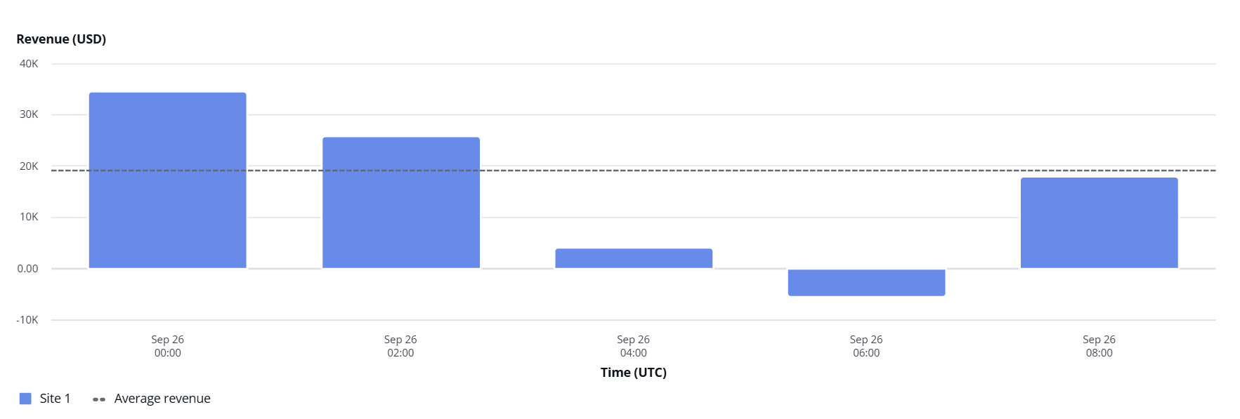
Cloudscape charts are divided into cartesian charts (bar, line, area, mixed line and bar) and pie and donut charts.
Cartesian charts display information along horizontal and vertical axes to clearly show patterns, comparisons, and relationships between values. It includes line, bar, area, scatter, bubble, and mixed charts.
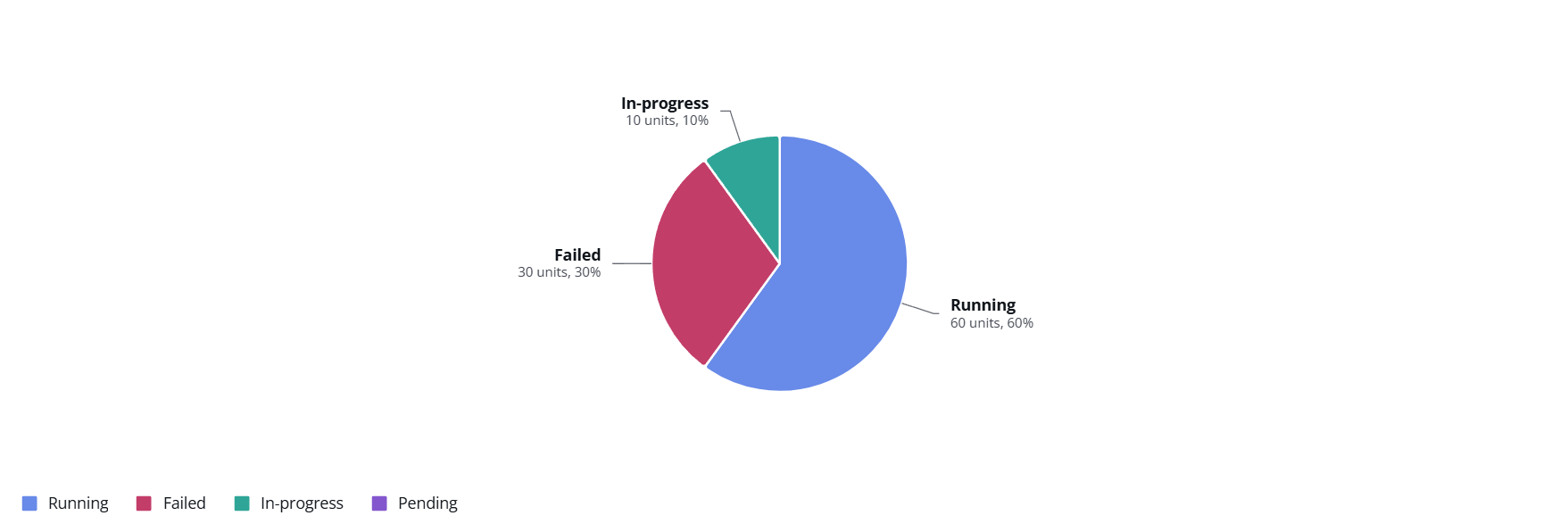
Pie and donut charts are circular charts divided into segments to illustrate numerical proportions. Best for a small number of segments; pair with a table if precision matters.
Cloudscape charts use a default color palette that is designed to be visually distinct and accessible. However, you can customize the colors to better fit your application's branding, theme, or to highlight specific data points.
Check out how to configure colors in the Cloudscape documentation.
For a lighter and React-first charting stack, Recharts combines well with custom layouts and Halstack primitives (for example DxcInset, DxcFlex, and DxcContainer).
As previously mentioned, Halstack does not ship chart components today. The examples below use a small set of reference wrappers-patterns you can recreate in your own codebase-to cover typical analytics views: vertical bars (including grouped series), lines (with optional brush), filled areas, part-to-whole pies and donuts, and horizontal percentage bars for KPI-style rows. They are for illustrative purposes only, not a versioned API of the design system.
Apply the same narrative guidance as the rest of this page (clear baselines, readable labels, sensible color differentiation). Prefer Halstack categorical colors when you pass color or fill props so charts stay on-brand.
- Consider a thin Recharts wrapper layer when your product already standardizes on Recharts and you want shared defaults for axes, grids, and tooltips.
- Prefer Cloudscape charts when you need out-of-the-box AWS console patterns, their data-vis color tokens, or parity with Cloudscape documentation.
- Prefer raw Recharts when you need a chart type or behavior a wrapper does not expose yet.
Open the CodeSandbox example to see each chart in depth and run the examples. We created some examples of how you can use recharts as a base to build your own chart components in conjunction with Halstack primitives.
There you will find:
- An overview of dependencies and how data is expected to be shaped.
- A dedicated section for each wrapper, props, suggested use cases, and live demos.
- Full source for all five components in one place so they stay in sync.
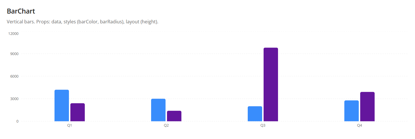
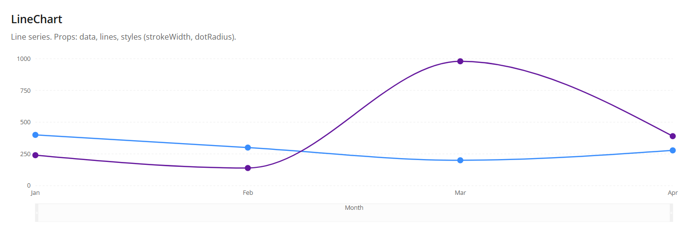
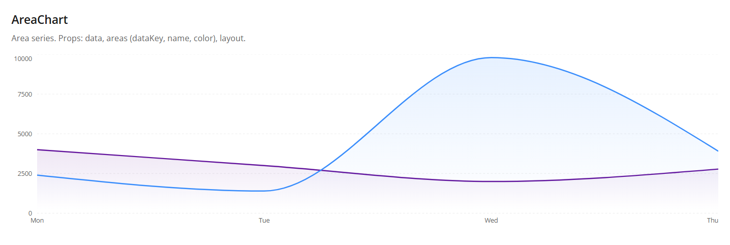
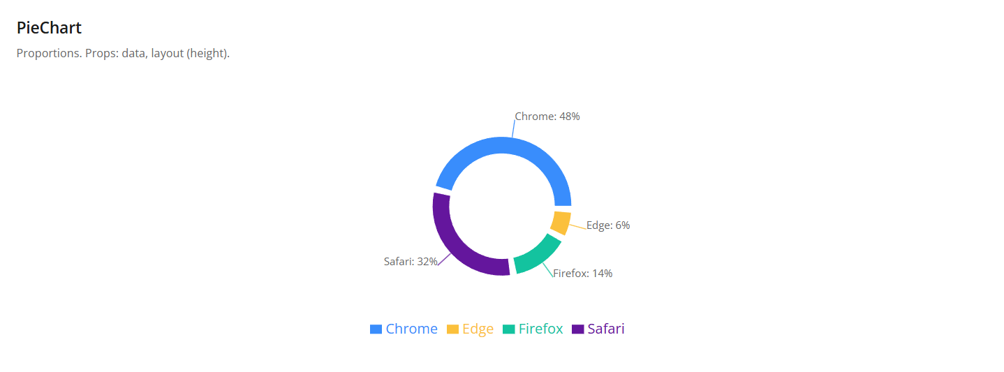
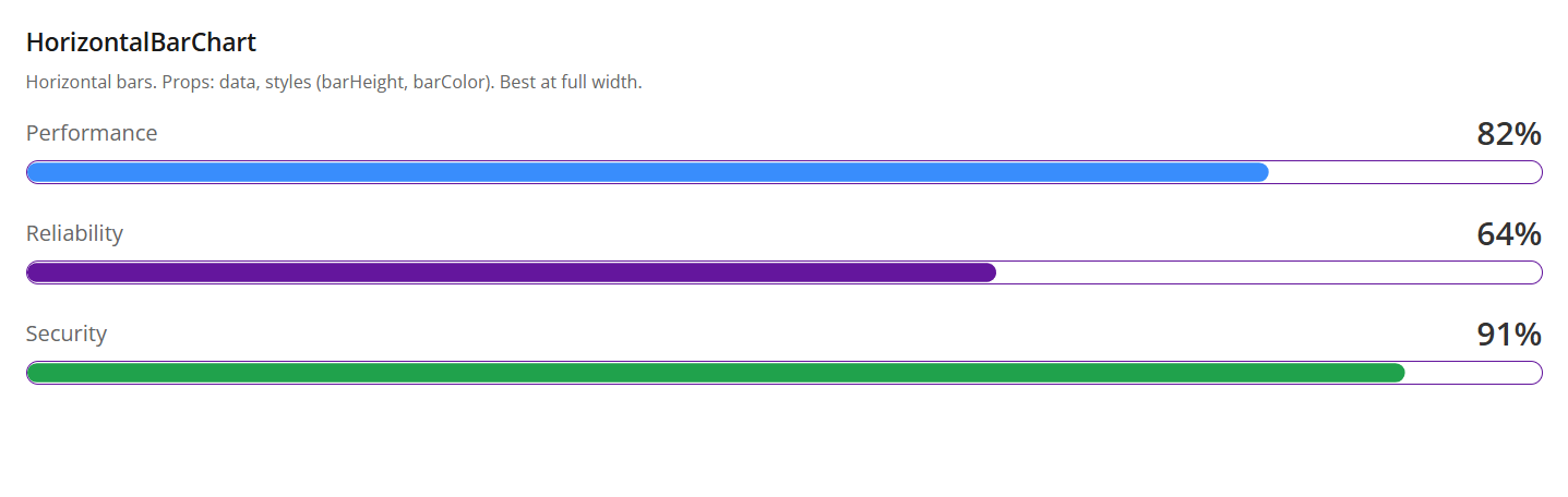
Recharts does not have a built-in color palette, but you can pass any colors you like via props. It is highly recommended to use Halstack tokens for color values to maintain consistency with the rest of your UI.
Check out how colors are configured in the codesandbox example.