Time inputs allow users to enter or select a specific time using a time picker or manual text entry. Designed to support a wide range of use cases, particularly in working with the date input component, from booking systems to form submissions, using this component ensures clarity and consistency in date and time formats, helps prevent input errors, and adapts to different locale and accessibility requirements. Its combination of manual input and guided selection provides flexibility while maintaining a streamlined user experience.
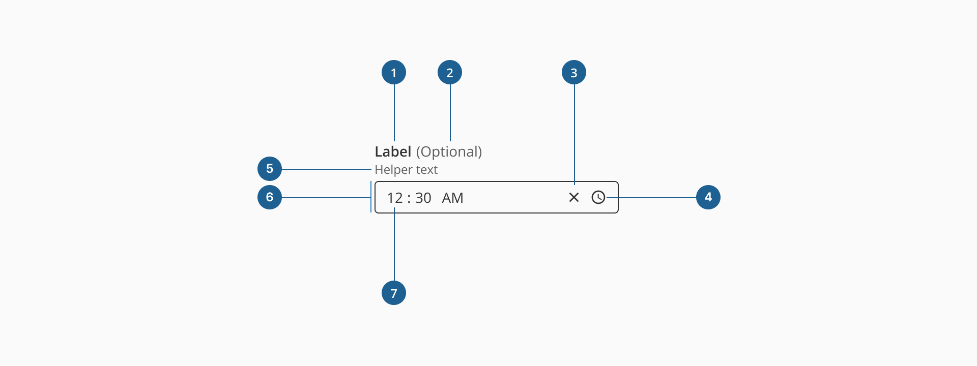
- 1.Label (Optional): a descriptive text that helps users understand what information is expected in the input field. It should be clear, concise, and placed near the input for better readability.
- 2.Optional indicator (Optional): a small indicator that signals the input field is not mandatory. It helps users know they can leave the field empty without causing validation errors.
- 3.Clear action (Optional): a small button, usually represented by an "X" icon, that allows users to quickly clear the time specified or selected without manually deleting each value.
- 4.Time button: an interactive element inside the input field that triggers the time picker of the component, where the user can select hour, minute, and AM/PM values.
- 5.Helper text (Optional): additional text placed below the input field that provides guidance, examples, or explanations to assist users in filling out the field correctly.
- 6.Container: the visual wrapper around the input field that provides structure, ensures accessibility, and helps differentiate the input from other UI elements.
- 7.Value: displays the selected or manually entered time in the input field, following an hour, minutes, AM/PM format.
Form inputs are essential UI elements that allow users to interact with digital products by entering or selecting data. Choosing the right input type and structure is key to designing efficient, user-friendly forms that support task completion and data accuracy.
A form input (also known as a form field) is used to capture user data. Common input types include text fields, date pickers, number fields, radio buttons, checkboxes, toggles, and dropdowns. Forms should always include a submission method, such as a submit button, link, or keyboard trigger, to complete the interaction.
Although input fields vary in type and purpose, they often share a common set of features:
- Placeholder: a short hint displayed inside the input field that describes its expected value or purpose.
- Helper text: additional information displayed below the field to guide the user in providing the correct input.
- Optional label: inputs that are not mandatory can be marked with an "Optional" tag to set clear expectations.
Most inputs can also present standard interactive or informative states:
- Disabled: this state prevents users from interacting with the field. It's typically used when a value is not applicable or editable under certain conditions or roles.
- Error: when a user enters invalid or incomplete data, the input shows an error state, often accompanied by a helpful message to guide corrections.
- Read-only: the input is visible, focusable, and hoverable, but not editable. This is ideal for fields with auto-calculated values. Unlike disabled fields, read-only inputs can still be submitted with the form and are part of the form data.
Time inputs are designed to help users provide valid, well-formatted times with minimal friction. Similar to the date inputs, they combine manual input with an interactive picker, making them ideal for scenarios like bookings, forms, or scheduling events. They are particularly useful for reducing input errors and ensuring consistent formatting across different regions and use cases.
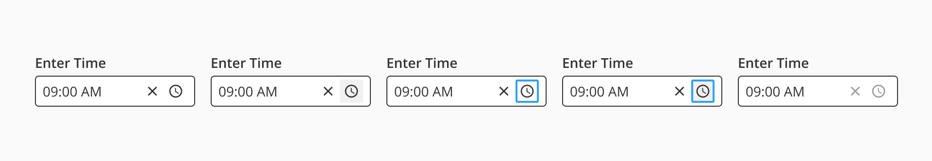
Similar to the date input, the time input includes a clear (close) icon that allows users to quickly remove the selected or typed time with a single click. This is especially helpful when correcting mistakes or resetting the field during form completion. The icon is only visible when a value is present, keeping the interface clean and focused.
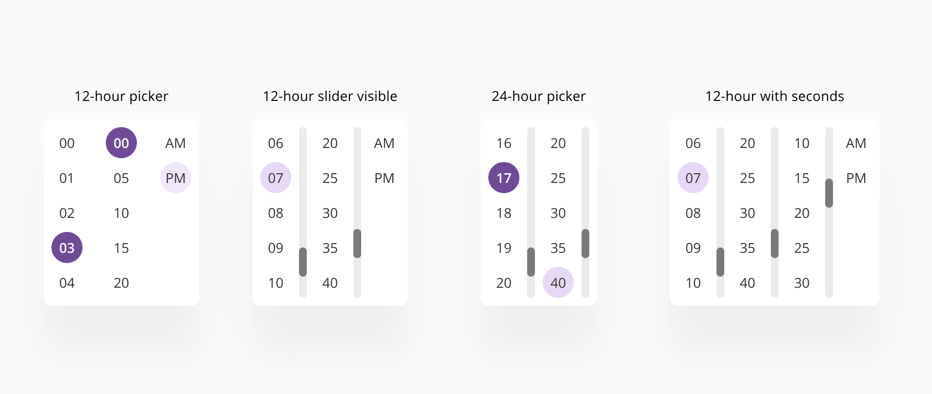
The component features a built-in time picker popup that can be opened via the time icon.
This popup allows users to select the hour, minute, and AM/PM values visually, reducing the likelihood of formatting errors. The minutes values are presented as 5-minute increments to provide an optimal balance of selectable items. Users can manually enter minutes values that are not part of the selectable list. The 24-hour variant does not include the AM/PM selection.
- Always use the time input when a valid time format is required. This helps ensure consistency and prevents user error.
- Display time formats clearly and consistently across your application.
- Include a clear label that describes the context or purpose of the time (e.g., "Notification time" or "Start time").
- Avoid setting default times unless the context explicitly calls for it, such as pre-filling the current time for quick scheduling.
- Utilize the time picker to reduce formatting errors and speed up time selection, especially for less tech-savvy users or on mobile.
- You have the option to use a combination of the dropdown (for hours) then manually adjust the minute values for values that are not part of the selectable list.