Cards help users scan and explore discrete pieces of information by grouping all relevant content about a subject into a single, self-contained unit. They are commonly used in grids and lists to display items such as products, articles, profiles, or resources, giving each entry its own visual space and making large sets of content easier to browse.
They are also designed to work across a wide range of use cases without prescribing what content goes inside them. They define the layout and visual treatment of the container, while the content itself is provided by the author. This flexibility makes them suitable for scenarios where items vary in content or where each entry deserves more visual emphasis than a table row or list item can provide.
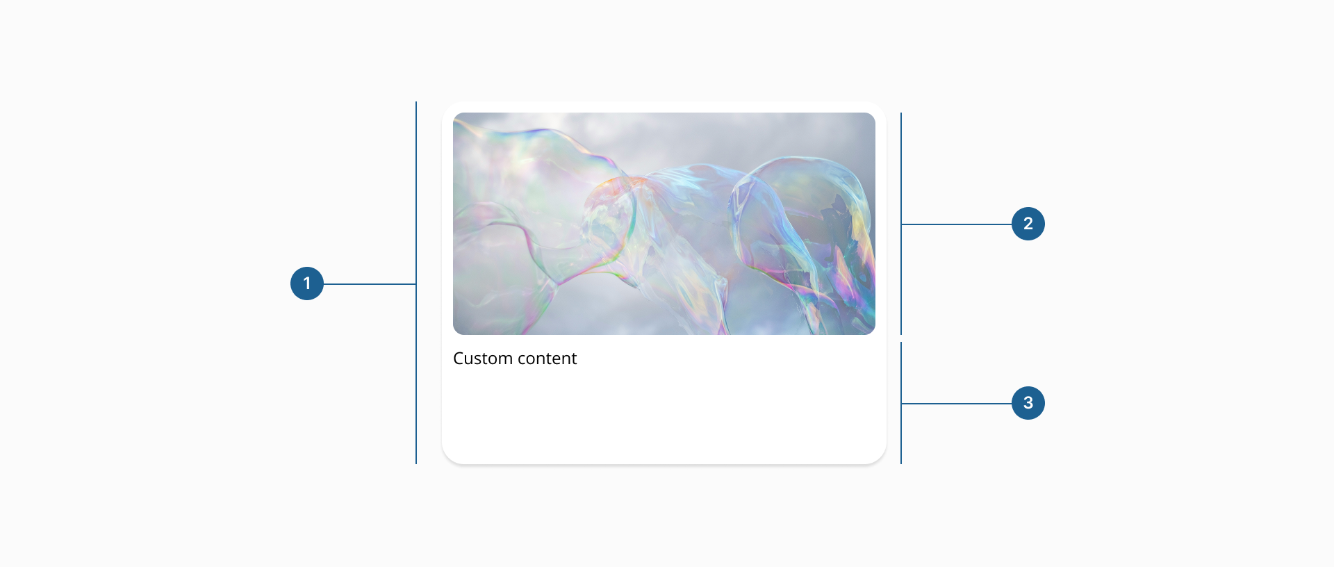
- 1.Container: it's the outermost element that defines the card's boundaries, background, and visual treatment. It is the primary interactive target when the card is clickable or selectable.
- 2.Image (Optional): a media area that provides visual context for the card's content. It can be placed before or after the body.
- 3.Body (Optional): a dedicated slot for descriptive or supporting custom content. At least one of body or image must be present.
Cards can be configured across several dimensions to adapt to different content needs and layout contexts. The sections below cover the available variants, how content and images can be composed within the card, and the states the component supports throughout its lifecycle.
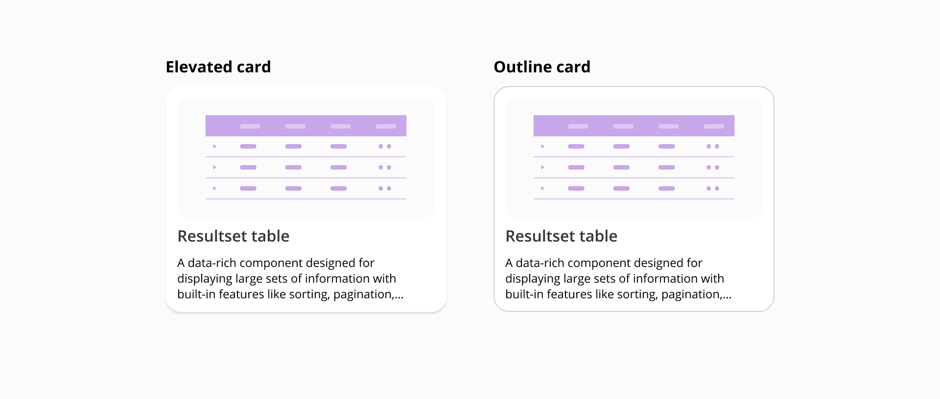
Cards are available in two variants that define how the container is visually distinguished from the surrounding surface:
A card must always contain at least one of its two core content elements: an image or a body. Both can coexist, but the card cannot be empty of both. When an image and body are used together, the image can be placed before the body (at the top in vertical orientation, or to the left in horizontal orientation) or after it (at the bottom or to the right), allowing authors to control the visual hierarchy of the card based on the relative importance of the media and the text.
Cards also support two orientations. In vertical orientation, content stacks from top to bottom. In horizontal orientation, the image and body appear side by side, producing a more compact layout suited to list-like contexts.
The card component supports a range of states that cover both its interactive and data-loading lifecycle. Interactive states such as hover, focus, active, and selected provide consistent visual feedback for pointer and keyboard users. Loading and empty states address the moments when content is not yet available or does not exist, ensuring the card always communicates something meaningful to the user regardless of the underlying data condition.
Use cases:
- Hover: a subtle visual change signals its interactivity when the pointer moves over the card.
- Focus: a visible focus indicator is applied when the card receives keyboard focus, ensuring accessibility for non-pointer users.
- Selected: for selectable cards, it indicates the user has chosen this card within a selection interface. Selected hover, focus and active sub-states are also provided for when the user revisits an already-selected card.
- Loading: renders a skeleton layout that mirrors the card's populated structure while content is being fetched. This state should be shown as soon as a request is in flight, not as a delayed fallback.
- Empty: shown when a request has completed but returned no content to display. This state is distinct from loading and should only be used when the absence of content is a known, stable condition.
- Scope each card to a single subject: A card should represent one thing, whether that is a product, a person, a document, or a resource. Mixing unrelated content inside a single card breaks the implicit contract the component makes with the user.
- Choose orientation based on content hierarchy, not aesthetics: Vertical orientation works well when the image is the primary draw and text plays a supporting role. Horizontal orientation suits contexts where text carries most of the meaning and the image is supplementary. Avoid mixing orientations within the same grid, as it disrupts scanning rhythm.
- Keep content concise and scannable: Cards are designed for quick consumption. Aim for content a user can parse in a few seconds. If the information required is more extensive, surface it on a detail view reached by interacting with the card.
- Maintain consistent image ratios across a grid: Inconsistent image dimensions create an uneven layout that makes scanning harder. Standardise on a single aspect ratio per view and ensure images are cropped or covered rather than stretched.
- Reserve the selected state for genuine selection interactions: Do not use it to indicate an active page or current section; that semantic belongs to navigation components. Use selected cards only in contexts where the user is making a discrete choice among a set of options.
- Show the loading state immediately: Render the skeleton as soon as a request is in flight. Displaying empty containers or no feedback while waiting for data creates an experience that feels broken rather than responsive.
- Do not confuse empty and loading: They communicate different things to the user. Show the loading state while a request is in progress and the empty state only once the request has completed and returned no results.