Chips help users quickly scan, organize, and interact with content by surfacing relevant items in a clear and lightweight way.
They are commonly used to support filtering, categorization, and selection workflows, or to display values generated by user input such as search terms, selected options, or attached items. Chips are typically displayed in groups and are designed to work alongside other interface elements such as inputs, filters, lists and data views, depending on the variant and use case.
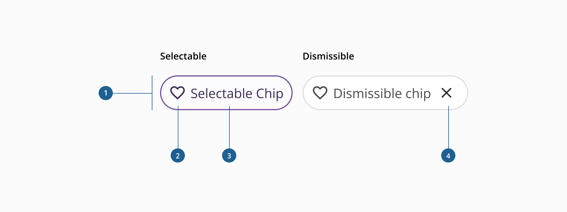
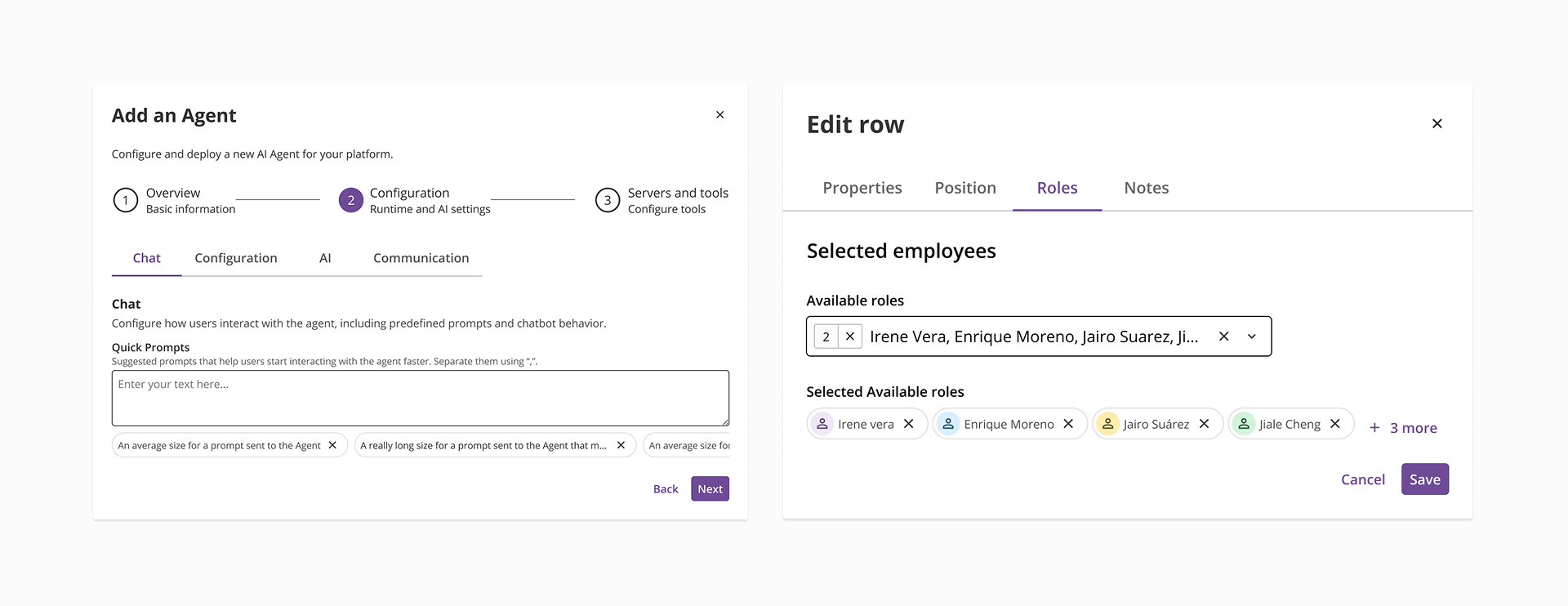
- 1.Container: it's the area that holds the chip’s content, defining its shape, size, spacing and interactive states (if applicable) of the component.
- 2.Left Element: an optional visual element displayed before the label. It can be an icon or an avatar used to provide additional context or help users quickly identify the content.
- 3.Label: displays the textual content of the chip, conveying selection, user input or key filtering data.
- 4.Dismiss action: an action control that allows users to remove the chip from the interface and it’s only present in the dismissible variant of the component.
Depending on how it is used within an interface, the chip component can take two different forms: selectable chip and dismissible chip. Each variant supports a different interaction pattern and serves a distinct purpose in the interface.
The selectable chip is an interactive element that allows users to activate or clear options directly within the interface. It is commonly used to filter content, highlight categories or trigger lightweight actions without requiring additional controls such as dropdowns or menus. Selectable chips are typically displayed in groups, allowing users to quickly adjust the information shown on the screen or interact with specific items.
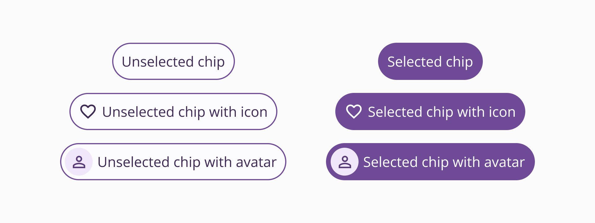
Selectable chips can include an optional left element, which may be either an icon or an avatar, used to visually reinforce the meaning of the chip. Depending on the context, the chip can be displayed in different configurations:
- Icon / Avatar + label, when the left element helps reinforce the meaning of the label.
- Icon only, when the icon is sufficiently descriptive on its own.
- Label only, when additional visual context is not required.
This flexibility allows selectable chips to adapt to different layouts and levels of visual density. This variant of the chip is often used in situations where users need to quickly explore or organize information without navigating away from the current view.
Use cases:
- Filtering content within a page, such as refining results in a table, list or dashboard
- Segmenting groups of content, for example switching between conversation categories in a messaging interface
- Highlighting attributes or tags that help organize large sets of information
- Triggering contextual actions, such as marking an item as a favorite or indicating a preference
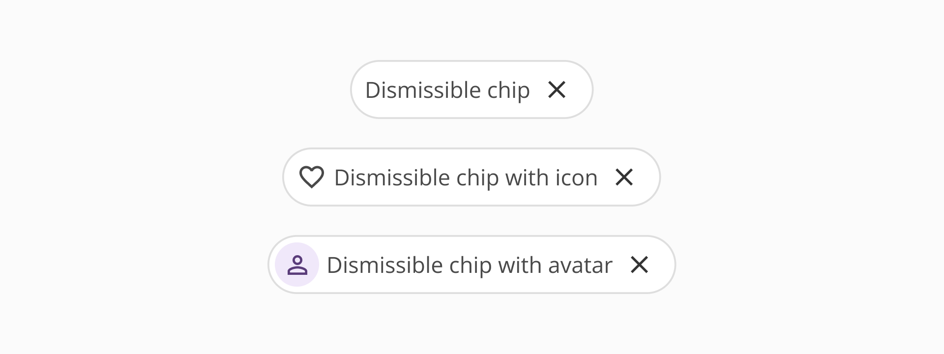
The dismissible chip is used to represent information generated by user input within an interface. It commonly appears after a user performs an action, such as entering search terms, selecting values from another component or attaching files. In this variant, the chip serves as a visual representation of the input provided by the user.
Unlike selectable chips, dismissible chips are not interactive elements by themselves. Their purpose is to display information that has already been applied or added. The only interactive element in this variant is the dismiss action, which allows users to remove the chip and clear the corresponding value or item.
Dismissible chips always include a label, which describes the value, term, or item being represented. They also include a dismiss action, represented by a close icon, that enables users to remove the chip from the interface. An optional left element, such as an icon or avatar, can be included to provide additional context when needed.
This variant is typically used in situations where users need to clearly see and manage the values they have entered or selected.
Use cases:
- Displaying search terms entered by the user in a search field
- Representing applied filters that originate from other components such as selects or filter panels
- Showing selected values from inputs such as multi-select fields
- Displaying attached items, such as documents or files added to a form or message
- Use chips to represent lightweight interactions. Chips should simplify common tasks such as filtering, categorizing or representing input without introducing additional complexity.
- Display chips in groups when possible. Chips are easier to understand when presented alongside related options or values.
- Use consistent labeling across chips. When chips appear together, labels should follow the same naming pattern to improve readability and comprehension.
- Use selectable chips for lightweight filtering or categorization. They are most effective when helping users quickly refine or organize visible content.
- Group related chips together. Selectable chips should usually appear in clusters that represent related categories or options.
- Avoid using selectable chips for mutually exclusive options with strict selection rules. In cases where one option must always remain selected, the correct component to use is our toggle group.
- Use icons or avatars only when they add meaningful context. Decorative elements should reinforce the meaning of the chip rather than duplicate the label.
- Use dismissible chips to represent user-generated input. They should display values that the user has entered, selected or added through other components.
- Always provide a clear and accessible dismiss action. Users should be able to easily remove chips when they want to clear a value or undo an action.
- Ensure the label clearly represents the value or item. The label should make it easy for users to understand what information the chip represents.
- Place dismissible chips close to the input that generated them. This helps users understand the relationship between the chip and the original action.
- Use icons or avatars only when they provide additional context. For example, icons can help represent file types, categories or other recognizable items.