The popover component is a non-blocking, contextual container that appears anchored to a trigger element to display supplementary content. It is designed to support secondary actions, contextual menus, and additional information without interrupting the user's current flow or taking focus away from the main interface.
From a behavior perspective, the popover provides a flexible and robust positioning system. It supports preferred positions, explicit alignment control, optional auto placement, and dynamic positioning with automatic fallback, ensuring the content remains visible and usable across different screen sizes and layouts. Thanks to this flexibility, popover can also be used as the foundation for popup menus and contextual action panels.
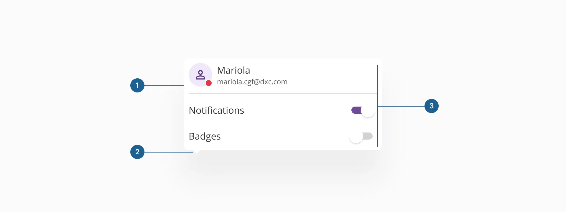
- 1.Container: the structural wrapper that holds all popover content. It defines the surface, spacing, elevation, and overall layout, ensuring the popover is visually separated from the background and clearly associated with its trigger.
- 2.Arrow (caret) (optional): a small visual indicator that points to the trigger element. It reinforces the contextual relationship between the popover and its origin and helps users understand where the content comes from.
- 3.Content area: the main area where information and actions are displayed. It can contain non-interactive content, interactive elements such as toggles or buttons, or structured elements like menu items, depending on the use case.
The popover component is the foundation for multiple Halstack components that need to display non-critical, contextual content. It is used internally by elements such as the dropdown list, select options, and the date input calendar, providing a consistent way to surface additional information or controls without interrupting the user's flow.
Beyond these composite components, a popover can also be used on its own to support a wide range of use cases, including contextual action lists, quick configuration panels, lightweight tutorials, small product cards, and popup menus.
A popover always requires a trigger element to appear. It is anchored to a reference element in the interface, which defines its position and context. This trigger can be interactive, such as a button or icon, or non-interactive, such as a text label or avatar, depending on the use case and interaction model.
When designing interfaces with contextual content, it’s important to choose the right overlay pattern for the job. Popover, tooltip, and dialog are all mechanisms for displaying layered content, but they serve different purposes and interaction models. The following table easily displays in which ways popovers relate and differ from tooltips and dialogs.
| Component | Purpose | Interaction | Blocking | Typical content | When to use |
|---|---|---|---|---|---|
| Popover | Displays contextual content associated with a specific element | Can contain interactive and non-interactive elements | Non-blocking | Secondary actions, contextual menus, configuration panels, supplementary information | Used to expose contextual functionality or information while keeping the user within the current flow |
| Tooltip | Provides brief, descriptive information about an element | Non-interactive | Non-blocking | Text hints | Used to clarify the meaning or purpose of an element without introducing actions |
| Dialog | Presents content that requires focused user attention | Interactive, often task driven | Blocking | Forms, confirmations, complex workflows | Used when a task or decision must be completed before returning to the main interface |
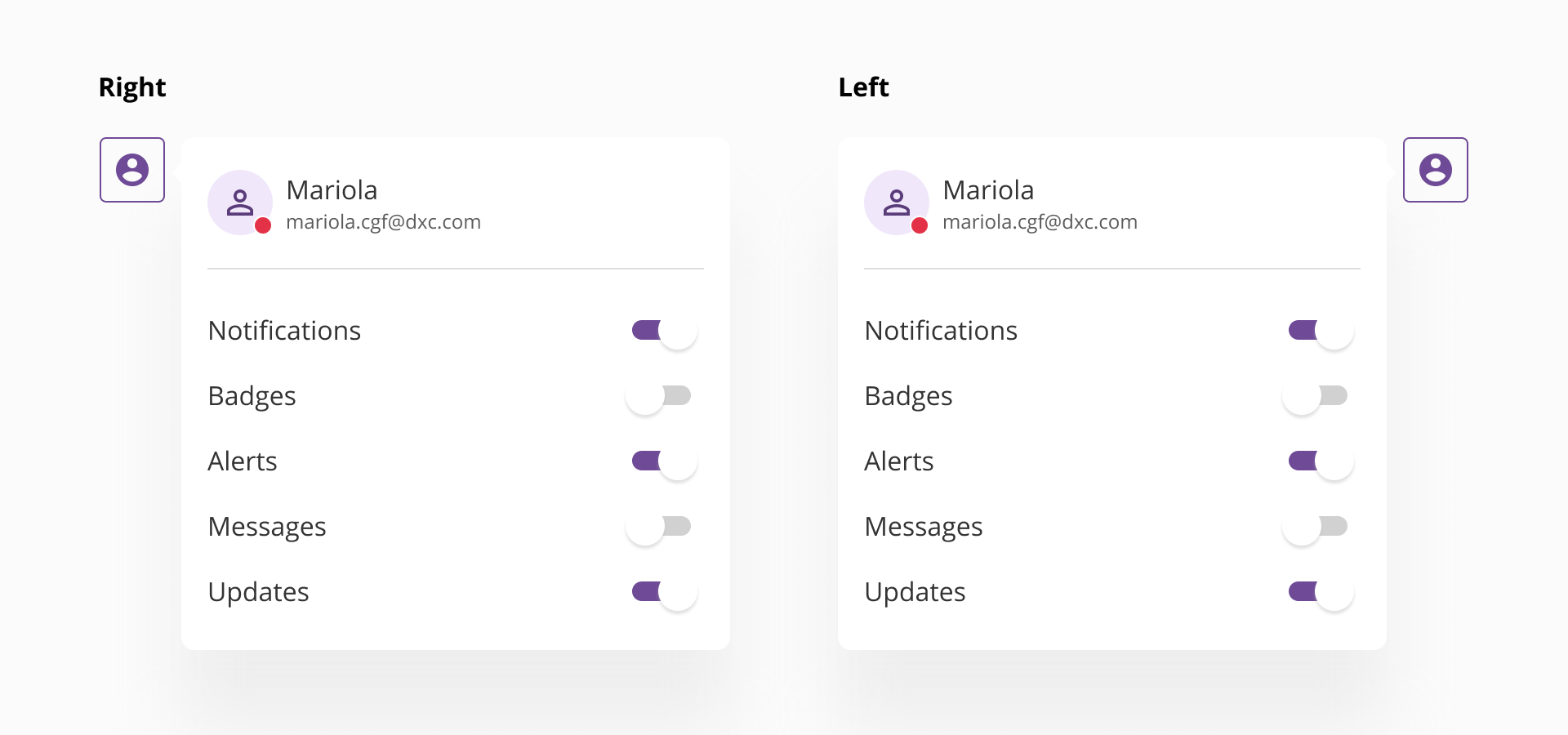
The popover component is positioned relative to a trigger element and is designed to adapt dynamically to the surrounding layout and available space. By default, the popover can be displayed on any of the four main sides of its trigger: top, right, bottom, or left. The final placement is determined by the preferred position defined by the consuming component, combined with the available space within the viewport.
Popover supports dynamic positioning with automatic fallback, allowing it to change its placement when there is not enough space in the preferred direction. This behavior ensures that the popover remains visible, accessible, and fully contained within the browser boundaries, preventing content from being clipped or rendered off-screen.
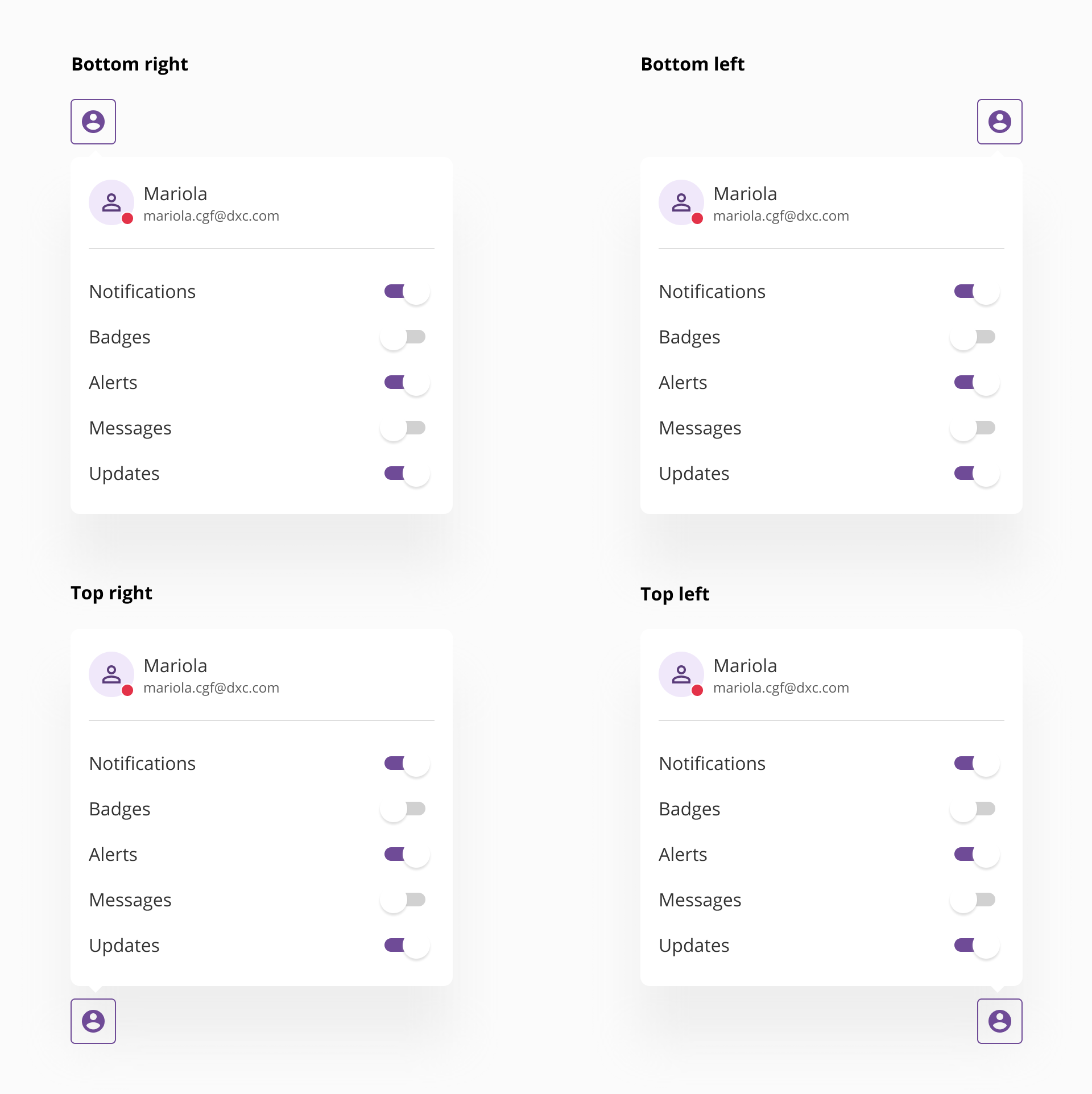
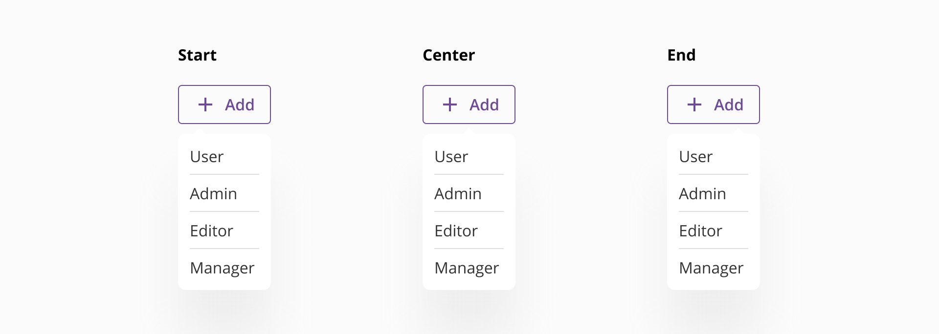
In addition to side placement, popover allows explicit control over alignment, making it possible to align the popover to the start, center, or end of the trigger element. This enables more precise layout control and supports a wide range of interface patterns, from simple contextual hints to complex action panels.
This flexible placement system ensures that popovers remain visually connected to their trigger, responsive to different screen sizes, and robust across varying layouts and containers.
The popover component can be rendered with or without a caret, depending on the use case and visual needs. The presence of a caret is optional and should be intentionally selected based on how strongly the relationship between the popover and its trigger needs to be expressed.
- When used with a caret, the popover visually points to its trigger element, reinforcing the contextual connection between both. This configuration is commonly applied in scenarios such as contextual help, lightweight tutorials, onboarding cues, or explanatory content, where it is important to clearly indicate the origin of the information and guide the user's attention.
- When used without a caret, the popover behaves as a floating surface that is still anchored to a trigger but does not explicitly point to it. This approach is typically preferred for action oriented content, such as popup menus, command lists, or configuration panels, where the emphasis is on the content itself rather than on visually highlighting the trigger element.
Both variants share the same positioning and interaction model. The choice to include a tip should be driven by clarity, visual hierarchy, and the role the popover plays within the interface.
- Let the popover size be defined by its content: Popover is a content driven container. Its dimensions should adapt to what is inside rather than enforcing fixed sizes. As a general guideline, a popover should not occupy more than 40% of the viewport in either width or height. If the content exceeds this threshold, a different pattern such as dialog should be considered.
- Use popover only for non-critical, contextual content: Popover is intended to complement the interface, not to interrupt it. It should not be used for critical flows, mandatory decisions, or complex tasks that require full user attention.
- Keep content focused and lightweight: Popover works best with concise, clearly scoped content. Long forms, dense data tables, or multi-step processes reduce readability and weaken the contextual content.
- Ensure a clear relationship with the trigger: The trigger element should make it evident why the popover appears. The content should always feel directly related to the element it is anchored to.
- Avoid overusing popovers: Excessive use can clutter the interface and create cognitive overload. Popovers should be reserved for cases where content truly benefits from staying visually connected to a specific element.
- Ensure accessibility and dismiss behavior: Popovers should be easy to dismiss and should not trap the user. Clear focus management and predictable closing behaviors are essential to maintain usability and accessibility.