The datagrid component offers a robust solution for displaying and managing tabular data. It supports essential features such as sorting, allowing users to organize and refine data easily. With multi-selection capabilities, users can perform bulk actions like deleting or exporting records efficiently. The component also includes in-line editing for quick data modifications directly within the grid, and expandable rows for showcasing additional details without cluttering the main view. Additionally, users can reorder columns to customize their data layout, ensuring an intuitive and flexible user experience tailored to their specific needs.
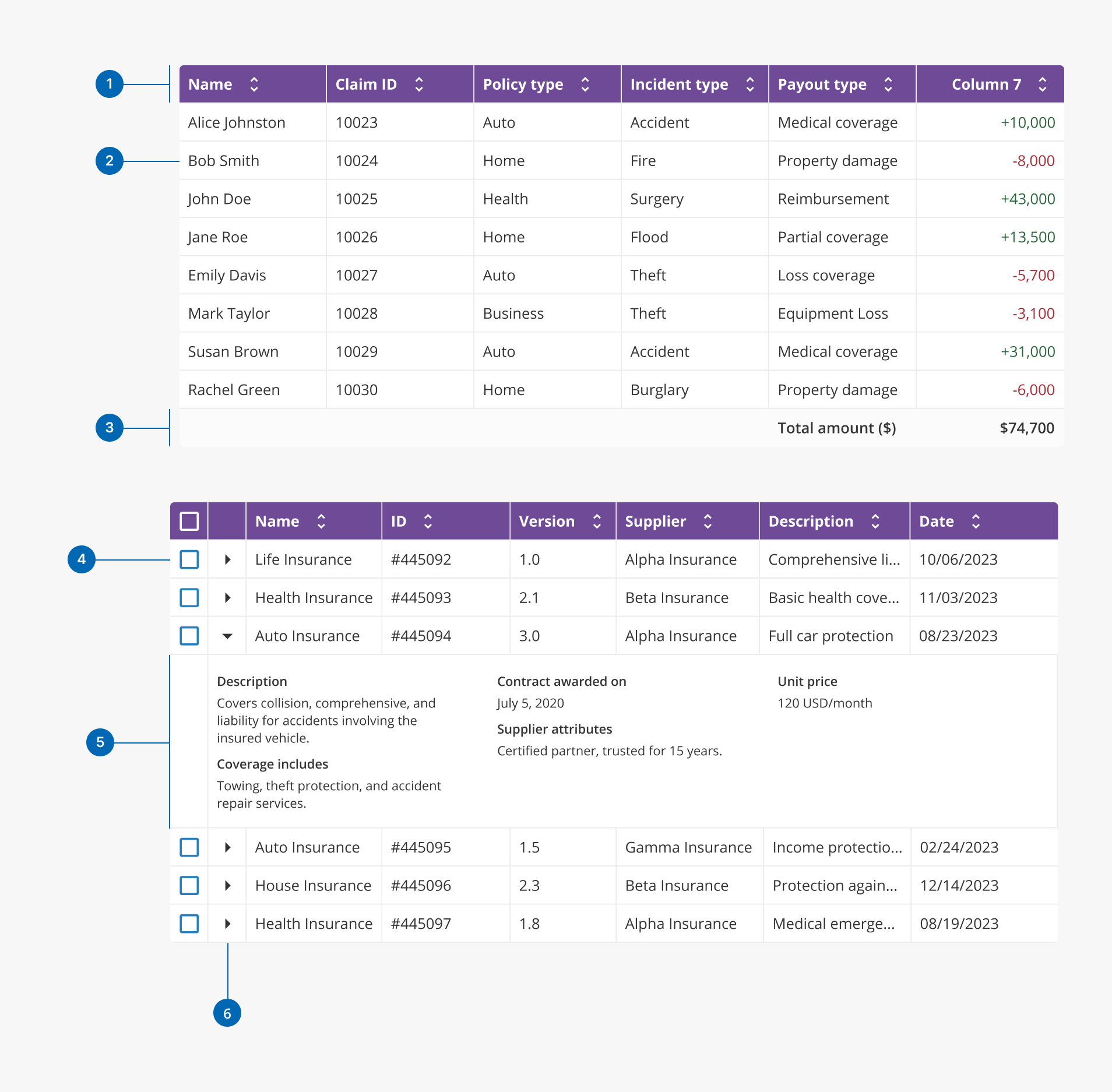
- 1.Header row: it's the top section of the datagrid that displays the column titles and can support actions like sorting or filtering.
- 2.Cell: basic unit of the datagrid where individual pieces of data are displayed and aligned with the column.
- 3.Summary row (Optional): row at the bottom that shows summarized or aggregated data for one or multiple columns.
- 4.Selectable row (Optional): a data row that users can click to select, usually for performing actions like editing or deleting.
- 5.Expanded row (Optional): a row that, when expanded, reveals additional contextual information related to that entry.
- 6.Expandable indicator (Optional): an icon or control that shows users a row can be expanded to access more detailed content.
- Users can select one or multiple rows for bulk actions. It's recommended to include checkboxes for multiple row selection, or else radio buttons for single-row selection.
- Row selection can persist across pages when pagination is used in the datagrid, ensuring users can perform bulk actions on rows even if they navigate away from the current view.
- Users can set a default selected row on initial load, useful for pre-populating forms or automatically highlighting the most relevant data for their specific use case.
- Users can easily undo multiple selections at once using the select/deselect all feature located in the datagrid's header, streamlining bulk actions.
- Users can apply sorting to multiple columns simultaneously, enabling more complex data analysis by arranging data based on different criteria.
- Filtering in our datagrid is enabled through integrated Halstack components, such as dropdowns, and is applied at the row level for precise data refinement.
- Users can modify data directly within the grid cells, allowing for quick and intuitive updates without navigating away from the grid. This feature is particularly valuable for large datasets, where edits need to be made directly within the data source for efficiency and real-time updates.
- Changes made through in-line editing are immediately reflected in the datagrid, giving users real-time feedback on their edits.
- Built-in validation ensures that only correct and acceptable values are submitted, reducing errors and improving data accuracy.
- Additionally, when editing permissions are required, the datagrid can be configured with other Halstack components, such as the button, to enable editing only after the button is activated.
- The datagrid component allows users to reveal additional information for specific rows without cluttering the main view. This optimizes space efficiency and improves user experience by offering access to in-depth information when needed, all while maintaining a clean and organized grid layout.
- When a row is expanded, it displays supplementary details, such as extra data fields, images, or action buttons, providing context and enhancing data exploration.
- The expanded area can display various content types, such as additional data fields, images, or action buttons, enhancing the data presentation.
- The re-ordering feature of our datagrid allows users to rearrange columns according to their preferences by dragging and dropping them, enhancing the personalized data viewing experience.
- By letting users prioritize the most relevant columns, this feature helps them access and analyze data more efficiently. It is also designed to be user-friendly, enabling quick adjustments with minimal effort.
- As users drag columns, visual indicators guide them, making it clear where the column will be placed when dropped.
- The datagrid supports hierarchical or tree-structured data, allowing users to explore nested information within expandable rows. This is especially useful when working with parent-child relationships, such as organizational structures, grouped datasets, or categories with subcategories.
- Rows can be expanded to reveal child rows, enabling users to view and interact with multi-level data in context, without navigating away or loading separate tables.
- This feature improves clarity and usability for complex datasets by letting users drill down into relevant sections while keeping the rest of the grid collapsed and clean.
The datagrid's size adjusts to the available space.
- When placing a datagrid inside a parent component, adjusting the parent component's width also correspondingly adjusts datagrid width up to a certain extent. A datagrid's minimum width based on the content of the column headers and the number of columns it has.
- The Datagrid will adjust its own scroll based on the content and the avalaible space. Careful planning for structuring large datagrids (such as using a combination of managing column counts, using expandable content, or even resizeable columns) can help minimize over reliance on scrollbars to display a lot of information.
- For smaller screen sizes, managing information density becomes even more important because of limited space. Leveraging features such as allowing for expandable rows or managing the number of columns during initial display can go a long way towards maintaining a clean and manageable datagrid.
- Data contextualization: provide context within the grid by labeling columns clearly, ensuring users understand the significance of the data they are viewing.
- Column alignment: although data can be aligned in columns however the user chooses, it must be aligned consistently across columns to enhance readability:
- Text: aligned to the left for natural reading flow.
- Numbers and currencies: align numbers, currencies, and other quantitative data to the right for clear comparison, especially when dealing with decimals or aligning figures by their numerical place value.
- Dates and times: aligned to the left for readability, as users generally read these like text, but consider right-aligning if dates need to be compared sequentially.
- Actions: align action buttons or interactive elements (such as "Edit" or "Delete") to the center or right, depending on layout consistency. Centering actions can make them more accessible and distinguishable from data fields.
- Booleans: align checkboxes or toggles to the center to visually separate them from text or data and create a clear, interactive area.
- Icons: aligned to the center or next to their corresponding text, with spacing, to maintain clarity and improve the user interface.
- Column sizing: make sure that columns are sized appropriately for the type of data they display (e.g. dates should not take up too much space, neither do numerical values, which must take only the minimal space it requires for them to be shown without truncation).
- Clear default sorting: set a sensible default sorting order for columns to help users quickly access the most relevant data when they first interact with the grid.
- Clear filters option: when filtering data, include a button to clear all filters at once, allowing users to quickly reset their views and return to the unfiltered dataset.
- Accessible bulk actions: ensure that bulk actions, such as "Delete" or "Export", are easily accessible once rows are selected, facilitating efficient data management. Consider also implementing confirmation prompts for bulk actions to prevent accidental data loss and ensure users are intentional with their actions.
- Use of expandable rows: use expandable rows to display additional information that isn't crucial for immediate viewing, but avoid overusing this feature to prevent increased cognitive load on users.
- Limit expandable content: use expandable rows sparingly to avoid overwhelming users, ensuring that only essential supplementary information is included.
- Scrolling: the datagrid supports both horizontal and vertical scrolling to handle extensive data sets, ensuring all rows and columns are accessible without cluttering the UI. While the component supports scrolling, it is designed to prioritize displaying the most essential data upfront, minimizing the need for scrolling to reduce potential user confusion and enhance accessibility.