The Message input provides a structured composition area for conversational interfaces. It combines a text input field, an optional context zone for attachments and selections, and a persistent action bar with submission controls. Common use cases include chat applications, customer support tools, AI assistants, and any interface where users compose and send messages or queries.
Unlike our text area, which is a general-purpose multi-line text field for form contexts, the message input is built around the interaction model of sending a message. It exposes configurable zones for attached context, a left action slot for secondary selections, and a voice input toggle, and it includes a dedicated generating state for AI interfaces that need to communicate when the system is processing a response.
Proper use of placeholder text, the available states, and the optional zones can significantly improve the usability and clarity of any conversational interface.
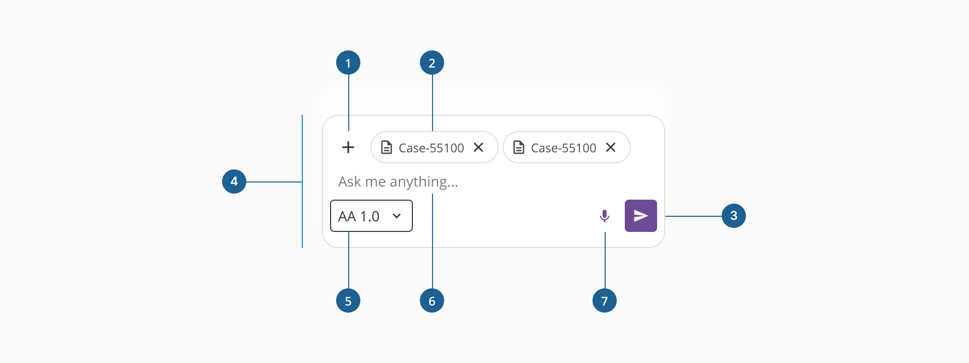
- 1.Dropdown (optional): allows the user to attach files, either as context for the AI or as files to send in a conversation or message.
- 2.Attachments (optional): A chip or set of chips that reflects the selection made by the dropdown immediately to its left. It represents the context attachments the user can add for the agent, or any file they want to include with the message.
- 3.Send button: the primary submission control, anchored to the bottom right of the action bar. Transitions to a stop or cancel affordance in the generating state.
- 4.Container: the visual wrapper of the component, defining its boundary, background, and border. Border color changes to reflect the current interaction state.
- 5.Model Selector (optional): a dropdown anchored to the bottom-left corner of the action bar. Intended for selections that shape how the message is processed, such as a model selector or a conversation mode picker.
- 6.Text input area: the main composition field. Displays placeholder text when empty and grows vertically as the user types.
- 7.Dictation button (optional): a voice input trigger positioned to the left of the send button that lets user dictate their query instead of typing. It should only be visible when voice input is functional in the target context.
The message input is designed for conversational UI patterns, where the primary user goal is to compose and submit a message or query. Unlike traditional form inputs, it is not intended for data collection in structured forms.
A message input always requires a send action to complete the interaction. It may optionally include a contextual zone for attachments and a left action slot for secondary selections that affect how the message is processed.
Although the Message input differs from standard form inputs, it shares some common configurable features:
- Placeholder text: a short hint displayed inside the text input area that describes its purpose or expected content.
- Helper text: additional guidance displayed below the component to help the user understand constraints or formatting requirements.
- Optional elements: the top actions zone, left action slot, and voice button are all optional and can be toggled independently to fit the needs of each interface.
The message input supports the following standard interactive and informative states:
- Disabled: prevents user interaction. Use when the input is not applicable or editable under certain conditions, such as when permissions are insufficient or the interface is in a read-only mode.
- Error: applied when the input fails validation or a submission results in a system error. The border switches to the error color and the error message zone below the container becomes visible.
- Read-only: the field is visible and focusable but not editable. Suitable for displaying a message that cannot be modified.
The Message input is highly configurable, allowing teams to adapt it to both simple messaging interfaces and complex AI-assisted applications. This section highlights the key behaviors and zones of the component.
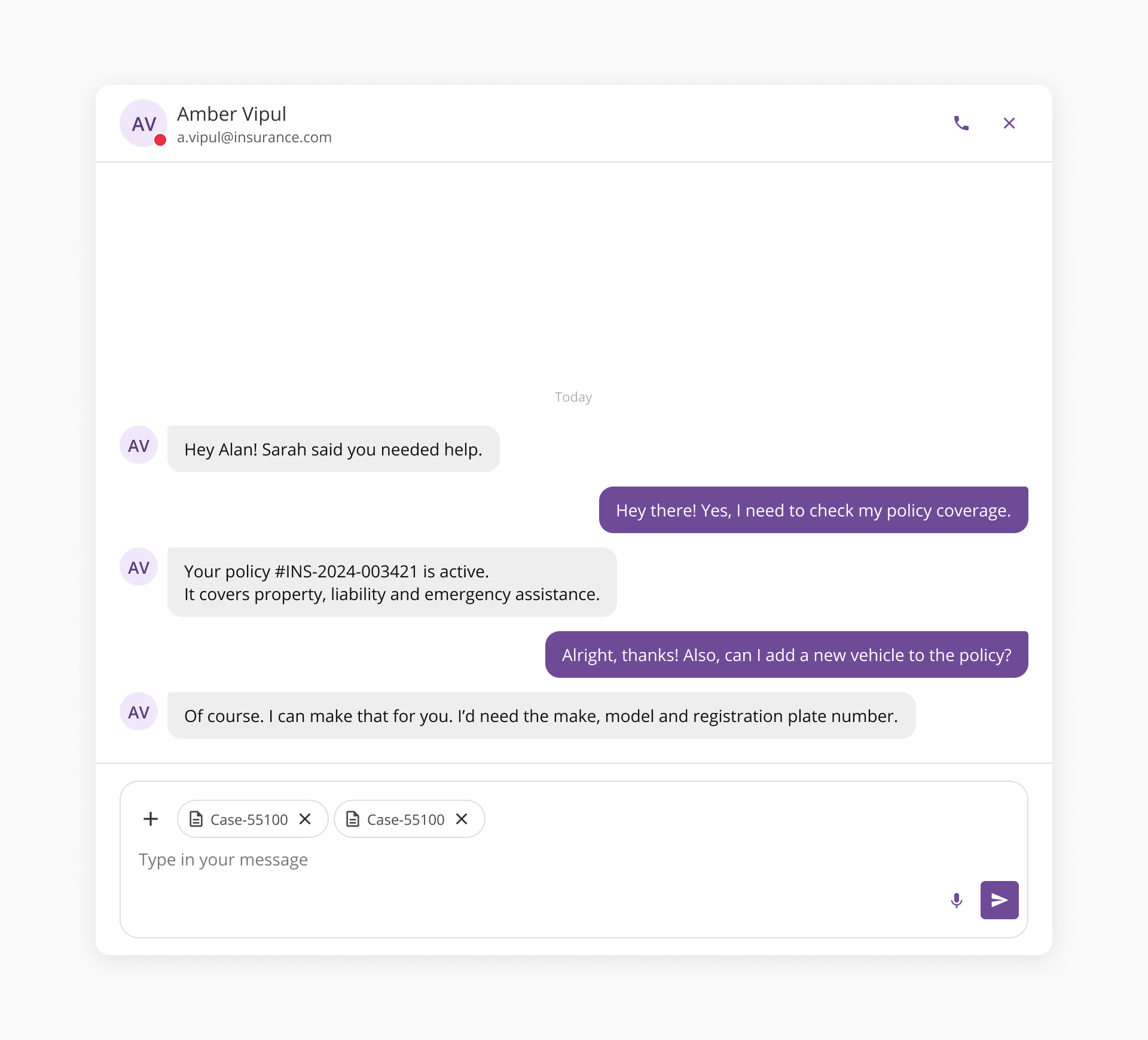
The top actions zone provides space for contextual chips and a dropdown. When enabled, it appears as a horizontally scrollable strip above the text input. Chips in this zone represent items attached to or scoping the current message, such as uploaded files or active filters.
Users can dismiss individual chips using the close action on each one. When the number of chips exceeds the available width, the strip scrolls horizontally.
The left action slot hosts an optional selector at the bottom left of the action bar. Its purpose is to provide a secondary selection that affects how the message is processed, not to trigger an action. Examples include model selectors, conversation mode pickers, and language selectors.
The action bar's right side contains the send button, and optionally the voice button.
- The send button is always visible and submits the composed message.
- The voice button provides a voice input trigger. It should only be shown when dictation is supported and operational in the target context. Displaying it without functional voice capability creates a broken affordance.
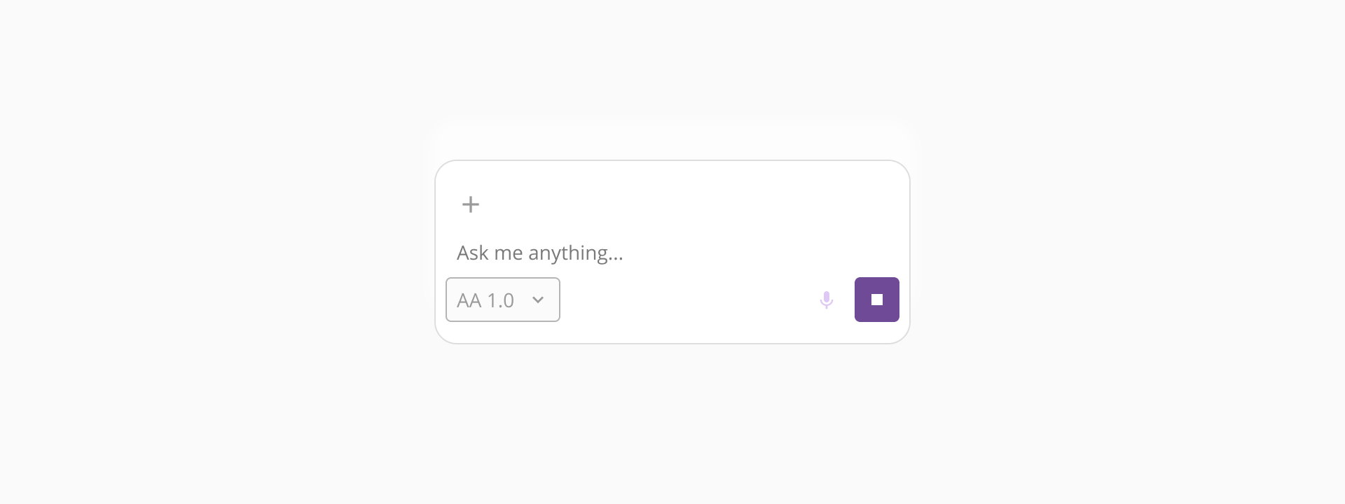
The generating state is specific to AI-assisted interfaces. It locks the send button to prevent duplicate submissions while the system processes a response, and transitions the button to a stop or cancel affordance. The text input area remains accessible so users can draft their next message while waiting.
- Use this component for message composition only: The message input carries conversational connotations by design. Using it in standard form contexts, such as notes fields, description inputs, or feedback forms, creates mismatched expectations. Use our text area component for those cases.
- Write placeholder text that sets scope: avoid generic strings like "Type here" or "Write something...". Prefer specific strings that reflect the capability of the interface, such as "Ask about your policy documents". Keep it short enough to be absorbed at a glance.
- Keep chips focused on the current message: chips should represent items directly tied to the message being composed, such as attached files or active filters. Do not use this zone for persistent session state or navigation elements unrelated to the current input.
- Avoid overloading the context selector: the context selector dropdown in the top zone should offer a focused set of options. If the number of options grows large, consider using a separate selection pattern before the user enters the composition area.
- Reserve this slot for context-setting selections: the left action slot is intended for selections that shape the message, not for buttons or navigation elements. Model selectors, mode pickers, and language selectors are appropriate. Overloading this slot with primary controls creates ambiguity about the message flow.
- Use the generating state instead of disabling the component: disabling the field during AI processing removes the ability to draft the next message while waiting for a response. The generating state locks submission while keeping the composition area accessible. Reserve disabled for genuinely unavailable contexts.
- Write actionable error messages: the error string should tell the user what to do, not just what went wrong. "Maximum 2,000 characters" is more useful than "Input too long". If the error originates from a system failure, acknowledge it clearly and offer a next step.