Header
The header is a structural component placed at the top of the interface. It provides global access to navigation, branding, and user actions, ensuring consistency and orientation across products and applications.
The header is part of the application layout, so it can only be used inside of it. Please check the DxcApplicationLayout documentation.
The Header serves as the primary navigation and identity element for an application. It includes branding, quick access to key sections via navigation links, and a user account menu. Its consistent presence reinforces brand recognition and improves usability by offering easy navigation and access to user-related actions.
It typically contains three main areas: left slot, main navigation and right slot.
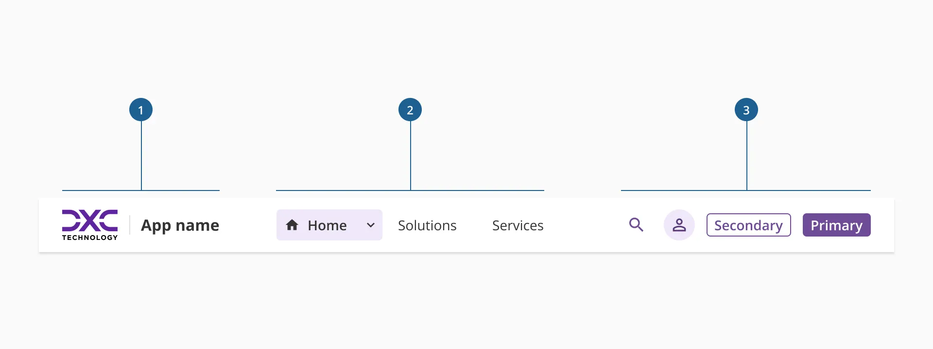
- 1.Left slot: it's where the branding and application name is displayed.
- 2.Main navigation: a section that allows access to primary and secondary navigational levels, which purposes is to guide the user through the primary levels of the interface.
- 3.Right slot: it's the place where all utilities related to an application are hosted. It's highly adaptable for each product's needs.
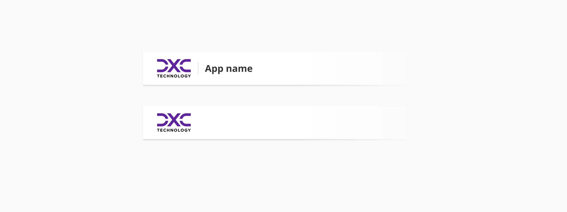
The left slot hosts all branding elements of the product, application, or website. It is the visual anchor of the header and helps users quickly identify the environment they are interacting with.
The logo is a required element in every implementation of the header, ensuring brand presence and recognition across all platforms. It must always be displayed inside a fixed container to maintain consistency in size and alignment with other header elements.
The name of the product or service is optional and can be placed to the right of the logo. When included, it reinforces brand identity and provides additional context—particularly useful in multi-product ecosystems or environments where the logo alone may not be distinctive enough.
Both elements together should remain visually balanced, with consistent spacing and vertical alignment, contributing to a cohesive and professional visual hierarchy.
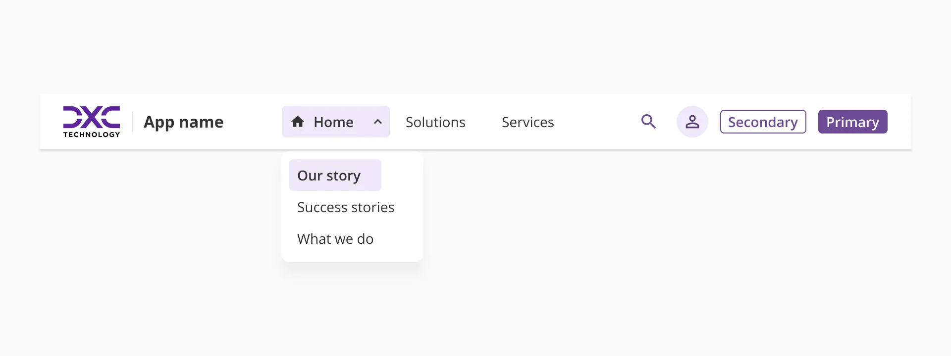
The main navigation section occupies the central area of the header and serves as the primary entry point for exploring the product or application. It spans the full available width, making it the most visually dominant and functionally important area of the component.
Navigation items within this section can be either single-level links or expandable items that reveal one additional level of navigation. This two-level limit is intentional and designed to keep the header focused on orientation rather than deep exploration. The goal is to help users understand where they are and move between high-level areas efficiently, while deeper navigation is delegated to components such as the sidenav.
Each navigation item should provide clear affordances for interaction, indicating whether it leads directly to a section or expands to show sub-options.
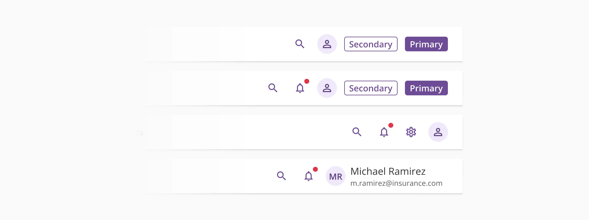
The right slot is reserved for utilities and user actions that support quick access to key functions within the product or application. It typically includes elements such as search, notifications, settings, help, or user profile; but its configuration is intentionally flexible to adapt to different product contexts.
While some elements may be predefined or recommended as part of the default header configuration, this area remains open and customizable, allowing teams to include, remove, or reorder actions according to their needs.
This flexible structure allows the right slot to serve both standardized and product-specific use cases without compromising the header's overall consistency and usability.
However, though this area is open and configurable, we strongly recommend starting from one of the predefined layout examples provided in Halstack. It is also very important not to include too many actions, as it may overload the component and reduce clarity.
On smaller viewports, the header adapts to its responsive version. This layout is designed to accommodate the component's elements clearly and consistently, so the experience remains coherent across all screen sizes. The responsive header is organized into three sections: the top bar, the body, and the bottom.
- Top bar: this section displays the product or application branding, along with the most relevant utilities from the right slot of the standard header.
- Body: this is where the main navigation items are placed. Visually, these items follow a structure similar to the ones in our sidenav component, and their behavior remains consistent with how they function in the default sidenav.
- Bottom: this area is custom, but it's reserved for the header's call-to-action elements, when present.
- Use a header in any product that requires clear orientation and structure, especially those that are more than just data dashboards.
- In complex applications, the combination of the header and the sidenav provides a solid navigation framework that allows users to move efficiently and understand the product’s structure.
- When designing an application, always consider the information architecture and how it will map across the navigation components offered by Halstack. Defining clear hierarchies and dependencies between header and sidenav is essential for usability and a smoother user experience.
- Keep the header focused on orientation and high-level access, avoiding turning it into a full navigation menu.
- Choose a compact version of the brand logo that occupies as little horizontal space as possible. This ensures enough room for other header elements with higher interaction priority.
- When including the product or service name, keep it short, clear, and recognizable. Avoid long or redundant titles that compete visually with the navigation items.
- Ensure that the logo maintains sufficient contrast and legibility on different background colors.
- Carefully evaluate the depth of navigation before configuring the header. Determine whether the sidenav is needed and design both navigation layers to complement each other rather than overlap in functionality.
- Keep link names clear, concise, and action-oriented so users can immediately understand where each link will take them.
- Use icons sparingly and only when they add value or clarity. Avoid decorative or overly abstract icons that could create confusion.
- Limit the number of visible items to maintain balance and prevent overflow.
- Avoid overloading the header with too many utilities. Keep only the most essential actions visible, and relocate secondary or less frequent actions to other areas such as the sidenav, footer, or dedicated sections.
- Ensure that the icons used for actions are universal and easily recognizable. When an icon may not be self-explanatory, provide a tooltip for clarity.
- Group related actions within containers to maintain alignment and logical order.
- Follow accessibility best practices: all icons and actions must have an accessible label and be operable by keyboard.
- Review responsive behavior when adding or removing utilities to ensure the right slot maintains balance and visual stability across viewports.
- Even though the responsive header is composed of custom sections, each area should remain aligned with the structure described above to preserve clarity and consistency across smaller viewports.
- Avoid overcrowding the top bar in the responsive layout. Only the most essential and frequently used actions should remain visible there. Additional actions or CTAs should be placed in the bottom section, while navigation items should be housed in the body.
- Keep visual hierarchy as simple as possible. In reduced spaces, users scan content faster, so each section should present its elements in a clear and predictable order.
- Ensure that labels, icons, and interactive elements resize or reorganize in a way that maintains readability and touch friendliness, especially on mobile devices.