Footer
The footer is a UI component placed at the bottom of the page, providing informational context, secondary navigation, and legal or support links.
The footer is part of the application layout, so it can only be used inside of it. Please check the DxcApplicationLayout documentation.
The footer is used as the final section of a page to display utility elements such as legal disclaimers, secondary links, copyright information, or the brand logo. Its purpose is to reinforce brand identity and provide consistent access across digital experiences without disrupting the main user flow.
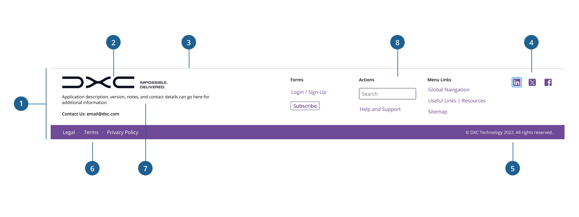
- 1.Container: The outer wrapper that defines the overall layout, padding, and alignment of all footer content. Ensures consistency across screen sizes.
- 2.Logo: Represents the brand identity visually. Positioned on the left side, it helps reinforce company recognition across all pages.
- 3.Border: Marks the upper boundary of the header to visually separate it from the main content.
- 4.Social icons: A set of clickable icons linking to the company's social media platforms (e.g., LinkedIn, Facebook). Placed on the right side for easy visibility and access.
- 5.Copyright: Text displaying legal ownership of the content. Ensures users know the site is officially owned.
- 6.Company links: A horizontal list of navigational hyperlinks such as Privacy Policy, Terms & Conditions, etc. Offers users access to important legal or informational resources.
- 7.Left slot: Commonly used for short informational paragraphs or contact details.
- 8.Right slot: Commonly used for additional links, buttons, forms, or call to action.
To maintain consistency in layout flexibility and brand presentation, the footer offers two primary variants: Default and Reduced.
- Default: provides a balanced layout with branding and essential legal links. It offers a clean, uncluttered appearance suitable for most standard applications.
- Users can add content to the Default view using custom code such as content sections, text, links, and other components for increased customization based on their specific needs.
- Reduced: offers a compact version of the footer, typically limited to branding and minimal legal text. It's best suited for lightweight experiences, login pages, or environments with constrained vertical space.
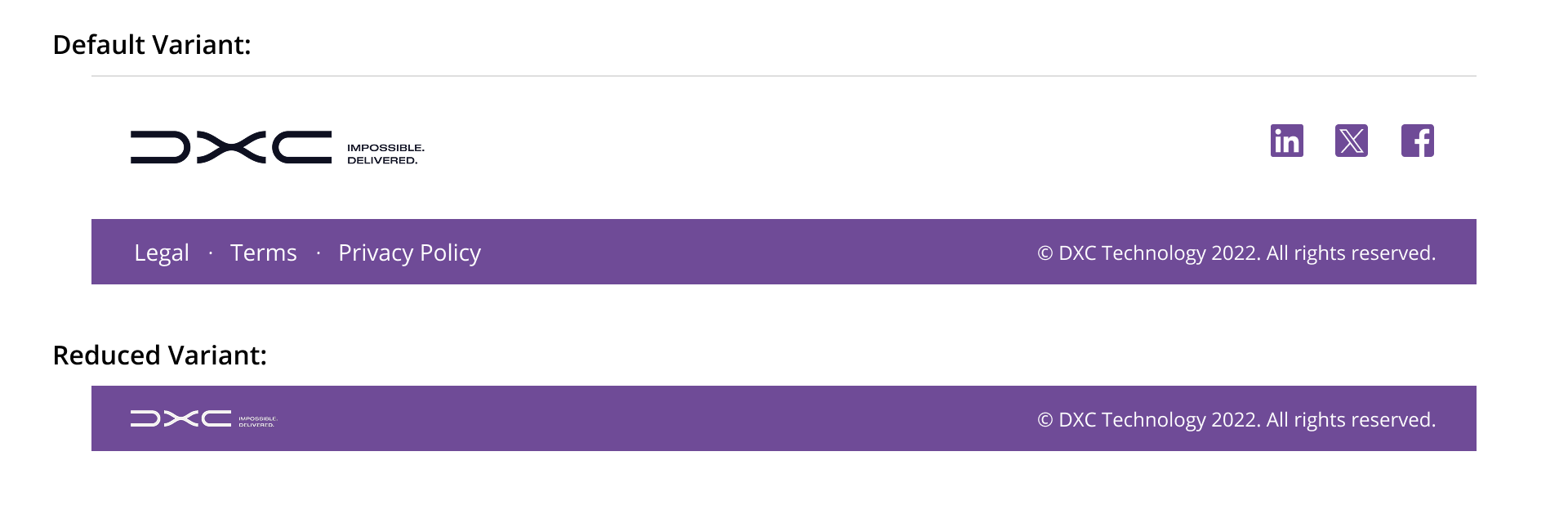
Choosing between these variants helps tailor the footer to a wide range of contexts, whether prioritizing simplicity, providing extended navigation, or optimizing for space efficiency.
- Dock the footer at the bottom of the page: The footer should appear after the content at the bottom page at all times. If the page content exceeds the current view and the user needs to scroll to reach the bottom of the content and see the footer.
- Ensure full-width alignment: By default, the footer spans the entire width of the page excluding the Sidenav. For cases when the left Sidenav is not used, the footer container should always span the full width of the screen to create a clean, structured boundary and support responsive behavior across breakpoints.
- Display copyright information on the right: consistently place legal disclaimers or copyright text aligned to the right edge of the footer to support predictable user expectations.
- Use a simplified or alternate logo: consider using a smaller or alternative version of the brand logo (isotype, imagotype, or monochrome variant) rather than duplicating the main header image to reduce visual redundancy.
- Limit the number of links: include only the most essential company links (e.g., Terms, Privacy, Accessibility) to avoid overwhelming users with excessive options.
- Select the most appropriate variant for context: choose the footer variant that best fits the content density and user goals of the page.