Tokens
Design tokens are the single source of truth for all design decisions in the Halstack Design System. They create a shared language between design and development, ensuring consistency across products while maintaining flexibility where customization is needed.
In Halstack, tokens define core attributes like colors, typography, spacing, and more — serving as the foundation for scalable, themeable, and reusable component styling.
Tokens allow product teams to build faster, with greater consistency and confidence.
When Halstack was first established, its token structure followed a two-tier model: primitive tokens (the raw foundational values) and component tokens (styles applied at the component level.) The intermediate alias layer — commonly used to connect foundations to components — was missing.
Over time, this gap led to inconsistencies. Each component seemed to "speak its own language," with naming conventions, color assignments, and styling logic varying wildly between them. Without clear documentation or a shared taxonomy, this structure is hard to maintain and harder to scale.
The absence of a middle layer and a consistent naming strategy cause several challenges:
- Inconsistent styles: Components with similar behaviors (e.g., hover states) often used unrelated token values.
- Difficult maintenance:Without a systematic link between primitives and components, updating or theming became unpredictable.
- Limited reusability: Repeated values were not abstracted into tokens, forcing duplication and increasing the chance of drift.
The refactor aims to create a three-tier token architecture:
- 1.Core: The raw values.
- 2.Alias: Contextual tokens that translate foundations into semantic meanings.
- 3.Component: Tokens applied to specific UI components, referencing aliases rather than hardcoded values.
At this stage, the Core and Alias layers are already in place and actively used in both design and development workflows. These two layers give us a solid foundation of structured, semantic tokens that ensure consistency and scalability.
The next step is to extend this work into the Component layer, where tokens will be defined specifically for UI components by referencing existing Alias tokens. This will allow us to standardize pattern across all Halstack components and give product teams even greater flexibility when theming. We expect to begin working on this layer in the coming months.
The Core layer contains the fundamental, non-contextual design values that form the base of the system. They are not tied to any component or theme; instead, they describe pure design attributes such as specific colors or type sizes.
Foundations in Halstack include:
- Color — Defines the base color palette, organized and measured using the OKLCH color space for accuracy and accessibility.
- Typography — Sets font families, weights, sizes, and line-heights that serve as the system's typographic foundation.
- Spacing — A consistent set of spacing values to control layout and component padding/margins.
- Border — Defines border widths, radius, and styles for consistent corner and edge treatment.
- Elevation — Standardized elevation styles for depth and hierarchy in UI elements.
- Height — Predefined vertical dimensions for components and layouts.
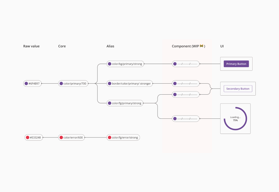
The Alias layer maps core values to semantic meanings that align with the design language and user context.
For example: color/bg/primary/strong → maps to a core token like color/primary/700 (#6F4B97)
By separating raw values from their semantic role, we not only enable easy theming and quick adjustments without touching the foundational values, but also establish clear usage expectations: whether a token should be applied as a background (bg), foreground (fg), or border element. This reduces ambiguity and ensures that tokens are applied consistently across components and interfaces.
Component tokens define the styling for each component in Halstack, referencing Alias tokens rather than hardcoded values.
Example: A button's hover background might use, which itself maps to an alias token, which then points to a core color.
This indirection:
- Keeps component styles consistent across the system.
- Simplifies global updates.
- Allows products to theme components without rewriting every style rule.
Until now, Halstack has supported two theming strategies — an opinionated approach with limited, safe customization, and an advanced approach with broader freedom. Several products have already benefited from these strategies.
With the new token architecture, our goal is to continue supporting both levels of theming, even though the underlying structure that makes them possible will change. This ensures that product teams can rely on the same flexibility they know today, while also benefiting from a more scalable and consistent system.
By aligning this strategy with our token architecture:
- With the Core layer, we can already enable opinionated theming, exposing tokens like colors, spacing, or typography in a way that is safe and predictable.
- To unlock Advanced theming, we will rely on the upcoming Component layer, which will allow deeper overrides at the component-token level. This work is still in progress and will be rolled out in the coming months.
This structured approach ensures that theming in Halstack is flexible but safe — giving teams the ability to adapt components to their needs while still protecting those design decisions that are critical for accessibility such as maintaining proper contrast ratios, minimum font sizes, and spacing values. In this way, we preserve both brand flexibility and usability standards across all products.
Design tokens in Halstack are created in Figma, where they serve as the foundation for all design decisions. From there, they evolve into development-ready assets, ensuring a seamless bridge between design and code.
In Halstack, tokens are defined and maintained as Variables in Figma. These variables represent values like colors, spacing, typography, and more, and are applied directly in the design of components and interface flows.
We have overhauled our token system to improve consistency in naming and usability. To achieve this, we chose an implementation with CSS variables over our previous JavaScript-based implementation. There are other advantages to using CSS variables, including less re-rendering, better performance and the ability to update them at runtime.
As explained in the previous section, the token structure has been updated from a two-layer system to a three-layer system. This new structure will allow developers to customize both the first and third layers.
The first layer (composed of core tokens) can be customized when using the opinionated theming approach. You can view the list of available core tokens.
The second layer (composed of alias tokens) can be used to replace raw values such as colors, paddings, sizes, etc. Alias tokens act as an intermediate mapping between the low-level core values and the visual roles used by components. You can view the list of available alias tokens.
The third layer (component tokens) is still under development.