Typography
Typography plays a critical role in structuring the user's experience through the visual impact it has on the interface content.
It defines what is the first noticeable piece of information or data based on the font's shape, size, color, or type, and it highlights some pieces of text over others.
Our selected typography helps organize and prioritize content in a way that is clear, accessible, and visually appealing.
Text styles and typography tokens consist of certain font properties, such as font family, size or weight. In design tools like Figma, text styles are applied visually, while in code, typography tokens serve this purpose.
Some typographic elements used in the Halstack Design System include headers, body, helper texts, titles, and labels. In your designs, make use of those elements. These typographic choices are already embedded within the typography tokens and will make it possible to enable typography theming in the future.
These are the core definitions and tokens that form the base of the typographic system. They should be used consistently across all typographic styles.
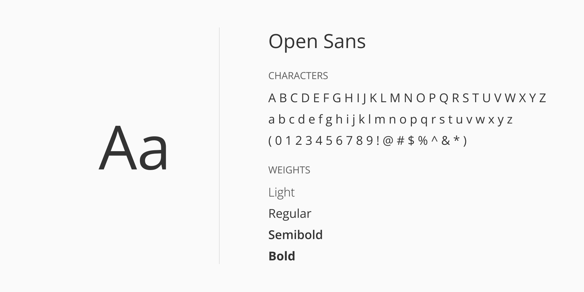
For our sans-serif font-family we use Open Sans; a modern, humanist sans-serif typeface designed by Steve Matteson. It is known for its clarity, neutrality, and readability across a wide range of digital and print applications.
With its open forms, neutral yet friendly appearance, and optimized legibility at small sizes, Open Sans is optimized for both web and mobile interfaces, balancing aesthetic appeal with functional clarity. The typeface includes a wide character set that supports Latin, Greek, and Cyrillic scripts, making it suitable for internationalization.
Open Sans can be accessed via Google Fonts and is released under the SIL Open Font License Version 1.1.
Font styles provide additional ways to convey meaning and emphasis in text elements. While different styles such as italic can be used to highlight certain content, the default style applied is normal. This ensures consistency and readability across most text, reserving other styles for special cases.
| Token | Style | Usage |
|---|---|---|
font/style/normal | normal | Default |
font/style/lightitalic | italic | Applied selectively for helper text where subtle emphasis is needed. |
Typography usage is categorized by purpose. Each category has predefined size and weight combinations to ensure consistency and scalability across interfaces.
Use headings for page titles and section introductions. Headings are designed to stand out from regular text, creating clear visual hierarchy and making it easier for readers to follow the organization of the content.
Headings mark the start of new sections. Always use designated heading styles, rather than just bolding text or changing the font size, since proper headings are important for accessibility.
Appropriate heading levels guide users through the page, especially those using screen readers or other assistive devices. Correct use of heading levels also helps organize information, making content easier to scan.
Heading tags (<h1> through <h6>) should be applied in order, without skipping levels. Each page should have a single h1, typically reserved for the main title, and subsequent headings should follow in sequence (for example, use h2 after h1, not h4).
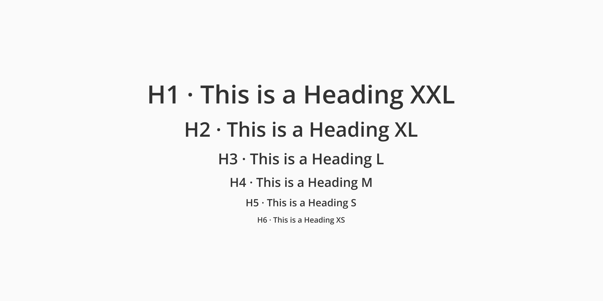
| Token | Font size | Font weight | Usage |
|---|---|---|---|
typography/heading/xs | font/size/12 | Light / Regular / Semibold | H6 |
typography/heading/s | font/size/16 | Light / Regular / Semibold | H5 |
typography/heading/m | font/size/20 | Light / Regular / Semibold | H4 |
typography/heading/l | font/size/24 | Light / Regular / Semibold | H3 |
typography/heading/xl | font/size/32 | Light / Regular / Semibold | H2 |
typography/heading/xxl | font/size/40 | Light / Regular / Semibold | H1 |
Used for paragraphs, long-form content, and general UI copy. It usually follows headings or subheadings, providing detailed information or messages. Body text should prioritize readability. Use sizes according to density and layout needs.
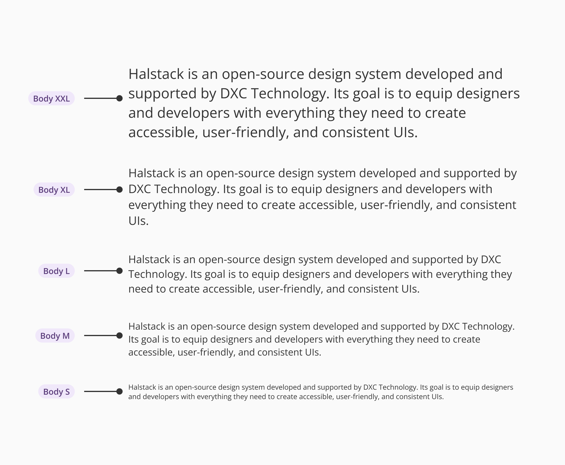
| Token | Font size | Font weight |
|---|---|---|
typography/body/xs | font/size/12 | Regular |
typography/body/s | font/size/14 | Regular |
typography/body/m | font/size/16 | Regular |
typography/body/l | font/size/18 | Regular |
typography/body/xl | font/size/20 | Regular |
typography/body/xxl | font/size/24 | Regular |
Used for inline guidance, validation messages, or tooltips. Helper text is typically small and subtle but must remain legible.
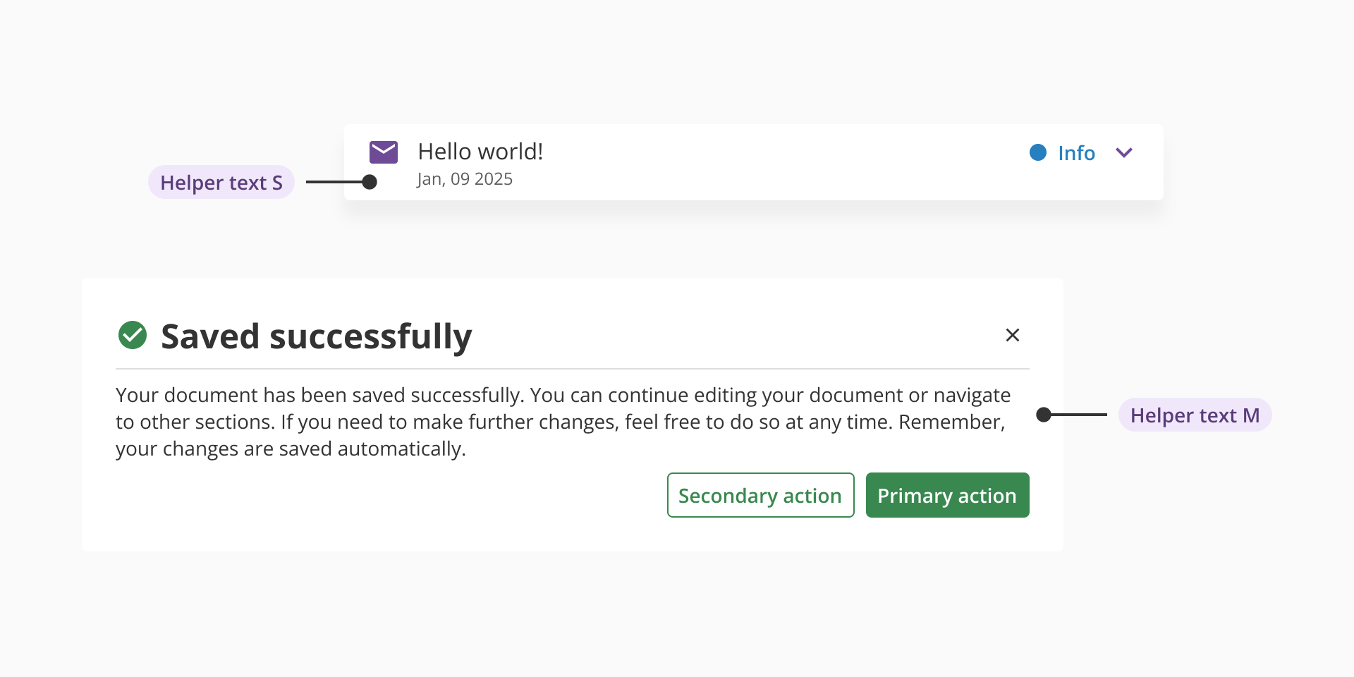
| Size | Font size | Font weight | Font style |
|---|---|---|---|
typography/helper-text/s | font/size/12 | Regular | - |
typography/helper-text/m | font/size/14 | Regular / Semibold | - |
typography/helper-text/l | font/size/16 | Light | Italic |
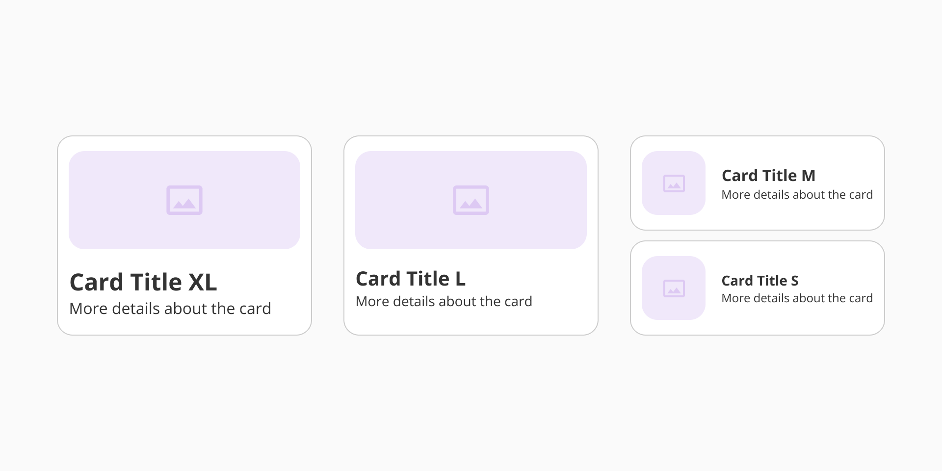
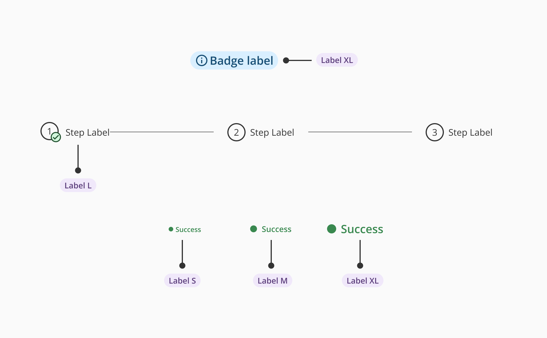
Used to describe UI elements such as form fields, checkboxes, or sections. Labels should be clear, concise, and consistent in weight and size throughout the product.
| Size | Font size | Font weight |
|---|---|---|
| S | font/size/12 | Regular / Semibold |
| M | font/size/14 | Regular / Semibold |
| L | font/size/16 | Regular / Semibold |
| XL | font/size/20 | Regular / Semibold |
- Use the defined font family (
font/family/sans) consistently. - Apply only the specified weight and size combinations per use case.
- Avoid using font sizes smaller than 12px for accessibility reasons.
- Maintain a minimum 4.5:1 contrast ratio for standard text.
- Do not apply custom typography outside of the predefined system to ensure consistency and scalability.