Iconography
Icons are visual elements that can serve different purposes depending on their context. In Halstack, icons are used not only to represent ideas, objects, or actions, but also to support the user's journey through the interface. They help guide attention, reinforce meaning, and visually enhance actions or sections within an application.
At Halstack, we've chosen to adopt the Material Icons library, specifically the outline and filled variants, as our standard icon set. While we did not create these icons ourselves, there are strong reasons behind this decision that align with the goals of our design system:
- Consistency: Material Icons offer a comprehensive, visually coherent set of icons that cover a wide range of common actions, objects, and concepts. Using a unified library helps us maintain consistency across all Halstack-based products.
- Scalability: with hundreds of pre-designed icons available and frequent updates, Material Icons scale easily with product needs: whether we're designing simple interfaces or more complex workflows.
- Accessibility: Material Icons are built with accessibility in mind, supporting clear recognition and compatibility with assistive technologies when used correctly.
- Design and engineering efficiency: leveraging a widely adopted icon set reduces the effort needed to create and maintain custom icons. This speeds up both design and development workflows, allowing teams to focus on building better user experiences.
- Cross-platform support: Material Icons are optimized for use across web, Android, and iOS platforms, helping us build consistent and adaptable experiences regardless of the target platform.
By adopting Material Icons, we ensure that our iconography remains modern, flexible, and easy to work with, without sacrificing quality or usability.
Material Icons are grouped into functional categories that help organize their purpose and usage. Within Halstack, we follow this categorization to help designers and developers quickly find the right icon for each context.
The main categories include:
- Navigation
Icons that help users move through the interface (e.g.,
menu,arrow_back,close,more_vert). - Actions
Icons that represent specific user actions (e.g.,
edit,delete,download,add,check_circle). - Feedback / Status
Icons that indicate the state of a system or user feedback (e.g.,
error,warning,info,check_circle_outline). - Media and Files
Icons representing media types or file interactions (e.g.,
image,video_library,attach_file). - Communication
Icons used in messaging, comments, or user contact interfaces (e.g.,
chat,email,notifications). - Content and Layout
Icons related to formatting, content manipulation, or UI controls (e.g.,
filter_list,sort,grid_view,view_list). - Device and System
Icons for hardware or system-level actions (e.g.,
battery_full,wifi,settings).
In Halstack products, the outline style is the default and most widely used for icons. This choice reflects our preference for clean, lightweight visual elements that align with our UI aesthetics.
Among all available categories, the following are the most commonly used:
- 1.Navigation
Used extensively across headers, sidebars, and in-page navigation elements.
- 2.Actions
Found in interactive components like buttons, dropdowns, and toolbars.
- 3.Feedback / Status
Integrated into form validation, alerts, snackbars, and system messages to communicate state clearly.
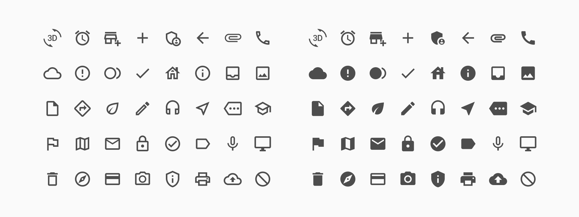
Halstack supports two visual styles of Material Icons: Outline and Filled. Both styles are available through the Material Icons library and can be used across the design system depending on the context and visual intent. By offering both outline and filled styles, Halstack ensures visual flexibility while maintaining system consistency. Designers can use tone and emphasis intentionally, matching icon style to context without compromising clarity or usability.
The outline icons are characterized by their lightweight, hollow appearance with thin strokes and open shapes. They offer a modern, minimalist aesthetic that aligns well with Halstack's clean UI philosophy.
This variant is our default style because it:
- Integrates seamlessly into interfaces without overwhelming other UI elements
- Maintains legibility and clarity even at small sizes.
- Provides a subtle visual cue without drawing excessive attention.
- Harmonizes with our typography, spacing, and component structure, particularly in low-density layouts.
They are ideal for secondary actions, interface navigation structure (such as back arrows or menus) and supporting text-based content without dominating the visual hierarchy.
Filled icons feature solid shapes with strong visual presence. This style creates a sense of emphasis and weight, making it suitable for highlighting actions or reinforcing key statuses in the UI.
While not the default in Halstack, filled icons are available for intentional use cases where stronger visual contrast is needed.
Filled icons are effective when:
- Used in active states, such as selected tabs or toggled buttons.
- Reinforcing status and feedback, especially in system messages (e.g., error, success, warning).
- Enhancing visibility in dense interfaces or darker backgrounds.
However, because of their bolder visual weight, filled icons should be used carefully to avoid visual clutter or drawing attention away from primary content.
While Material Icons offer a wide range of visual representations, we acknowledge that there may be rare cases where a concept, function, or domain-specific idea is not adequately covered.
In such cases, teams may need to create a custom icon. However, to ensure consistency and maintain the integrity of the Halstack visual language, the following guidelines apply:
- Responsibility
The responsibility for designing a custom icon lies with the team that requires it. This includes:
- Defining the icon's intended meaning and use.
- Designing or sourcing the visual asset.
- Testing the icon within its intended context to ensure clarity and accessibility.
- Style consistency
It is highly encouraged that any custom icon:
- Follows the same visual style as the Material Icons being used in Halstack (either outline or filled, depending on context).
- Matches the same stroke weight, corner radius, and overall proportions.
- Is optimized for the same grid size (typically 24×24 pixels).
Designing with these parameters in mind ensures visual cohesion with the rest of the interface.
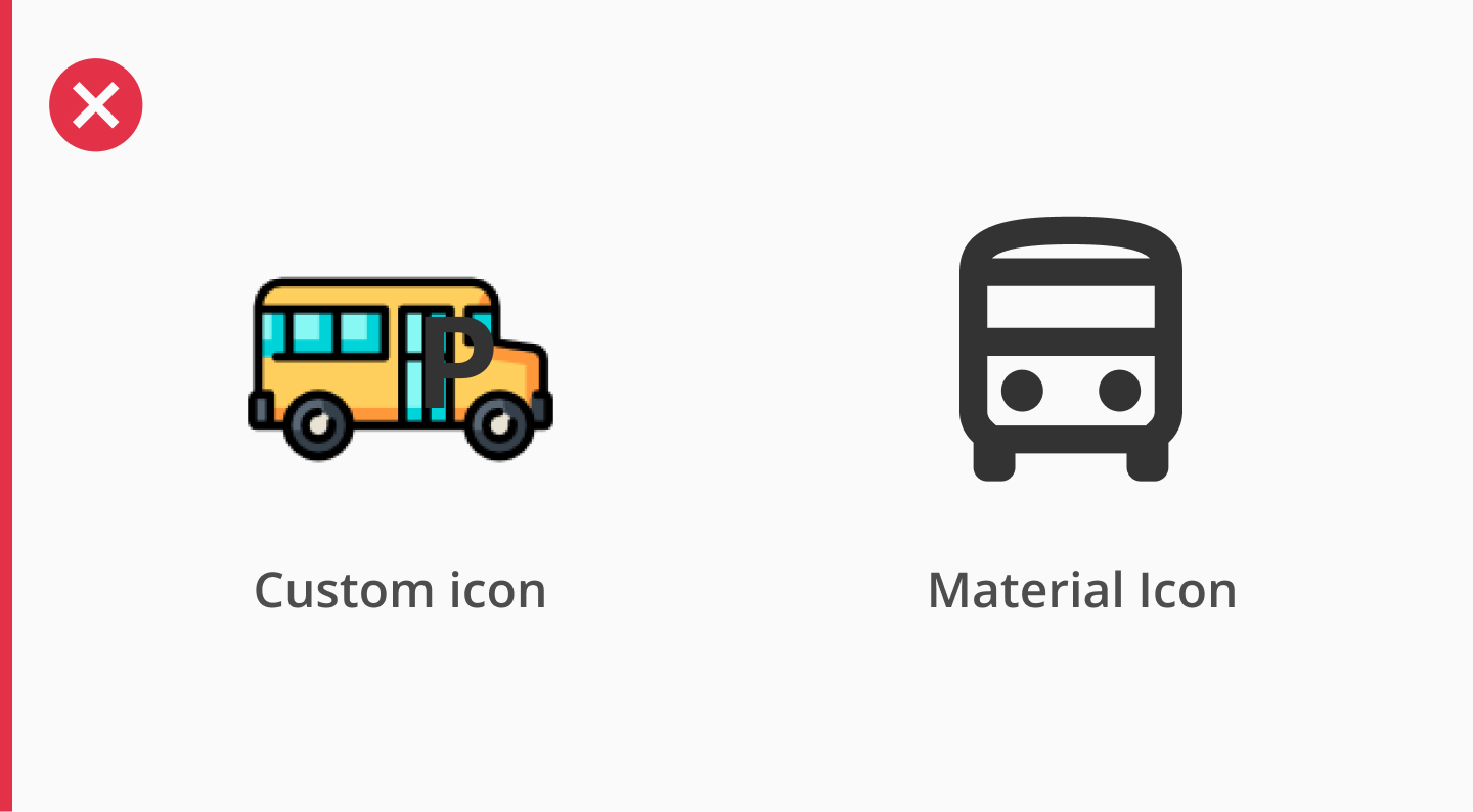
In the first figure, we can see how the custom icon is colorful, highly detailed and visually complex. This doesn't match the monochromatic, simplified geometry of the Material Icons, as you can see on the same example. Therefore, this custom icon introduces a visual "noise" that could potentially break the consistency of the interface. While it may be visually appealing on its own, this custom icon feels out of place when using it alongside the rest of the system, and should always be avoided.
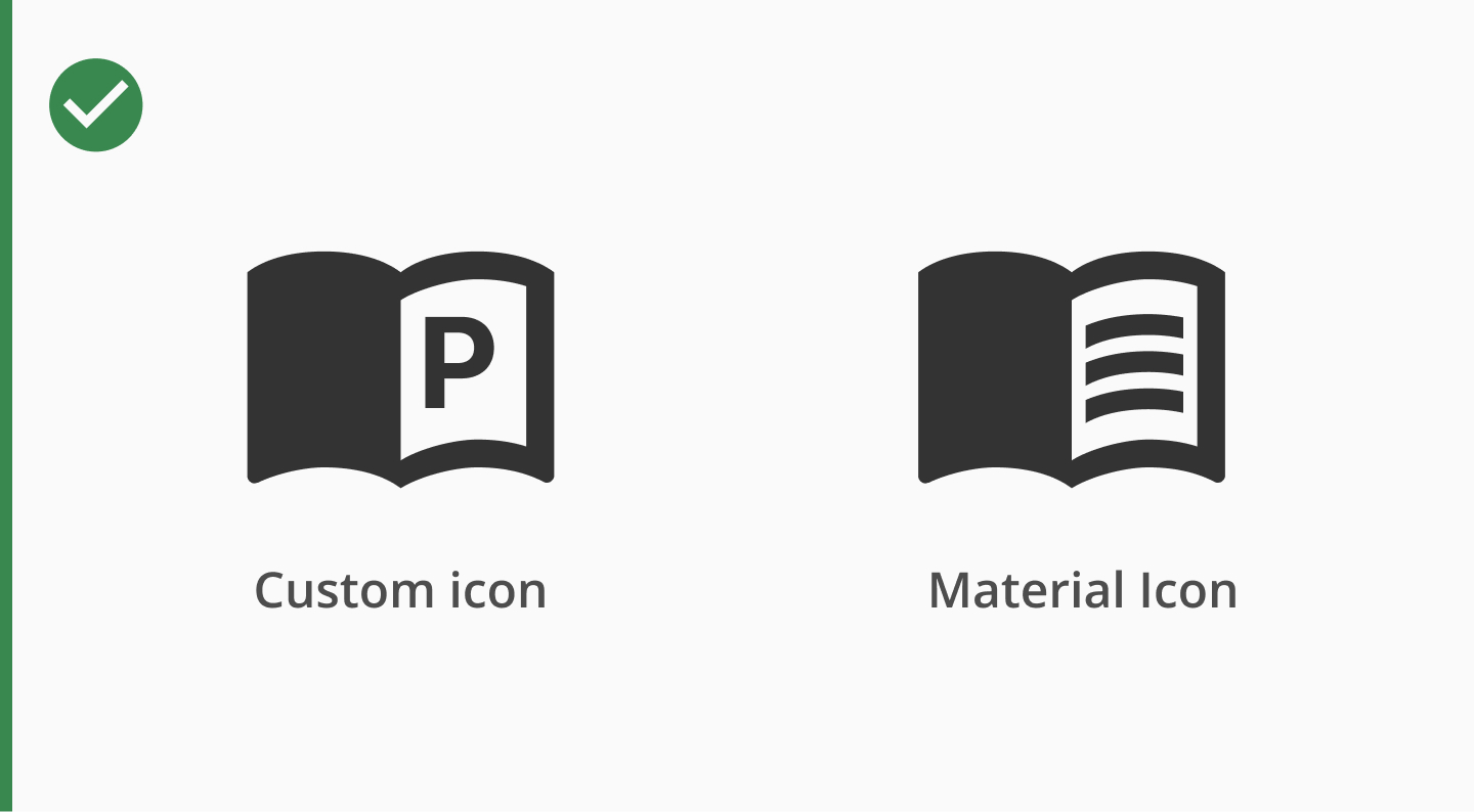
In contrast, the custom icon in the Figure 2 has been designed to mimic the look and feel of the Material icons, as it uses the same weight, proportions and stroke style. The level of detail is consistent and balanced, and it integrates naturally into the UI, appearing as if it were part of the original set. This is the kind of alignment we aim for when extending the icon set.
Icons play an important role in user interaction and communication. To ensure that all users (including those using assistive technologies) can fully understand and navigate Halstack-based interfaces, the following accessibility best practices should be followed when using icons.
- 1.Provide meaning with labels
- Informative icons (icons that convey meaning or trigger actions, like a "delete" or "download" button) must be accompanied by accessible labels.
- Use
aria-label,aria-labelledby, or an associatedlabelelement so screen readers can announce the icon's purpose.
- 2.Hide decorative icons from Assistive Tech
- Decorative icons (e.g., a chevron indicating expandable content, or a checkmark in a success message) should not be read by screen readers.
- Use
aria-hidden="true"or mark them withrole="presentation".
- 3.Maintain color contrast
- Icons must have sufficient contrast against their background, especially when used as status indicators (error, success, info).
- Follow WCAG AA or AAA contrast ratios (minimum 3:1 for UI components and 4.5:1 for icons conveying meaning).
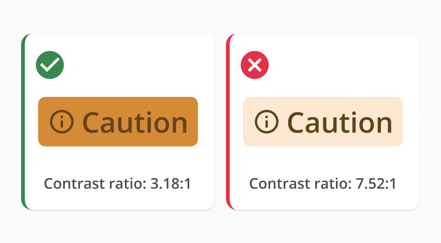
Contrast ratios in icons - 4.Don't rely on icons alone to convey meaning
- Always pair critical icons with text or tooltips to reinforce meaning, especially in form validation, alerts, and interactive components.
- This ensures understanding for users with cognitive disabilities, color blindness, or screen reader usage.
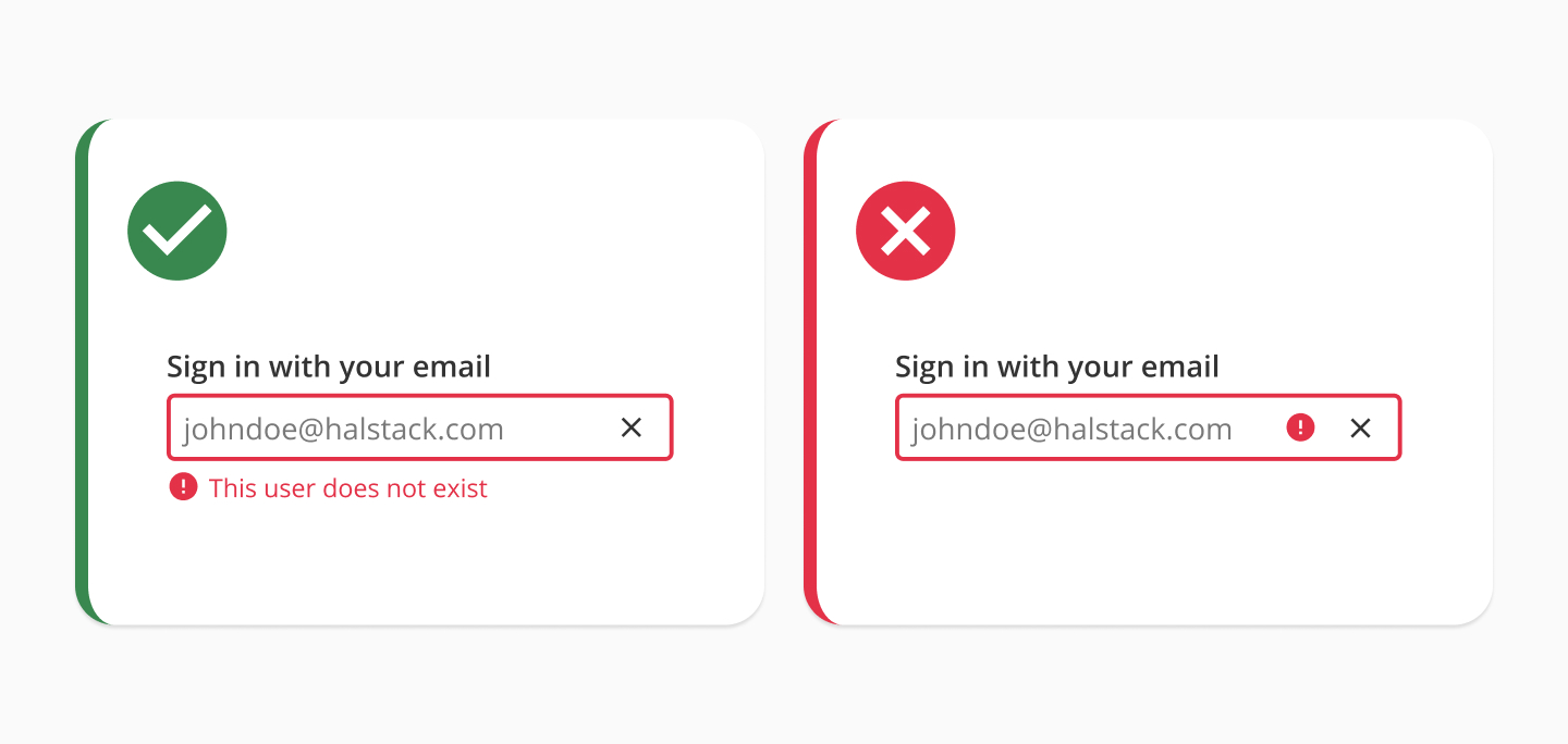
Icons with and without conveying meaning - 5.Use consistent size and hit areas
- Icons inside clickable areas (e.g., buttons or toggles) must have a minimum touch target size of 44×44px to support users with motor impairments.
- Ensure icon-only buttons are large enough and padded properly, not just visually aligned.
Using icons in our components is simple — just set the relevant prop to a Material Symbol name. To display the filled version, prefix the icon name with filled_.
If you need to use icons outside of our components, make sure the font family is set to Material Symbols Outlined. This font is automatically loaded when using our components; otherwise, it must be manually imported or installed.
To toggle between filled and unfilled icons, use the font-variation-settings CSS property:
'FILL' 0for outlined'FILL' 1for filled
- Handling icons in frames
Material Icons are carefully designed and optimized within a 24×24 pixel frame. This frame includes built-in padding and alignment rules that ensure the icon scales correctly and aligns visually with text and components.
Avoid resizing or cropping the icon inside its original frame. Doing so may lead to misalignment, uneven spacing, or loss of visual balance.
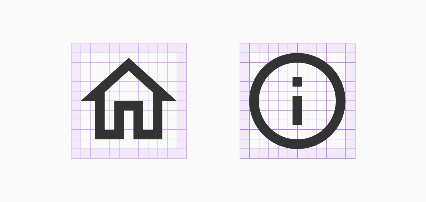
Material icons with grid and safe area - Keep the default icon names
Each Material Icon comes with a predefined name (e.g.,
edit,check_circle,menu). We recommend keeping this name unchanged when importing or using the icon in Figma or code, as it makes collaboration between design and development easier and it aligns with the original documentation and Material search. - Use consistent sizes
Halstack commonly uses icons at these sizes:
- 16x16 px — for compact UI elements (e.g., small buttons, tags)
- 20x20 px — for medium-sized interactions
- 24x24 px — default size, used in most components
These sizes map directly to our height tokens. Other sizes from the height scale are acceptable, but use them only when necessary, such as in hero banners or extra-large action areas.
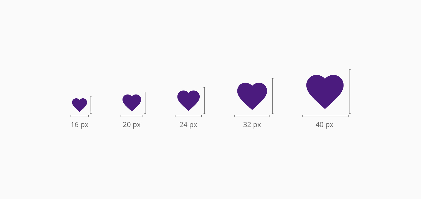
Halstack commonly used sizes for icons - Respect spacing and alignment
Icons should align vertically centered with adjacent text or content, maintain consistent padding when placed inside components (e.g., icon + label buttons), and never be stretched or highly cropped. Follow spacing tokens for margins and paddings. When paired with text, use a spacing token between the icon and label to ensure visual balance.
- Choose the right style: outline vs filled
Use outline icons as the default style in Halstack. They are clean, lightweight, and match the overall tone of our UI. When needing additional visual emphasis, use filled icons for active or selected states, important status indicators, or in places with low visual density or dark background.
Avoid mixing outline and filled styles in the same context unless you are using them to clearly indicate states or semantic differences.
- Don't use icons without clear purpose
Every icon should add value and support comprehension. Avoid using icons just for decoration: if it doesn't clarify, reinforce, or simplify an interaction, it's better to leave it out. Also avoid overly abstract or ambiguous icons. Clarity is more important than cleverness.
For further reference and documentation about Material icons library, please visit the following resources:
- Material Icons Library
Explore the complete set of Material Icons available for download or use via web fonts. You can search by name, category, or keyword, and preview each icon in outline, filled, rounded, sharp, or two-tone styles - Icons in Material Design System
Learn about the design principles, structure, and usage guidelines behind Material Icons. This resource explains how icons are built, how to choose between styles, and how to apply them consistently across interfaces.