Layout
Layout designates the position and organization of the elements of an interface. Halstack provides multiple components to achieve layout consistency and an easy way to arrange elements in the UI. An effective layout design is essential for creating seamless, consistent and robust user experiences across products, where information is easy to find and users can carry out the intended actions without getting lost in the process.
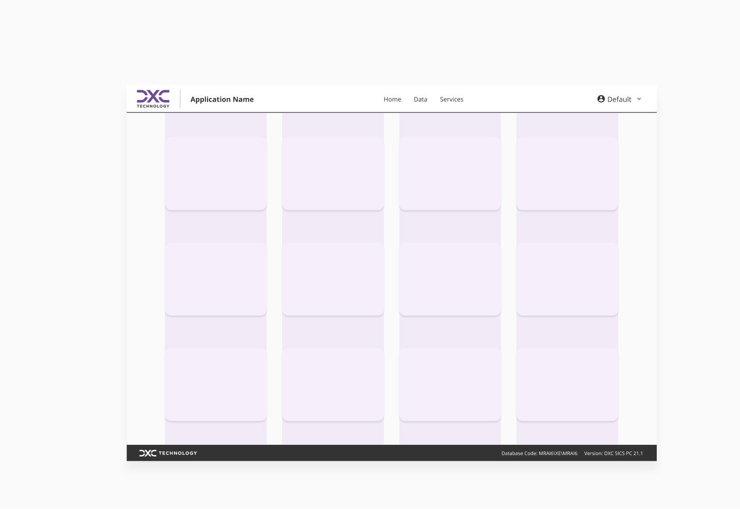
The application layout is the base that wraps any application built with Halstack. In addition, all of the components listed below can be used within each other to create a wide variety of standard layouts:
Grids provide the foundation for consistently positioning elements onscreen. The 8x Grid is the geometric foundation of all the visual elements of Halstack Design System components and spacing. It provides structure and guidance for all creative decision-making. As mention above, our design system provides its own Grid component to help users place elements within an interface effectively.
It is recommended to design based on a 12-column grid as the base layout structure. This approach allows for a wide range of combinations, from single-column layouts to more complex multi-column arrangements.
Each column is separated by a gutter, and the overall layout is framed by margins on both sides to ensure content doesn't touch the edges of the viewport.
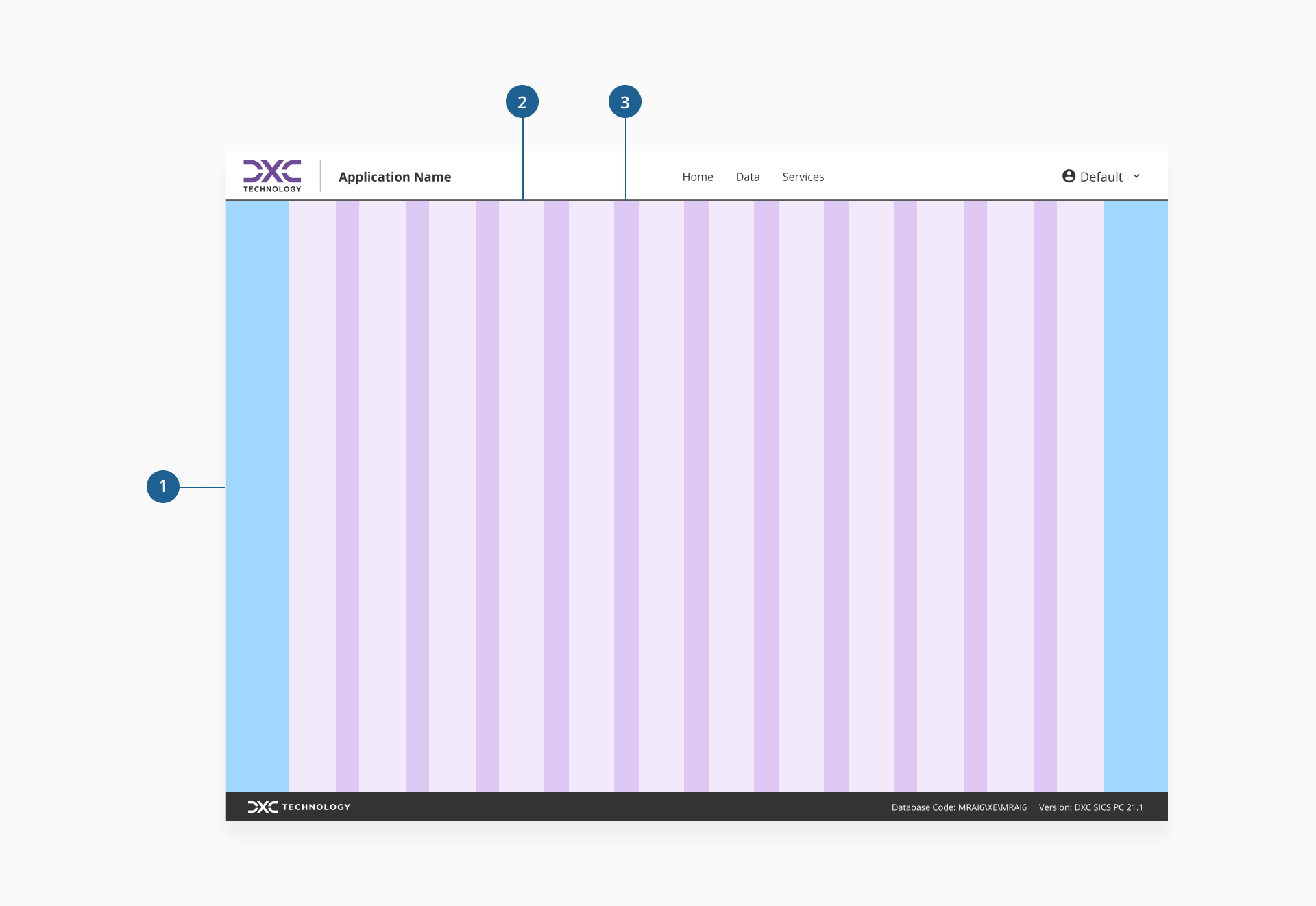
- 1.Margin
- 2.Column
- 3.Gutter
When working with columns in Halstack, the number in use can change depending on the screen size, but we recommend the grid itself to remain based on 12 columns. For example, a sidebar might take 3 columns on desktop and stack above the content on smaller viewports.
Gutters are the spaces between columns that keep content visually separated and easy to read. In Halstack, their size is defined using our spacing tokens, ensuring consistent alignment and rhythm across all layouts. Gutters remain fixed within a given breakpoint but adjust proportionally as the layout changes.
Margins are the spaces that separate the grid content from the outer edges of the layout. They help maintain a balanced and readable design, especially on larger screens. Margins remain consistent within a given breakpoint and are typically equal to or wider than the gutters, ensuring visual harmony across the layout.
Breakpoints are specific viewport widths at which the layout adapts to provide an optimal experience across devices. They determine how many columns are displayed, how margins and gutters scale, and how content is arranged. Breakpoints are chosen to ensure readability, usability, and consistency, allowing designs to fluidly adjust from small to large screens.
When defining responsive behavior, consider:
- Content-first approach: let the content guide breakpoint definition, rather than relying on arbitrary device sizes.
- Column reflow: as the viewport changes, columns may shrink, expand, or stack to preserve usability.
- Element scaling: spacing, typography, and component sizes should adjust in harmony with the grid changes.
- Consistent rhythm: maintain visual balance by aligning breakpoints with your design system's spacing and typography scales.
- Avoid device-specific breakpoints: instead of targeting exact device models, use ranges that work well for multiple screen types.
In the following table, we recommend the best combination of columns, gutters and margins for each breakpoint.
| Breakpoint | Viewport (px) | Columns | Gutters (px) | Margins (px) |
|---|---|---|---|---|
xss | 320-479 | 2 | 12 | 16 |
xs | 480-767 | 6 | 12 | 16 |
s | 768-1023 | 6 | 12 | 16 |
m | 1024-1439 | 12 | 12 | 32 |
l | 1440-1767 | 12 | 12 | 32 |
xl | 1768+ | 12 | 12 | 32 |
A well-structured page helps users navigate content efficiently, understand hierarchy, and focus on their tasks. In Halstack, we encourage a consistent structure across applications so users can quickly orient themselves, regardless of the product they are using.
Every application should include at least a header and a footer. A sidenav is highly encouraged for complex applications with multiple navigation levels, but it is not mandatory.

The header provides global context and primary navigation. It remains visible across most screens to help users quickly access high-level actions and navigate between key sections.
Expected content:
- Product or company logo
- Primary navigation links or menus
- Global actions (search, notifications, profile dropdown)
- Contextual tools (switcher for apps, quick actions relevant to the entire product)
The sidenav offers persistent access to main sections of the application. It supports exploration, quick switching between areas, and clear orientation within complex products.
Expected content:
- Main navigation links (usually grouped into categories)
- Icons alongside labels for faster scanning
- Optional collapsible groups for secondary navigation
The body is where the main content lives. It adapts depending on the specific page and user task, and it is the most flexible region of the layout.
Expected content:
- Primary task flows (forms, tables, dashboards, content areas)
- Inline navigation for subsections
- Supporting components such as breadcrumbs, tabs, or filters
The footer anchors the page with supporting information and secondary navigation. It remains consistent across pages and serves as the end point of the scroll experience.
Expected content:
- Legal links (privacy policy, terms of service)
- Secondary navigation (help center, contact, feedback)
- Copyright information
- Optional language switcher
Our own Application layout comes with a pre-configured page layout specially tailored to help users place content within their applications.
- Use the grid consistently: align all major elements (headers, content areas, components) within the defined columns and gutters to ensure visual harmony and layout predictability.
- Apply margins over padding for layout spacing: use margins to space components from each other and from page edges. Reserve padding for internal component spacing, ensuring separation and layout clarity.
- Maintain layout breathing room: keep a clear buffer between your content and the screen edges. Avoid layout without margins, which can feel cramped and reduce readability.
- Adapt to different screen sizes thoughtfully: test layouts across breakpoints to ensure content reflows naturally. Let your design scale fluidly (columns stack, gutters resize, margins adjust) to remain both usable and visually balanced.
- Design modular and scalable layouts: structure your layout into reusable sections (e.g., header, body, sidebar). This enables easy updates, extensions without design breaks, and consistent experiences across products.
- Minimize custom overrides: avoid manually overriding grid rules or spacing tokens. Custom fixes can disrupt consistency and fragment the design system. If a special layout is needed, propose it for inclusion in the core standards.