Spacing
Spacing helps establish relationships between elements and gives users visual cues that improve comprehension and interaction. Good spacing reduces cognitive load, improves accessibility, and creates cleaner, more coherent interfaces.
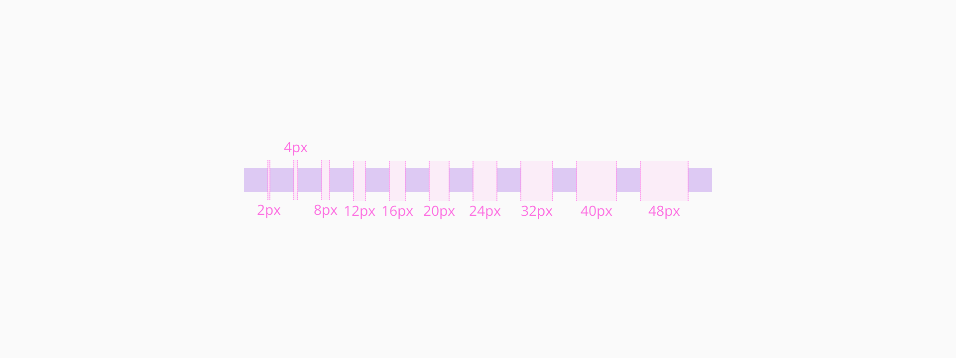
We use a scale-based spacing system derived from a base unit of 4px. All spacing — margins, padding, and element gaps — is applied using these defined increments. This promotes consistency across UI layouts and helps ensure design and code stay aligned.
We recommend using spacing tokens instead of hard-coded pixel values to maintain design consistency and scalability.
Our spacing scale is a set of predefined values based on multiples of 2px. This modular system allows designers and developers to build layouts that are consistent and responsive.
| Core token | Value (px) | Gap token | Padding token |
|---|---|---|---|
dimensions/0 | 0px | spacing/gap/none | spacing/padding/none |
dimensions/2 | 2px | spacing/gap/xxs | spacing/padding/xxxs |
dimensions/4 | 4px | spacing/gap/xs | spacing/padding/xxs |
dimensions/8 | 8px | spacing/gap/s | spacing/padding/xs |
dimensions/12 | 12px | spacing/gap/m | spacing/padding/s |
dimensions/16 | 16px | spacing/gap/ml | spacing/padding/m |
dimensions/20 | 20px | - | spacing/padding/ml |
dimensions/24 | 24px | spacing/gap/l | spacing/padding/l |
dimensions/32 | 32px | spacing/gap/xl | spacing/padding/xl |
dimensions/40 | 40px | - | spacing/padding/xxl |
dimensions/48 | 48px | spacing/gap/xxl | - |
Our spacing system is built around tokens that represent consistent pixel values. We can group these into small, medium, and large ranges to guide their application in different UI contexts — from tight, compact interfaces to broad layout structures.
For fine-grained spacing adjustments in compact UI elements where space is tight but still important.
Common uses:
- Spacing between small icons and adjacent text.
- Internal padding for tight UI elements like badges, icon buttons, or dense table cells.
- Narrow gaps between repeating elements.
- Padding inside input fields and controls.
- Vertical separation of elements within compact cards.
- Offset between a trigger element and its overlay.
For more relaxed spacing in moderately sized components or to separate content within larger elements.
Common uses:
- Padding inside medium-to-large components.
- Space between a large icon and its associated content.
- Vertical rhythm between grouped elements in cards.
- Gaps between elements in components that are not densely packed, offering a bit more breathing room.
To manage spacing at a layout or structural level, where content needs to feel clearly separated or grouped.
Common uses:
- Space between sections or major content areas on a page (e.g. from page top to header).
- Aligning content within wide containers or large components.
- Creating structure in grid systems or responsive layouts.
Both fixed and fluid spacing behaviors play a key role in determining the placement of components when adjusting screen sizes.
- Fixed spacing can make parts of the application stop resizing or show scrollbars when the screen gets too small. This is useful for layouts that need to stay structured so information is displayed correctly.
- Fluid spacing works better in smaller screens, letting elements move around as needed. For example, a form might switch from two columns to one, or components might wrap to the next line, creating a more vertical, flowing layout."
To build clean, accessible, and maintainable interfaces, apply these spacing principles:
- Design on a base grid
All spacing values should align to the 4px grid. This ensures rhythm and consistency across screens.
- Group related content with consistent spacing
Use consistent vertical and horizontal spacing between related items like form fields, titles and descriptions.
- Avoid excessive whitespace
Too much spacing can break content relationships and force users to scan longer distances.
- Test across viewports
Ensure spacing remains functional and clear on mobile, tablet, and desktop. Avoid overly tight or loose layouts.