Color
Color is a fundamental element of any design system. It communicates brand identity, guides user interaction, and establishes visual hierarchy. A well-structured color foundation ensures consistency across interfaces, reinforces accessibility, and enhances the emotional impact of the product.
Halstack defines a flexible and accessible color foundation to support brand expression, usability, and consistency across all digital products. The color palette is built on a system of design tokens that enable scalability, maintainability, and theming.
The color system ensures optimal contrast ratios for readability and accessibility, aligning with WCAG 2.1standards. Token naming follows a semantic structure to promote clarity in implementation and usage.
Color is foundational to delivering a coherent user experience and is tightly integrated with components, typography, and layout strategies throughout the Halstack ecosystem.
Previously, Halstack used the HSL color space to define and manipulate colors. While HSL offers simplicity, it falls short in delivering perceptual consistency; equal steps in saturation or lightness do not translate into equal visual changes, often resulting in tonal ramps that feel uneven or unreadable.
We now adopt the LCH (Lightness, Chroma, Hue) color space as a foundation for our color generation and manipulation. LCH is perceptually uniform, meaning changes in values correspond more closely to how humans actually perceive color differences. This results in:
- More balanced and predictable tonal scales
- Improved accessibility through consistent contrast across tones
- Better visual harmony in both light and dark themes
By switching to LCH, Halstack ensures a more robust, inclusive, and visually coherent color system that scales effectively across all interfaces and user needs.
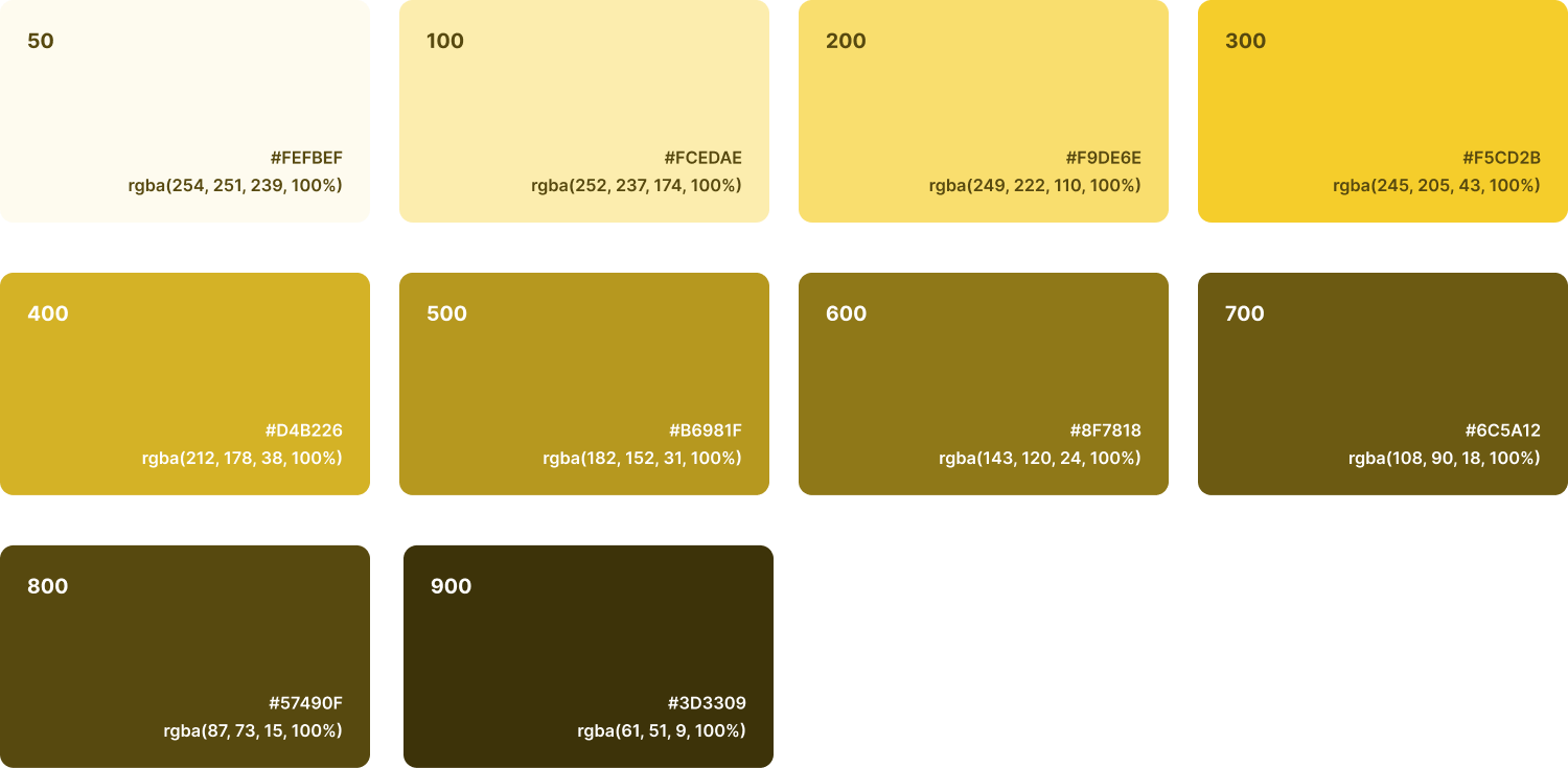
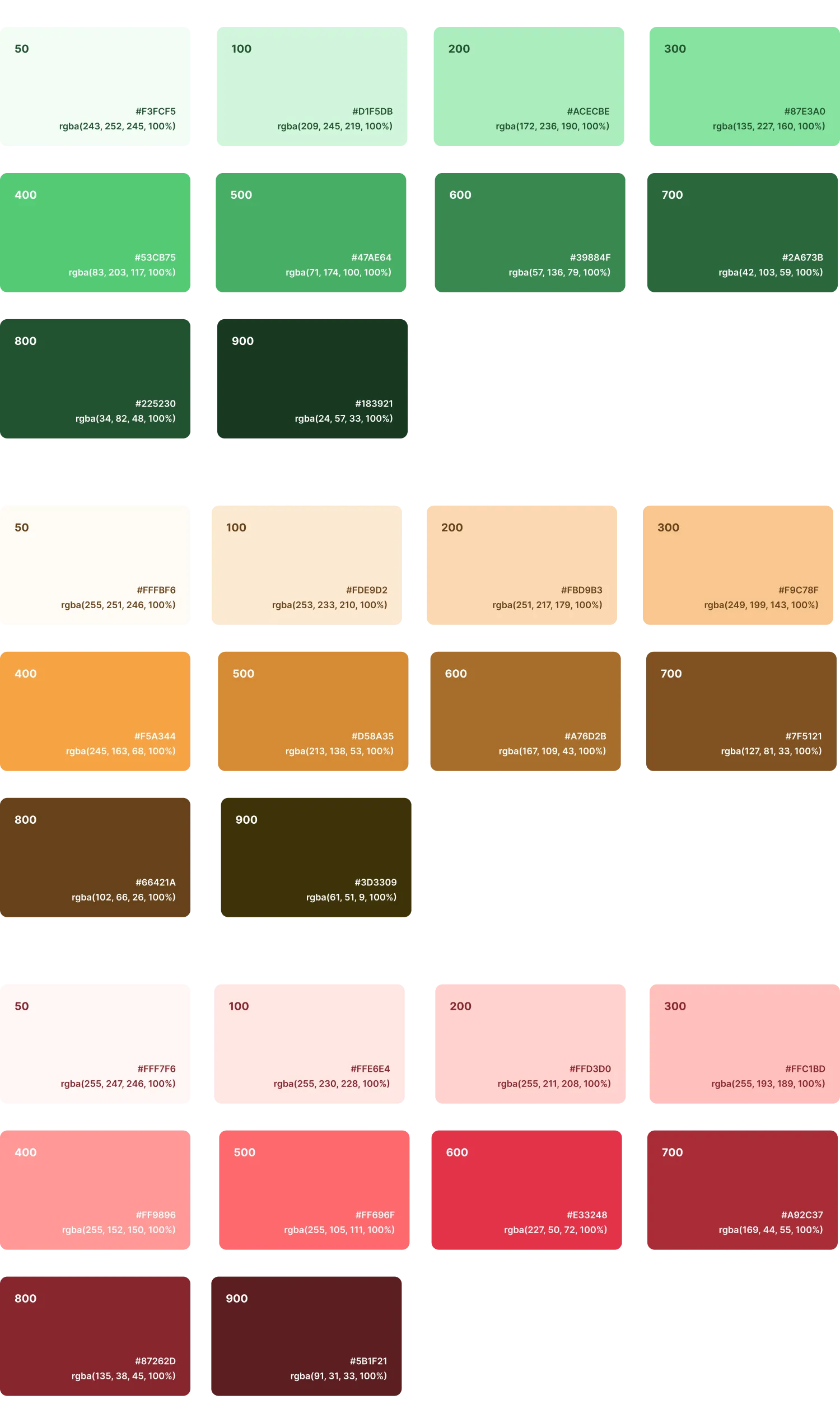
Colors are categorized by purpose (primary, secondary, neutral and semantic) and are extended through tonal ranges to offer clarity, depth, and hierarchy in UI design.
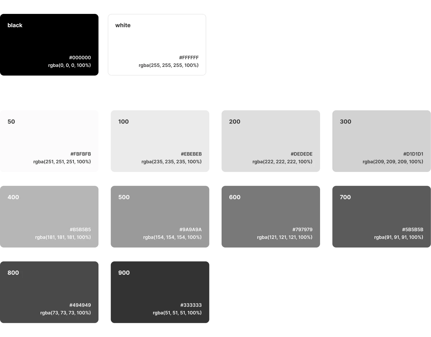
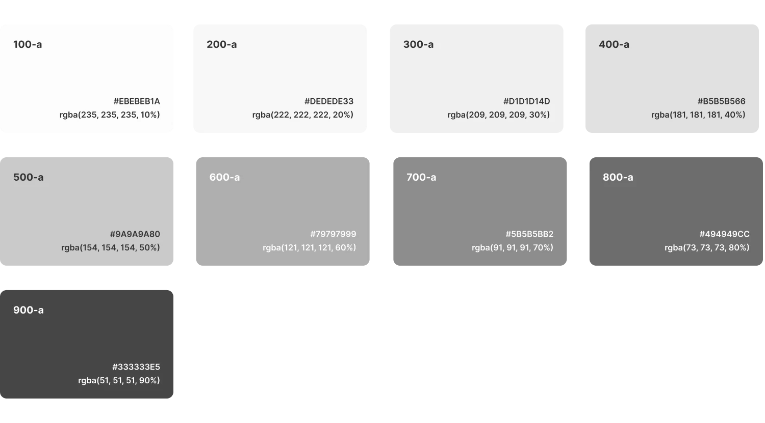
Neutral colors in Halstack provide structure, depth, and hierarchy without drawing attention. These include a range of grays used across surfaces, borders, dividers, and text.
They help balance the interface by supporting the primary and semantic colors, and are essential for creating clear layout separation and focus without introducing visual noise.
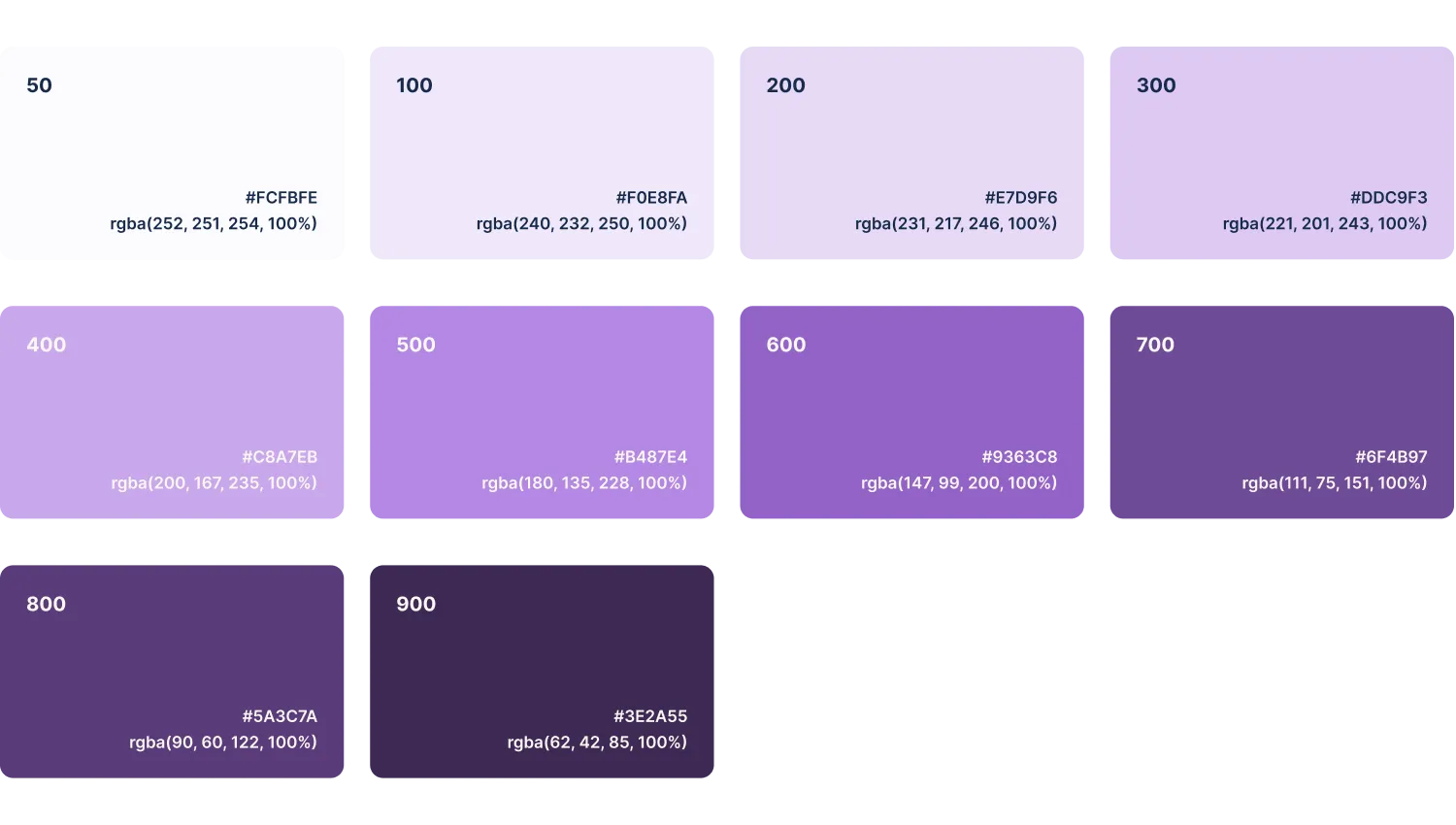
Represents the core identity of DXC and is used to drive the main interactions across the interface. It appears in key components such as primary buttons, active elements and highlights.
It is the most prominent color in the system and should be used intentionally to guide attention and reinforce brand consistency. Variants in tone are available for hover, active, and disabled states to ensure clarity and accessibility.
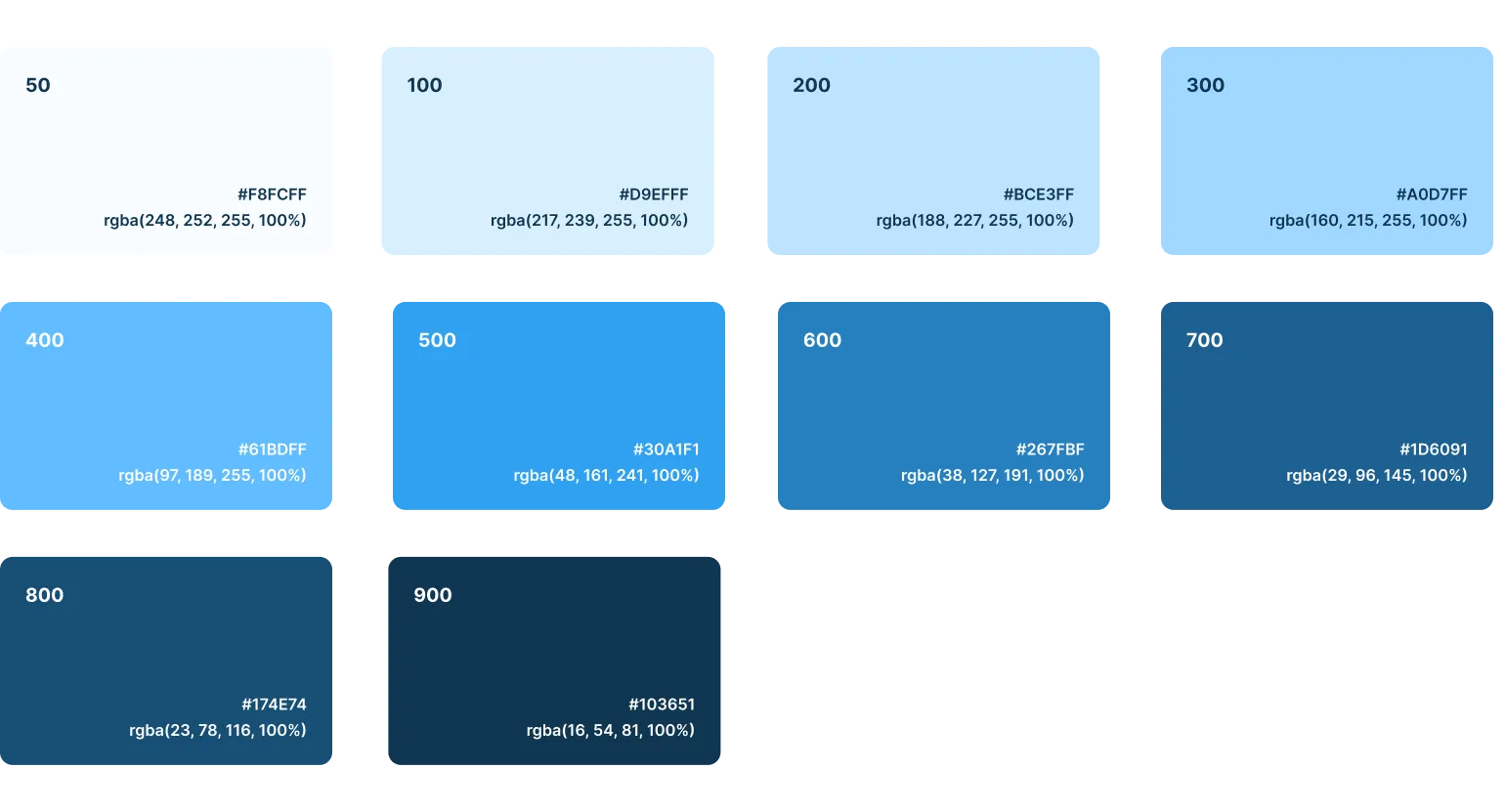
Complements the primary color and is used to support secondary actions or highlight less prominent interface elements. It helps introduce visual variety without overwhelming the user or competing with primary actions. Common use cases include secondary buttons, accent elements or supporting visuals.
Semantic colors are used to communicate system feedback and status clearly and immediately. These colors are designed to be universally recognizable and accessible, ensuring that users can quickly interpret the state of the system.
- Success: Communicates successful operations, confirmations, or valid states. It reassures users and reinforces positive outcomes.
- Info: Provides additional information, guidance, or context that helps users understand the current state or available options.
- Warning: Used for cautionary messages or potential risks that don't block progress but may require attention.
- Error: Indicates destructive actions, form validation errors, or system failures. It draws immediate attention and signals that something needs user correction or caution.
These colors are used in components such as alerts, form fields and status indicators among others.
To ensure color is used effectively, inclusively, and consistently across all user interfaces, follow these best practices:
- Don't rely solely on color to communicate information
Use color in combination with text labels, icons, or patterns. Some users may be color-blind, have limited color perception, or interpret colors differently based on cultural context. Always pair color with an additional visual cue to convey meaning.
- Ensure sufficient contrast for accessibility
Text and interactive elements must meet minimum contrast requirements to remain legible for all users. Follow these WCAG 2.1 guidelines:
- Use a contrast ratio of at least 4.5:1 for normal body text.
- Use a contrast ratio of at least 3:1 for large text (18pt or 14pt bold) and essential graphical objects (such as icons conveying meaning).
- Maintain a limited core palette
Avoid excessive use of colors. Stick to the defined palette to strengthen visual harmony and brand recognition. Introduce neutral tones to balance visual weight and focus user attention appropriately.
- Use tonal scales for depth and hierarchy
Leverage color ramps to create spatial relationships and support elevation.