Text areas are essential UI components that allow users to enter and interact with multi-line text-based information. They are commonly used in forms to collect feedback, comments, descriptions, and longer messages where a single-line input is not sufficient. Text areas support a wide range of use cases, from support forms and user profiles to product reviews and detailed reports.
Providing clear labels, helpful guidance, and proper formatting improves the user's ability to input information accurately and comfortably. Enhancing usability through accessibility, validation, and responsive behavior leads to a more intuitive and effective user experience.
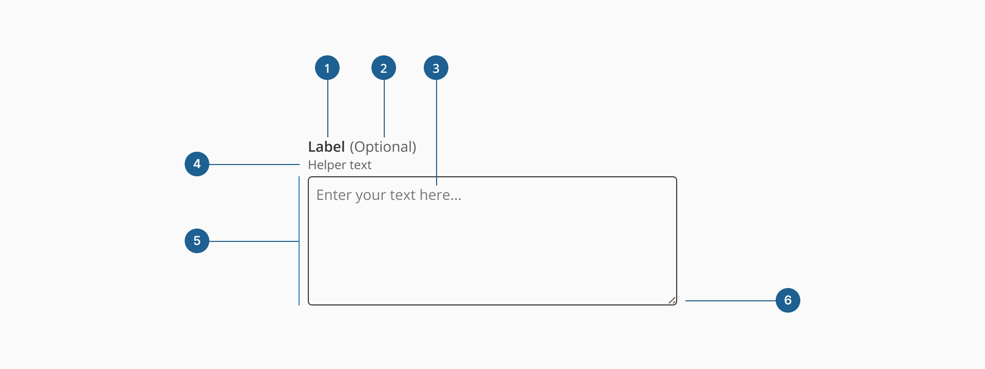
- 1.Label (Optional): a descriptive text that helps users understand what information is expected in the input field. It should be clear, concise, and placed near the input for better readability.
- 2.Optional indicator (Optional): a small indicator that signals the input field is not mandatory. It helps users know they can leave the field empty without causing validation errors.
- 3.Placeholder/Value: a short hint displayed inside the input field before any text is entered, offering a brief example or instruction on what type of data is expected. It disappears when the user starts typing. The value represents the actual content entered by the user. Unlike the placeholder, the value persists during interaction and is what gets submitted with the form.
- 4.Helper text (Optional): additional text placed below the input label that provides guidance, examples, or explanations to assist users in filling out the field correctly.
- 5.Container: the visual wrapper around the input field that provides structure, ensures accessibility, and helps differentiate the input from other UI elements.
- 6.Resizer (Optional): allows users to manually expand or shrink the textarea if resizing is enabled.
Form inputs are essential UI elements that allow users to interact with digital products by entering or selecting data. Choosing the right input type and structure is key to designing efficient, user-friendly forms that support task completion and data accuracy.
A form input (also known as a form field) is used to capture user data. Common input types include text fields, date pickers, number fields, radio buttons, checkboxes, toggles, and dropdowns. Forms should always include a submission method, such as a submit button, link, or keyboard trigger, to complete the interaction.
Although input fields vary in type and purpose, they often share a common set of features:
- Placeholder: a short hint displayed inside the input field that describes its expected value or purpose.
- Size and max length: inputs can have both a visual size (width of the field) and a character limit that defines how much text can be entered.
- Prefix or suffix: some inputs include a visual element before or after the user input, like currency symbols or units, to help clarify the expected data.
- Helper text: additional information displayed below the field to guide the user in providing the correct input.
- Optional label: inputs that are not mandatory can be marked with an "Optional" tag to set clear expectations.
Most inputs can also present standard interactive or informative states:
- Disabled: this state prevents users from interacting with the field. It's typically used when a value is not applicable or editable under certain conditions or roles.
- Error: when a user enters invalid or incomplete data, the input shows an error state, often accompanied by a helpful message to guide corrections.
- Read-only: the input is visible, focusable, and hoverable, but not editable. This is ideal for fields with auto-calculated values. Unlike disabled fields, read-only inputs can still be submitted with the form and are part of the form data.
While text inputs are ideal for short, single-line entries such as names, email addresses, or search queries, text areas are specifically designed to handle multi-line, freeform text. They offer users more space and flexibility, making them the right choice for collecting messages, feedback, descriptions, or any content that may extend beyond a sentence or two.
Choosing between a text input and a text area depends on the nature of the content you're asking for. For instance, a "Job Title" field should use a standard text input, while a "Cover Letter" or "Project Description" clearly benefits from a textarea. In some cases, even radio buttons, dropdowns, or checkboxes may be more effective if the expected input can be predefined or simplified.
Understanding the user's intent and the expected length and complexity of the response is key to choosing the right input type. Misusing a text area for short, simple answers can overwhelm users, while using a text input for extended responses can result in frustration or poor usability.
- Use the textarea for extended input: provide a textarea when users need to enter responses longer than a single line, such as comments, messages, or descriptions.
- Break down complex inputs: avoid using a textarea when a long question can be broken into multiple, simpler fields. This helps reduce cognitive load and improves response quality.
- Allow resizing only when beneficial: enable textarea resizing if the user may benefit from adjusting the visible input area, especially for writing long or detailed content.
- Avoid auto-expanding fields excessively: dynamic resizing can enhance usability, but ensure it doesn't disrupt page layout or push key UI elements out of view.
- Provide
errormessages for clarity: use theerrorprop to surface validation messages. Make sure these are clear and actionable. - Apply
placeholderfor hints, not instructions: useplaceholderto provide example content or expected format (e.g., "Write your feedback here..."). Avoid using it as a replacement for the label. - Leverage
helperTextto guide users: add context, tips to help users complete the input accurately (e.g., "Avoid including personal information like passwords or credit card numbers.").