The image component serves as a versatile tool for efficiently loading and displaying visual content across diverse contexts within your application. This powerful component is designed to optimize performance while enhancing the overall user experience. By leveraging its capabilities, developers can seamlessly integrate images into their projects, ensuring smooth rendering and responsive behavior.
To maximize the potential of the Image component and create visually appealing, high-performing applications, it's crucial to adhere to certain best practices and usage guidelines. These recommendations encompass various aspects of image implementation, from technical considerations to user-centric design principles. By following these guidelines, you can ensure that your images not only load quickly and efficiently but also contribute positively to the user's interaction with your application.
In the sections that follow, we'll delve into a comprehensive set of best practices and usage guidelines. These insights will help you optimize performance, enhance accessibility, and create a more engaging visual experience for your users across different devices and contexts.
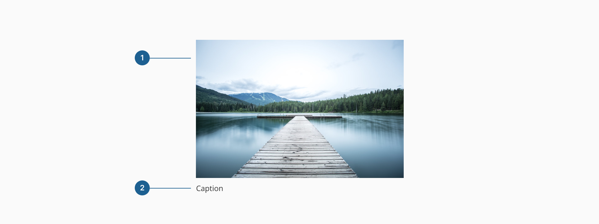
- 1.Image: a visual element used to illustrate content, provide context, or support storytelling. It should be relevant and meaningful, helping users better understand the subject or message being conveyed.
- 2.Caption (Optional): a short piece of descriptive text placed below the image. It provides context, credits, or additional explanation for the image, improving accessibility and user comprehension.
The Image component should always include an alt property to describe the content of the image. This is important for users who rely on screen readers to understand the content of the page. The alt text should be a short description of the image content.
If an image is purely decorative, use an empty value (alt="") to indicate this to screen readers, preventing unnecessary noise. Also, include captions when the image is an integral part of the content, providing users with additional context.
- Preserve aspect ratio. The aspect ratio of an image should generally be preserved, unless explicitly specified otherwise by the design.
- Avoid distortion. When resizing images, avoid stretching or squashing them to prevent distortion. Instead, use
object-fitto set how the image is displayed or control the dimensions through the container. - Thumbnails and zoom. When displaying thumbnails or zoomed images, ensure that the image is cropped appropriately to focus on the most relevant content.
- Image as content vs. background. If the image is essential content, use the Image component. For decorative backgrounds, consider using CSS background images to keep content and design separate.
- Contrast and readability. Ensure sufficient contrast between background images and overlaid text. This may require applying filters or overlays to the image.
An image should always adapt fluidly to the size of its container, ensuring that it maintains its aspect ratio unless otherwise specified. To achieve this, it's important to define the width and height properties to ensure images are loaded with known dimensions, which helps maintain layout stability and reduces cumulative layout shifts. When designing for multiple devices, leveraging responsive image techniques, such as the srcset andsizes props, ensures that the appropriate resolution is served based on the user's screen size and the layout's space allocation. This not only improves performance but also optimizes the experience across different viewports.
- Use high-quality images: always use high-resolution images to deliver a crisp and clear display, especially on high-density (retina) screens. This ensures a professional look and prevents pixelation.
- Optimize images: compress and optimize images for the web to minimize file sizes. Reducing load times and bandwidth consumption is crucial for performance, especially on mobile devices.
- Leverage modern formats: whenever possible, use newer image formats like WebP for improved compression without sacrificing quality. Be sure to provide fallback formats for browsers that don't support them.
- Allow lazy loading: implement lazy loading (
loading="lazy") for images that appear later on the page (below the fold). This helps speed up initial page loads and improve overall performance. - Use responsive image techniques: make use of
srcsetandsizesprops to serve images that adapt to different screen resolutions and sizes, ensuring the best display quality across devices. - Avoid using images for text content: text embedded within images reduces accessibility and harms SEO. Always use HTML text to ensure readability by screen readers and search engines.
- Limit decorative images: avoid overloading pages with unnecessary decorative images. This not only reduces performance but can also distract users from the main content.
- Avoid images for icons: use scalable vector graphics (SVGs) instead of images for icons. SVGs offer better performance, scalability, and accessibility across various screen sizes.