The heading component provides consistent typographic structure for titles and section headers within the UI. It enforces semantic hierarchy through HTML tags (h1 through h6), supports visual distinction via styles and weights, and plays a key role in SEO and accessibility. The component is flexible in use, allowing control over styling and structure without breaking the logical order of information.
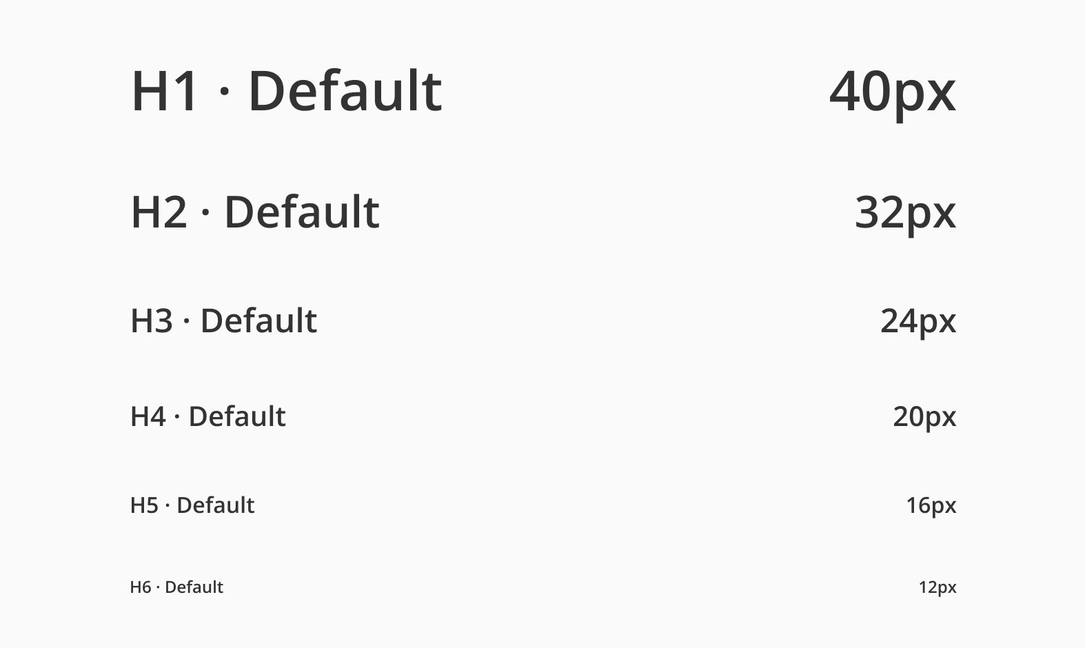
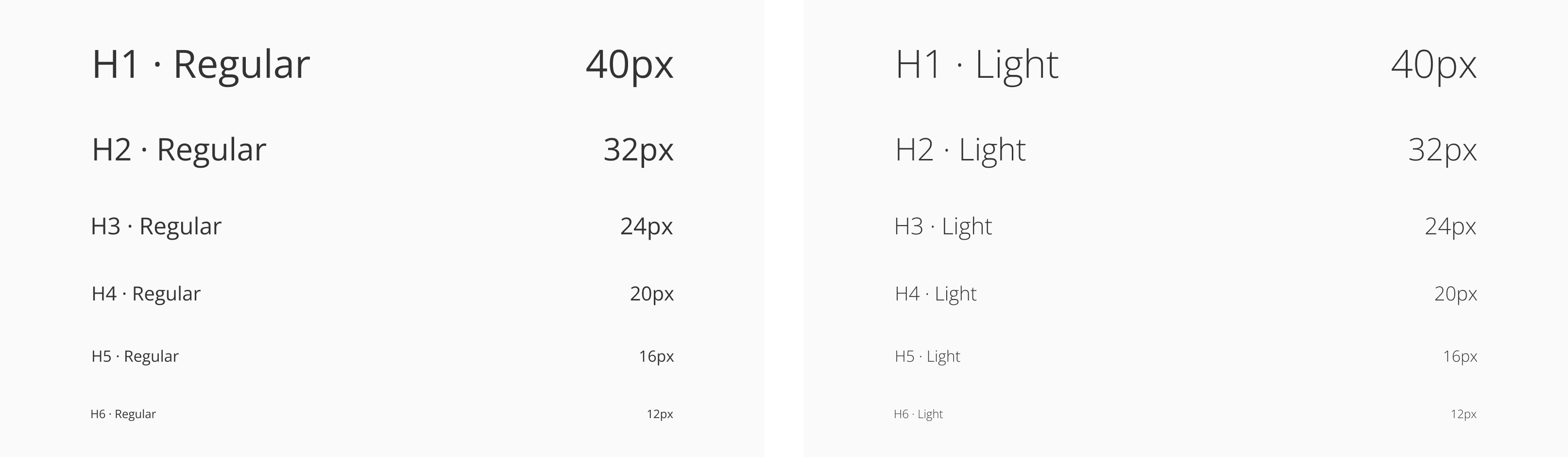
The Open Sans typeface has 5 different weights, from light to extra-bold but Halstack use three variations, light, regular and bold (default). The font size goes from 40 pixels for the h1 heading to 12 pixels for the h6 level.
| Variant | Purpose |
|---|---|
| H1 | Page title. Used once per page for the main heading. |
| H2 | Section title. Defines top-level content sections. |
| H3 | Sub-section titles. Used inside sections to separate content. |
| H4 | Nested subsections, often in detail-heavy contexts. |
| H5-H6 | Minor subsections, used for fine-grained grouping or labels. |
- Use headings to define page and section titles: start each page with an
h1, followed byh2-h6for content hierarchy and structure. - Organize subsections with appropriate heading levels: use
h3,h4,h5,h6to title content within larger sections for better scannability. - Apply headings to group content semantically in UI elements: use headings inside, cards, or other containers to establish clear structure.
- Support accessibility and SEO with semantic heading structure: proper use of heading tags enhances screen reader navigation and search engine indexing.
- Always use the Heading component for structural content: don't manually style text to look like a heading. Use the component to maintain consistency and semantics.
- Maintain proper heading order: avoid skipping levels (e.g., going from
h1toh4) unless there's a clear content structure that justifies it. - Avoid stacking headings without content: every heading should introduce related content. Don't chain multiple headings together without context
- Use the
levelprop to set visual style, andasto control the semantic tag: while we recommend following the defined levels and styles to maintain consistency, we understand that certain interfaces may require customization. Use these props to adapt the component as needed and ensure semantic meaning and structural clarity are preserved.
- Heading components should be in order. That means an
Headings-H1is followed by anHeadings-H2, anHeadings-H2is followed by aHeadings-H2orHeadings-H3and so on. - Keep heading tags consistent. Inconsistently implementing headings can create confusion and frustration for users using assistive technologies.
- Headings are not interactive elements and therefore have no keyboard or pointer interaction.
- SC 1.3.1 — Info and relationships: Information, structure, and relationships conveyed through presentation can be programmatically determined or are available in text.
- SC 2.4.6 — Headings and Labels: Headings and labels describe the topic or purpose.