Accordion
The accordion component is a vertical stack of interactive headers used to group related content into collapsible sections, allowing users to expand or hide content based on their needs or preferences. It enhances the user experience by organizing information into smaller, digestible chunks, helping reduce cognitive load and save screen space.
The accordion component is designed to present large amounts of content in a small space by leveraging progressive disclosure. It helps improve the user experience by breaking down information into manageable sections, allowing users to focus only on what they need.
Each accordion section consists of two main parts:
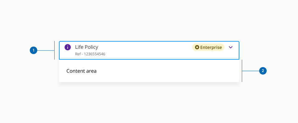
- 1.Header: Serves as the trigger for expanding or collapsing the section. It acts as a summary of the content, allowing users to decide if they want to interact with it.
- 2.Content area: The expanded section where detailed information or functionality resides.
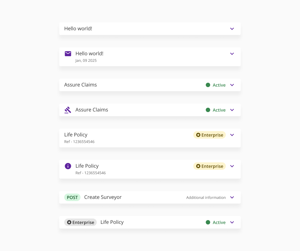
The accordion header is divided into two sections: left and right, each of which can contain different UI elements. These elements are categorised as primary or secondary, based on their importance and role within the accordion's functionality.

The primary elements are mandatory and provide the basic functionality of the accordion. These ensure the component is functional and intuitive for users:
- Title: A concise and descriptive label that summarises the content of the accordion section. It helps users understand what type of information they can expect to find inside.
- Chevron Icon: A visual indicator of the accordion’s current state (expanded or collapsed). It provides an affordance for interaction and ensures users can toggle the accordion intuitively.
Without these elements, the accordion cannot effectively communicate its purpose or provide a clear interaction model.
The secondary elements are optional and provide additional context or enhance the user experience. While not essential for the accordion's functionality, they add useful details or visual hierarchy.
- 1.Left secondary elements:
- Icon: Adds visual context or aids recognition by representing the content type or purpose of the section.
- Badge: Displays supplemental information, such as a notification count or status, to give users a quick overview of the section.
- 2.Right secondary elements:
- Helper text: Provides additional context, such as brief instructions or a summary of the content within the section.
- Status light: Displays a visual indicator of the section’s status (e.g., completed, in progress, or error).
- Badge: Similar to the left-side badge, but placed on the right for better alignment in specific layouts.
The accordion component has two main states: collapsed and expanded. The chevron icon at the end of the accordion indicates which state the accordion is in. Accordions begin by default in the collapsed state with all content panels closed. Starting in a collapsed state gives the user a high level overview of the available information.
- Trigger collapsed and expanded states when clicking on either the header or icon.
- Use icons and animation to easily reflect collapsed and expanded states.
- Use a chevron icon to indicate the expand/collapse behavior.
- When the panel expands, the chevron icon rotates 180 degrees counterclockwise.
- When the panel collapses, the chevron icon rotates 180 degrees clockwise.
The accordion component can be configured to allow either multiple sections to be open simultaneously or limit the user to a single-open section at a time. Each approach has specific use cases, but it’s important to prioritise user needs and content hierarchy when deciding which behavior to implement.
This approach gives users full control over the visibility of content, allowing them to open or collapse multiple sections at the same time. It’s particularly useful when:
- Users need to compare or reference information across different sections simultaneously.
- The content in each section is independent and doesn’t require strict linear navigation.
- There is enough vertical space to accommodate multiple expanded sections without overwhelming the layout.
Some implementations restrict the accordion to allow only one section to be open at a time. When a user expands a new section, the previously expanded section collapses automatically. This pattern is suitable when:
- The content is closely related or mutually exclusive, making it logical to view only one section at a time.
- Vertical space is limited, and having multiple sections open could cause usability or layout issues.
- A simplified and more guided user experience is desired, such as in wizards or step-by-step processes.
- One element per side: Each side of the header (left and right) should only include one secondary element to maintain a clean and organised visual hierarchy.
- No duplicates: Avoid including multiple instances of the same type of element in the header (e.g., two badges or two status lights), as this can create visual clutter and confuse users.
- Semantic colors: If both a badge and a status light are included, avoid using semantic colors (e.g., red, green) for the badge to prevent it from competing visually with the status light.
- Growth priority: Mandatory and descriptive elements, such as the title, are prioritised over optional elements to ensure that essential information is always visible and accessible.
Use an accordion when:
- Displaying and grouping additional information that is related or supplemental to the primary content.
- Shortening pages and reducing scrolling, especially for optional or non-critical content.
- Providing users with granular control over the visibility of information, helping them interact with the page in a way that meets their specific needs.
- Organising FAQs or similar repeated structures, where content can be logically divided into expandable sections.
- Enhancing content hierarchy by nesting detailed or secondary content under a more general overview.
Don’t use an accordion if:
- The majority of the content on the page is crucial for the user to see upfront, as hiding it may increase friction or confusion.
- You need to display a list of selectable options (e.g., navigation menus or filters)—a dropdown or other list pattern is more appropriate.
- Critical system information or actions (like alerts, confirmations, or primary buttons) need to be visible—these should remain prominent and accessible without requiring user interaction.
- The interaction of expanding and collapsing creates unnecessary complexity or extra clicks for the user.