Accordion
The accordion component is a vertical stack of interactive headers used to group related content into collapsible sections, allowing users to expand or hide content based on their needs or preferences. It enhances the user experience by organizing information into smaller, digestible chunks, helping reduce cognitive load and save screen space.
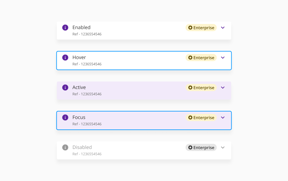
The accordion header can get four different states based on user interaction. States: enabled, hover, focus and disabled.
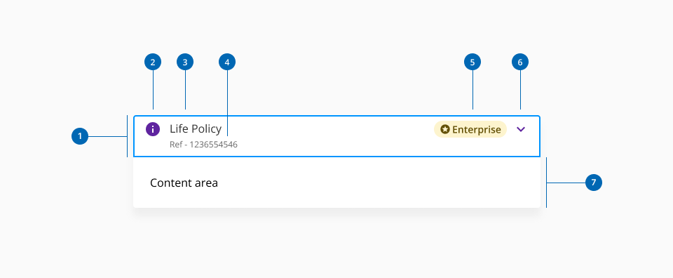
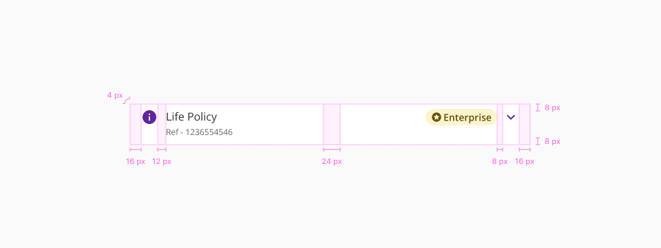
- 1.Header
- 2.Left secondary element (Optional)
- 3.Title
- 4.Sublabel
- 5.Right secondary element (Optional)
- 6.Caret icon (Expand/collapse)
- 7.Content area
| Component token | Element | Core token | Value |
|---|---|---|---|
accordionSeparatorBorderColor | Separator | color-grey-200 | #e6e6e6 |
accordionSeparatorBorderThickness | Separator | - | 1px |
accordionSeparatorBorderStyle | Separator | border-style-solid | solid |
activeBackgroundColor | Header background:active | color-purple-100 | #f2eafa |
arrowColor | Caret icon | color-purple-700 | #5f249f |
assistiveTextFontColor | Assistive text | color-grey-700 | #666666 |
backgroundColor | Container background | color-white | #ffffff |
disabledArrowColor | Caret icon:disabled | color-grey-500 | #999999 |
disabledAssistiveTextFontColor | Assistive text:disabled | color-grey-500 | #999999 |
disabledIconColor | Custom icon:disabled | color-grey-500 | #999999 |
disabledSubLabelFontColor | Sublabel:disabled | color-grey-700 | #999999 |
disabledTitleLabelFontColor | Title:disabled | color-grey-500 | #999999 |
focusBackgroundColor | Header background:focus | color-transparent | transparent |
focusBorderColor | Header outline:focus | color-blue-600 | #0095ff |
hoverBackgroundColor | Header background:hover | color-purple-100 | #f2eafa |
iconColor | Custom icon | color-purple-700 | #5f249f |
subLabelFontColor | Sublabel | color-grey-500 | #999999 |
titleLabelFontColor | Title | color-grey-900 | #333333 |
boxShadowColor | Container shadow | color-grey-200-a | #0000001a |
| Component token | Element | Core token | Value |
|---|---|---|---|
assistiveTextFontFamily | Assistive text | font-family-sans | 'Open Sans', sans-serif; |
assistiveTextFontSize | Assistive text | font-scale-01 | 0.75rem / 12px |
assistiveTextFontStyle | Assistive text | font-style-normal | normal |
assistiveTextFontWeight | Assistive text | font-weight-light | 400 |
subLabelFontFamily | Sublabel | font-family-sans | 'Open Sans', sans-serif |
subLabelFontSize | Sublabel | font-scale-01 | 0.75rem / 12px |
subLabelFontStyle | Sublabel | font-style-normal | normal |
subLabelFontWeight | Sublabel | font-weight-normal | 400 |
titleLabelFontFamily | Title | font-family-sans | 'Open Sans', sans-serif |
titleLabelFontSize | Title | font-scale-03 | 1rem / 16px |
titleLabelFontStyle | Title | font-style-normal | normal |
titleLabelFontWeight | Title | font-weight-regular | 400 |
- Understanding WCAG 2.2 - SC 2.1.1 Keyboard
- Understanding WCAG 2.2 - SC 4.1.2 Name, Role, Value
- WAI-ARIA Authoring Practices 1.2 - 3.1 Accordion (Sections With Show/Hide Functionality)
- WAI-ARIA Authoring Practices 1.2 - Accordion Design Pattern