Bar Chart
A bar chart is a graphical representation that displays and compares discrete data categories using rectangular bars. Each bar's length or height is proportional to the frequency or value of its corresponding category, allowing users to identify which groups are the highest or most common and compare them with others.
We use the Cloudscape library for data visualization in our design system. Cloudscape offers high-quality, adaptable, and user-friendly tools for creating clear and comprehensive data visualizations. This helps our users understand and analyze data effectively, facilitating informed decision-making.
- Ensure both the X and Y axes are labeled with appropriate units and descriptions.
- Always plot bars against a zero-value baseline. It simplifies bar length comparison and ensures accurate data visualization. A non-zero baseline can distort the comparison as it disrupts the ratio between bar lengths and actual values.
- When constructing a bar chart, consider the order in which you will plot the bars. A common convention is to sort the bars from longest to shortest. While comparisons can be made regardless of order, this approach can ease the reader's task. However, if the category labels have an inherent order, this should typically take precedence.
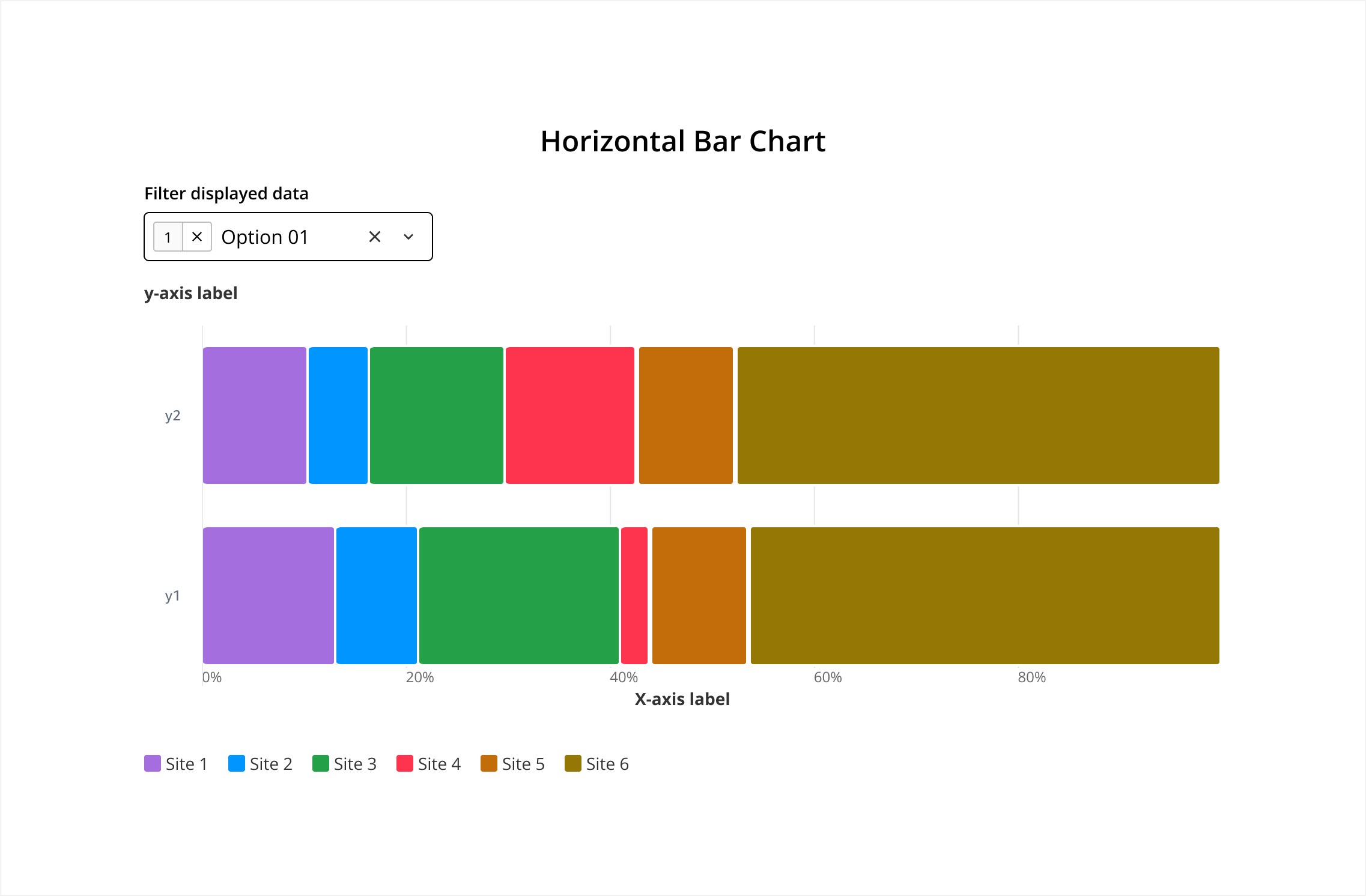
Bars are oriented horizontally with the Y-axis representing categories and the X-axis representing values.
- Use Case: Comparing quantities across different categories, especially when category names are long.
For more details on how to use this component, please refer to its original source, Cloudscape.
The Bar Chart is composed of several key elements that contribute to its effectiveness in visualizing data. They work together to provide a clear, accurate, and visually appealing representation of data, making it easier for viewers to understand and interpret the information being presented.
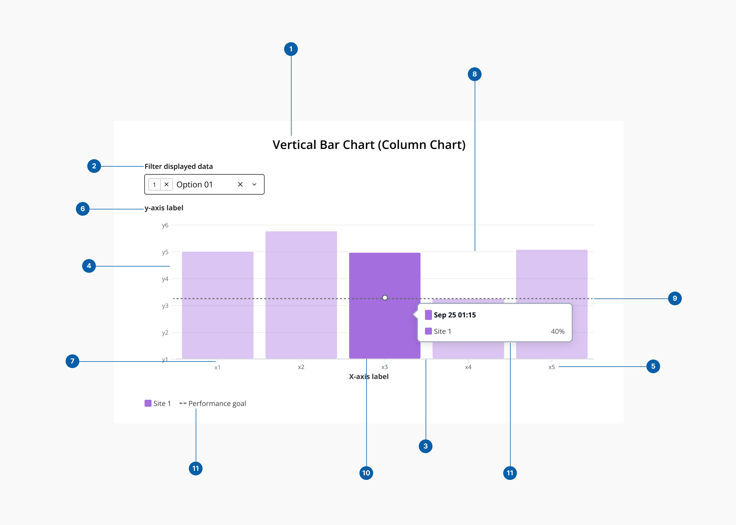
- 1.Title: A descriptive heading that explains what the bar chart is about.
- 2.Filter: Enable data filtering.
- 3.Category axis (x-axis): The horizontal axis in a vertical bar chart or the vertical axis in a horizontal bar chart. Typically represents categories or discrete data points.
- 4.Value axis (y-axis): The vertical axis in a vertical bar chart or the horizontal axis in a horizontal bar chart. Typically represents the scale of values or measurements.
- 5.Axis labels: Text labels that describe the data represented by each axis. Placed along the axes to identify categories (X-Axis) and units or magnitude (Y-Axis).
- 6.Axis titles: Descriptive titles for the X and Y axes that provide additional context about the data.
- 7.Tick marks: Small marks along the axes that indicate the scale or categories. Aid in aligning the bars with the corresponding values or categories.
- 8.Grid lines: Horizontal and/or vertical lines that help in reading the values of the bars against the axes. Their purpose is o enhance readability and precision in interpreting data values.
- 9.Average line (threshold): An average line in a bar chart is a horizontal (or vertical, depending on the chart orientation) line that represents the average value of the data points being displayed. It helps provide a quick visual reference for comparing individual bar values to the overall average of the dataset.
- 10.Bars: Rectangular blocks that represent data values. Can be vertical (column chart) or horizontal (bar chart).
- 11.Legend: A key that explains what different colors, patterns, or bar segments represent.
- 12.Details popover: Information box that appear when a user hovers over a bar. Displays detailed information about the data point.