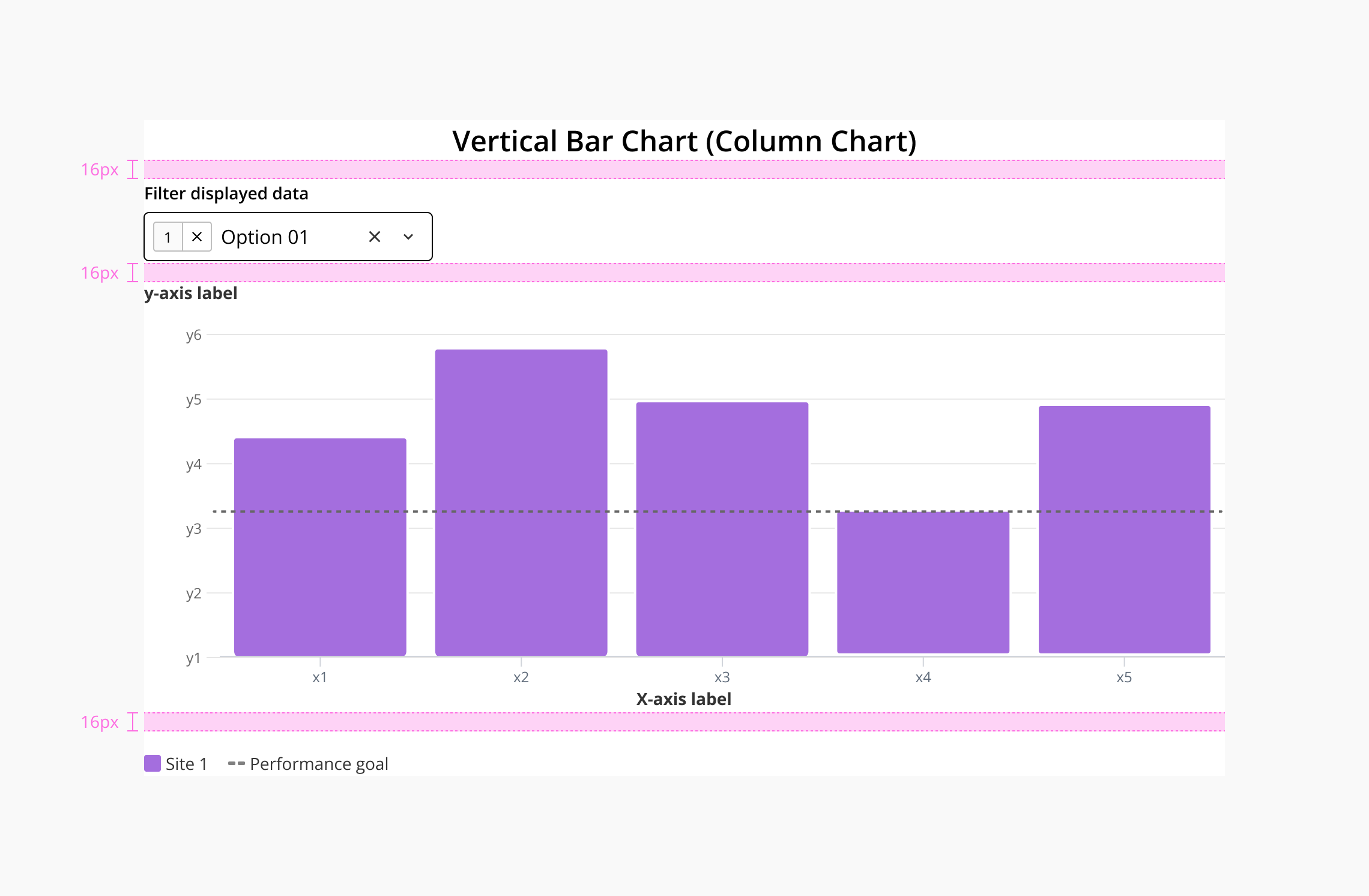
Bar Chart
A bar chart is a graphical representation that displays and compares discrete data categories using rectangular bars. Each bar's length or height is proportional to the frequency or value of its corresponding category, allowing users to identify which groups are the highest or most common and compare them with others.
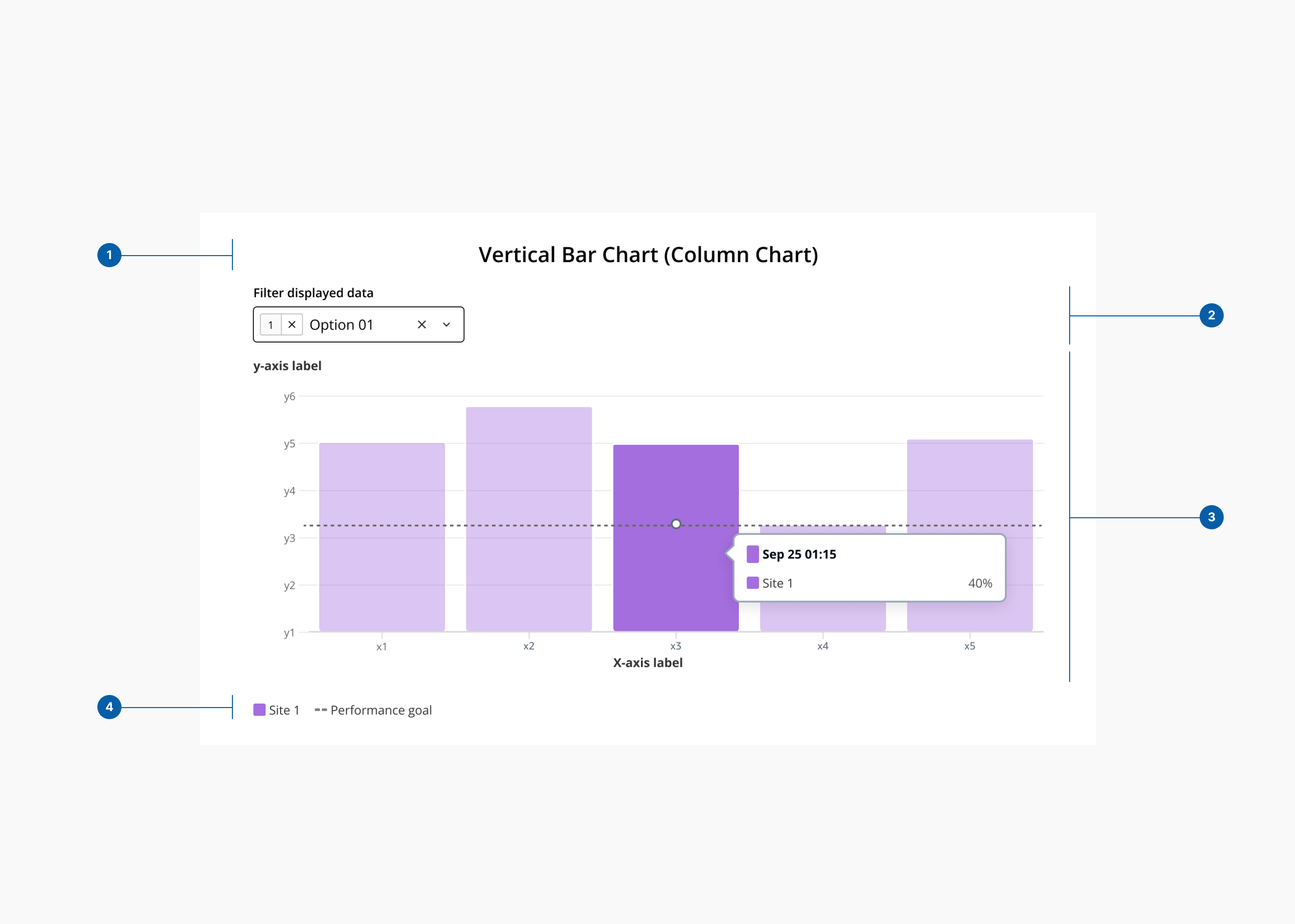
- 1.Title - This is a
DxcHeading level=2component - 2.Filter - This is a
DxcSelectcomponent - 3.Graph
- 4.Legend
We have carefully selected various shades from our color palette to be used in data visualization. Accessibility has been a key consideration in this selection, ensuring that these colors are distinguishable for all users.
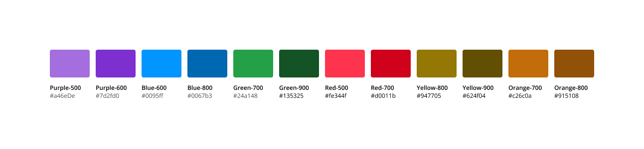
| Categorical color | Core token | Value |
|---|---|---|
| color-categorical-01 | color-purple-500 | #A46EDE |
| color-categorical-02 | color-blue-600 | #0095FF |
| color-categorical-03 | color-green-700 | #24A148 |
| color-categorical-04 | color-red-500 | #FE344F |
| color-categorical-05 | color-yellow-800 | #947705 |
| color-categorical-06 | color-orange-700 | #C26C0A |
| color-categorical-07 | color-purple-600 | #7D2FD0 |
| color-categorical-08 | color-blue-800 | #0067B3 |
| color-categorical-09 | color-green-900 | #135325 |
| color-categorical-10 | color-red-700 | #D0011B |
| color-categorical-11 | color-yellow-900 | #624F04 |
| color-categorical-12 | color-orange-800 | #915108 |