Button
Buttons are basic interface elements that initialize an action or function when the user interacts with them. The appearance of the button should suggest the user takes an action that leads to different scenarios. These elements that reinforce to the user the necessity to interact are called CTA (Call to Action) components, which basically are designed to capture user attention and improve the user experience within the application.
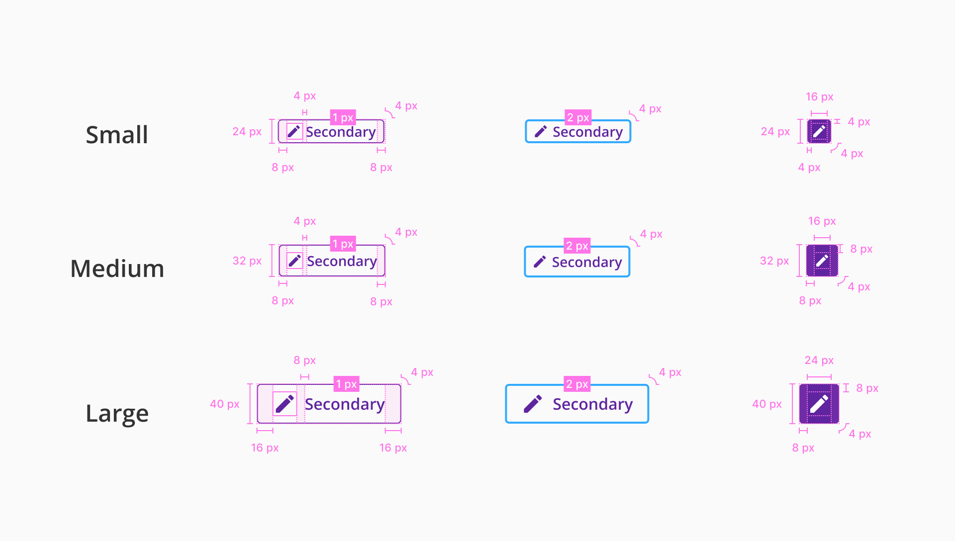
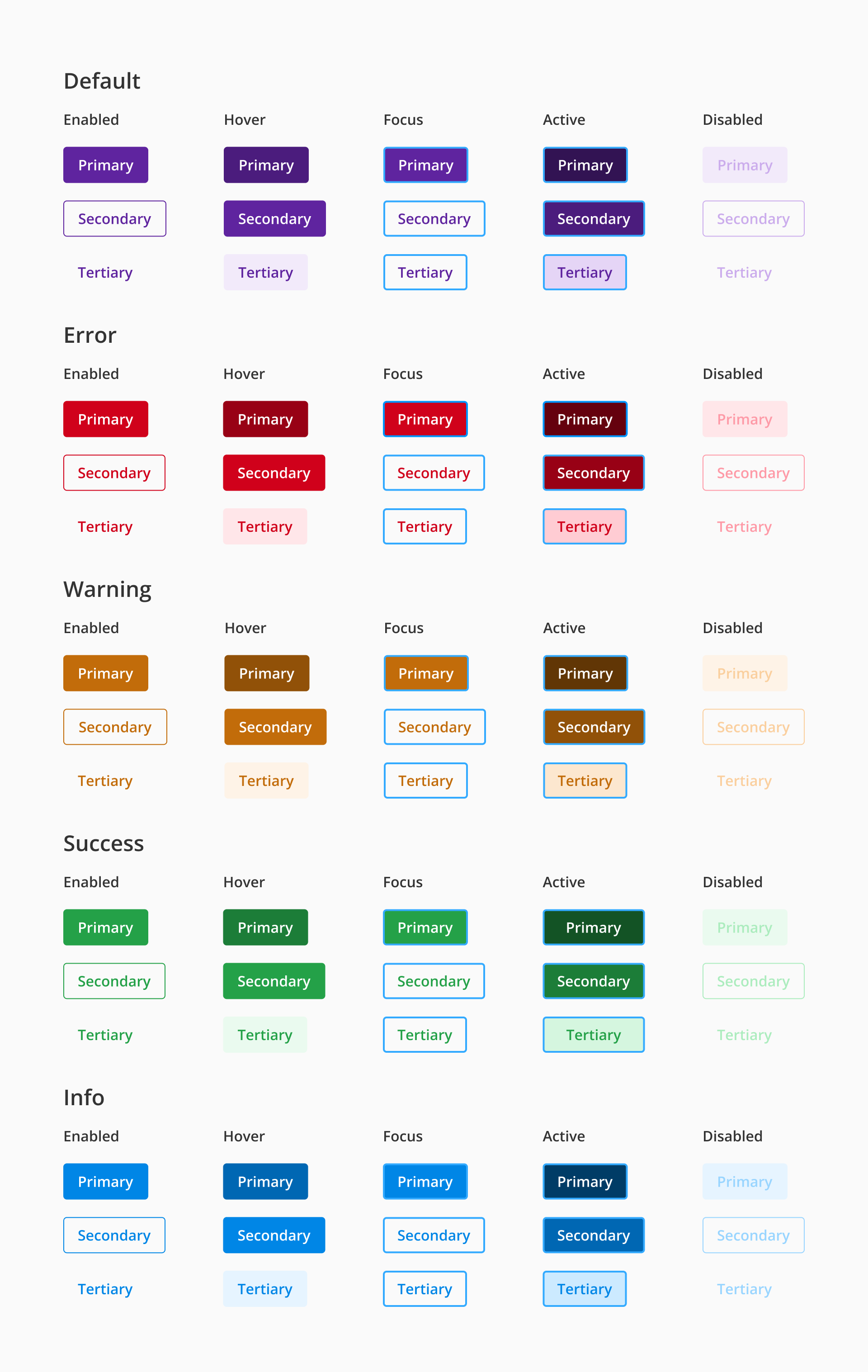
The states are the different behaviors of the button component based on the interaction of the user. For the desktop version, we contemplate five different states by which can pass.
States: enabled, hover, focus, active and disabled.
Semantics: default, error, warning, success and info.

| Component token | Element | Core token | Value |
|---|---|---|---|
paddingSmallTop | Container (small height) | spacing-0 | 0rem / 0px |
paddingSmallLeft | Container (small height) | spacing-08 | 0.5rem / 8px |
paddingSmallBottom | Container (small height) | spacing-0 | 0rem / 0px |
paddingSmallRight | Container (small height) | spacing-08 | 0.5rem / 8px |
paddingSmallOnlyIconTop | Container (small height) | spacing-0 | 0rem / 0px |
paddingSmallOnlyIconLeft | Container (small height) | spacing-04 | 0.25rem / 4px |
paddingSmallOnlyIconBottom | Container (small height) | spacing-0 | 0rem / 0px |
paddingSmallOnlyIconRight | Container (small height) | spacing-04 | 0.25rem / 4px |
paddingMediumTop | Container (medium height) | spacing-0 | 0rem / 0px |
paddingMediumLeft | Container (medium height) | spacing-08 | 0.5rem / 8px |
paddingMediumBottom | Container (medium height) | spacing-0 | 0rem / 0px |
paddingMediumRight | Container (medium height) | spacing-08 | 0.5rem / 8px |
paddingMediumOnlyIconTop | Container (medium height) | spacing-0 | 0rem / 0px |
paddingMediumOnlyIconLeft | Container (medium height) | spacing-08 | 0.5rem / 8px |
paddingMediumOnlyIconBottom | Container (medium height) | spacing-0 | 0rem / 0px |
paddingMediumOnlyIconRight | Container (medium height) | spacing-08 | 0.5rem / 8px |
paddingLargeTop | Container (large height) | spacing-0 | 0rem / 0px |
paddingLargeLeft | Container (large height) | spacing-16 | 1rem / 16px |
paddingLargeBottom | Container (large height) | spacing-0 | 0rem / 0px |
paddingLargeRight | Container (large height) | spacing-16 | 1rem / 16px |
paddingLargeOnlyIconTop | Container (large height) | spacing-0 | 0rem / 0px |
paddingLargeOnlyIconLeft | Container (large height) | spacing-08 | 0.5rem / 8px |
paddingLargeOnlyIconBottom | Container (large height) | spacing-0 | 0rem / 0px |
paddingLargeOnlyIconRight | Container (large height) | spacing-08 | 0.5rem / 8px |
| Component token | Element | Core token | Value |
|---|---|---|---|
primaryDefaultBackgroundColor | Button container (default) | color-purple-700 | #5f249f |
primaryErrorBackgroundColor | Button container (error) | color-red-700 | #d0011b |
primaryWarningBackgroundColor | Button container (warning) | color-orange-700 | #c26c0a |
primarySuccessBackgroundColor | Button container (success) | color-green-700 | #24a148 |
primaryInfoBackgroundColor | Button container (info) | color-blue-700 | #0086e6 |
primaryDefaultFontColor | Label (default) | color-white | #ffffff |
primaryErrorFontColor | Label (error) | color-white | #ffffff |
primaryWarningFontColor | Label (warning) | color-white | #ffffff |
primarySuccessFontColor | Label (success) | color-white | #ffffff |
primaryInfoFontColor | Label (info) | color-white | #ffffff |
primaryHoverDefaultBackgroundColor | Container fill:hover (default) | color-purple-800 | #4b1c7d |
primaryHoverErrorBackgroundColor | Container fill:hover (error) | color-red-800 | #980115 |
primaryHoverWarningBackgroundColor | Container fill:hover (warning) | color-orange-800 | #915108 |
primaryHoverSuccessBackgroundColor | Container fill:hover (success) | color-green-800 | #1c7d38 |
primaryHoverInfoBackgroundColor | Container fill:hover (info) | color-blue-800 | #0067b3 |
primaryActiveDefaultBackgroundColor | Container fill:active (default) | color-purple-900 | #321353 |
primaryActiveErrorBackgroundColor | Container fill:active (error) | color-red-900 | #65010e |
primaryActiveWarningBackgroundColor | Container fill:active (warning) | color-orange-900 | #613605 |
primaryActiveSuccessBackgroundColor | Container fill:active (success) | color-green-900 | #135325 |
primaryActiveInfoBackgroundColor | Container fill:active (info) | color-blue-900 | #003c66 |
primaryDisabledDefaultBackgroundColor | Container fill:disabled (default) | color-purple-100 | #f2eafa |
primaryDisabledErrorBackgroundColor | Container fill:disabled (error) | color-red-100 | #ffe6e9 |
primaryDisabledWarningBackgroundColor | Container fill:disabled (warning) | color-orange-100 | #fef3e7 |
primaryDisabledSuccessBackgroundColor | Container fill:disabled (success) | color-green-100 | #eafaef |
primaryDisabledInfoBackgroundColor | Container fill:disabled (info) | color-blue-100 | #e6f4ff |
primaryDisabledDefaultFontColor | Label:disabled (default) | color-purple-300 | #cbacec |
primaryDisabledErrorFontColor | Label:disabled (error) | color-red-300 | #fe9aa7 |
primaryDisabledWarningFontColor | Label:disabled (warning) | color-orange-300 | #facf9e |
primaryDisabledSuccessFontColor | Label:disabled (success) | color-green-300 | #acecbe |
primaryDisabledInfoFontColor | Label:disabled (info) | color-blue-300 | #99d5ff |
| Component token | Element | Core token | Value |
|---|---|---|---|
primaryFontFamily | Label | font-family-sans | 'Open Sans', sans-serif |
primarySmallFontSize | Label (small height) | font-scale-02 | 0.875 rem / 14px |
primaryMediumFontSize | Label (medium height) | font-scale-02 | 0.875 rem / 14px |
primaryLargeFontSize | Label (large height) | font-scale-03 | 1 rem / 16px |
primaryFontWeight | Label | font-semibold | 600 |
| Component token | Element | Core token | Value |
|---|---|---|---|
secondaryDefaultBackgroundColor | Container fill (default) | color-transparent | transparent |
secondaryErrorBackgroundColor | Container fill (error) | color-transparent | transparent |
secondaryWarningBackgroundColor | Container fill (warning) | color-transparent | transparent |
secondarySuccessBackgroundColor | Container fill (success) | color-transparent | transparent |
secondaryInfoBackgroundColor | Container fill (info) | color-transparent | transparent |
secondaryDefaultFontColor | Label (default) | color-purple-700 | #5f249f |
secondaryErrorFontColor | Label (error) | color-red-700 | #d0011b |
secondaryWarningFontColor | Label (warning) | color-orange-700 | #c26c0a |
secondarySuccessFontColor | Label (success) | color-green-700 | #24a148 |
secondaryInfoFontColor | Label (info) | color-blue-700 | #0086e6 |
secondaryDefaultBorderColor | Container border (default) | color-purple-700 | #5f249f |
secondaryErrorBorderColor | Container border (error) | color-red-700 | #d0011b |
secondaryWarningBorderColor | Container border (warning) | color-orange-700 | #c26c0a |
secondarySuccessBorderColor | Container border (success) | color-green-700 | #24a148 |
secondaryInfoBorderColor | Container border (info) | color-blue-700 | #0086e6 |
secondaryHoverDefaultBackgroundColor | Container fill:hover (default) | color-purple-700 | #5f249f |
secondaryHoverErrorBackgroundColor | Container fill:hover (error) | color-red-700 | #d0011b |
secondaryHoverWarningBackgroundColor | Container fill:hover (warning) | color-orange-700 | #c26c0a |
secondaryHoverSuccessBackgroundColor | Container fill:hover (success) | color-green-700 | #24a148 |
secondaryHoverInfoBackgroundColor | Container fill:hover (info) | color-blue-700 | #0086e6 |
secondaryHoverDefaultFontColor | Label:hover (default) | color-white | #ffffff |
secondaryHoverErrorFontColor | Label:hover (error) | color-white | #ffffff |
secondaryHoverWarningFontColor | Label:hover (warning) | color-white | #ffffff |
secondaryHoverSuccessFontColor | Label:hover (success) | color-white | #ffffff |
secondaryHoverInfoFontColor | Label:hover (info) | color-white | #ffffff |
secondaryActiveDefaultBackgroundColor | Container fill:active (default) | color-purple-800 | #4b1c7d |
secondaryActiveErrorBackgroundColor | Container fill:active (error) | color-red-800 | #980115 |
secondaryActiveWarningBackgroundColor | Container fill:active (warning) | color-orange-800 | #915108 |
secondaryActiveSuccessBackgroundColor | Container fill:active (success) | color-green-800 | #1c7d38 |
secondaryActiveInfoBackgroundColor | Container fill:active (info) | color-blue-800 | #0067b3 |
secondaryDisabledDefaultBackgroundColor | Container fill:disabled (default) | color-transparent | transparent |
secondaryDisabledErrorBackgroundColor | Container fill:disabled (error) | color-transparent | transparent |
secondaryDisabledWarningBackgroundColor | Container fill:disabled (warning) | color-transparent | transparent |
secondaryDisabledSuccessBackgroundColor | Container fill:disabled (success) | color-transparent | transparent |
secondaryDisabledInfoBackgroundColor | Container fill:disabled (info) | color-transparent | transparent |
secondaryDisabledDefaultFontColor | Label:disabled (default) | color-purple-300 | #cbacec |
secondaryDisabledErrorFontColor | Label:disabled (error) | color-red-300 | #fe9aa7 |
secondaryDisabledWarningFontColor | Label:disabled (warning) | color-orange-300 | #facf9e |
secondaryDisabledSuccessFontColor | Label:disabled (success) | color-green-300 | #acecbe |
secondaryDisabledInfoFontColor | Label:disabled (info) | color-blue-300 | #99d5ff |
secondaryDisabledDefaultBorderColor | Container border:disabled (default) | color-purple-300 | #cbacec |
secondaryDisabledErrorBorderColor | Container border:disabled (error) | color-red-300 | #fe9aa7 |
secondaryDisabledWarningBorderColor | Container border:disabled (warning) | color-orange-300 | #facf9e |
secondaryDisabledSuccessBorderColor | Container border:disabled (success) | color-green-300 | #acecbe |
secondaryDisabledInfoBorderColor | Container border:disabled (info) | color-blue-300 | #99d5ff |
| Component token | Element | Core token | Value |
|---|---|---|---|
secondaryFontFamily | Label | font-family-sans | 'Open Sans', sans-serif |
secondarySmallFontSize | Label (small height) | font-scale-02 | 0.875rem / 14px |
secondaryMediumFontSize | Label (small height) | font-scale-02 | 0.875rem / 14px |
secondaryLargeFontSize | Label | font-scale-03 | 1rem / 16px |
secondaryFontWeight | Label | font-semibold | 600 |
| Component token | Element | Core token | Value |
|---|---|---|---|
tertiaryDefaultBackgroundColor | Container fill (default) | color-transparent | transparent |
tertiaryErrorBackgroundColor | Container fill (error) | color-transparent | transparent |
tertiaryWarningBackgroundColor | Container fill (warning) | color-transparent | transparent |
tertiarySuccessBackgroundColor | Container fill (success) | color-transparent | transparent |
tertiaryInfoBackgroundColor | Container fill (info) | color-transparent | transparent |
tertiaryDefaultFontColor | Label (default) | color-purple-700 | #5f249f |
tertiaryErrorFontColor | Label (error) | color-red-700 | #d0011b |
tertiaryWarningFontColor | Label (warning) | color-orange-700 | #c26c0a |
tertiarySuccessFontColor | Label (success) | color-green-700 | #24a148 |
tertiaryInfoFontColor | Label (info) | color-blue-700 | #0086e6 |
tertiaryHoverDefaultBackgroundColor | Container fill:hover (default) | color-purple-100 | #f2eafa |
tertiaryHoverErrorBackgroundColor | Container fill:hover (error) | color-red-100 | #ffe6e9 |
tertiaryHoverWarningBackgroundColor | Container fill:hover (warning) | color-orange-100 | #fef3e7 |
tertiaryHoverSuccessBackgroundColor | Container fill:hover (Success) | color-green-100 | #eafaef |
tertiaryHoverInfoBackgroundColor | Container fill:hover (info) | color-blue-100 | #e6f4ff |
tertiaryActiveDefaultBackgroundColor | Container fill:active (default) | color-purple-200 | #e5d5f6 |
tertiaryActiveErrorBackgroundColor | Container fill:active (error) | color-red-200 | #ffccd3 |
tertiaryActiveWarningBackgroundColor | Container fill:active (warning) | color-orange-200 | #fce7cf |
tertiaryActiveSuccessBackgroundColor | Container fill:active (success) | color-green-200 | #d5f6df |
tertiaryActiveInfoBackgroundColor | Container fill:active (info) | color-blue-200 | #cceaff |
tertiaryDisabledDefaultBackgroundColor | Container fill:disabled (default) | color-transparent | transparent |
tertiaryDisabledErrorBackgroundColor | Container fill:disabled (error) | color-transparent | transparent |
tertiaryDisabledWarningBackgroundColor | Container fill:disabled (warning) | color-transparent | transparent |
tertiaryDisabledSuccessBackgroundColor | Container fill:disabled (success) | color-transparent | transparent |
tertiaryDisabledInfoBackgroundColor | Container fill:disabled (info) | color-transparent | transparent |
tertiaryDisabledDefaultFontColor | Label:disabled (default) | color-purple-300 | #cbacec |
tertiaryDisabledErrorFontColor | Label:disabled (error) | color-red-300 | #fe9aa7 |
tertiaryDisabledWarningFontColor | Label:disabled (warning) | color-orange-300 | #facf9e |
tertiaryDisabledSuccessFontColor | Label:disabled (success) | color-green-300 | #acecbe |
tertiaryDisabledInfoFontColor | Label:disabled (info) | color-blue-300 | #99d5ff |
| Component token | Element | Core token | Value |
|---|---|---|---|
tertiaryFontFamily | Label | font-family-sans | 'Open Sans', sans-serif |
tertiarySmallFontSize | Label (small height) | font-scale-02 | 0.875rem / 14px |
tertiaryMediumFontSize | Label (medium height) | font-scale-03 | 0.875rem / 14px |
tertiaryLargeFontSize | Label (large height) | font-scale-03 | 1 rem / 16px |
tertiaryFontWeight | Label | font-semibold | 600 |
- Understanding WCAG 2.2 - 2.4.7: Focus Visible
- Understanding WCAG 2.2 - 3.2.2: On Input
- WAI-ARIA Authoring Practices Guide (APG) - Button Pattern