Tooltip
A tooltip is a descriptive or supplementary element that is displayed when an object is focused or hovered over. They are typically employed to enhance user experience by offering brief and helpful descriptions, instructions or tips without cluttering the interface.
- Use tooltips when sharing valuable information as clearly and concisely as possible.
- Describe icons by using tooltips. Tooltips effectively provide context and clarity for components without labels, delivering helpful information directly to the user when they hover over or focus on an icon.
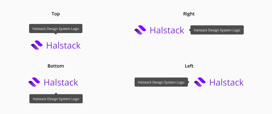
- Maintain consistency in the positioning of tooltips throughout the user interface.
- Use clear and accurate phrasing when placing the text inside a tooltip.
- Avoid using tooltips to convey crucial information. This type of information must always be present, not only when the user hovers over or focuses on a component.
- Don't place tooltips where they might cover or obscure important information or critical areas of the interface that need to remain visible at all times.
- Don't use tooltips to communicate error messages.
- Avoid using tooltips in interfaces where there is sufficient space to display additional information directly, without the need for hiding it.