Building a custom theme is a simple three-step process. You can navigate between these steps at any time using the wizard at the top of the page or the navigation buttons at the bottom.
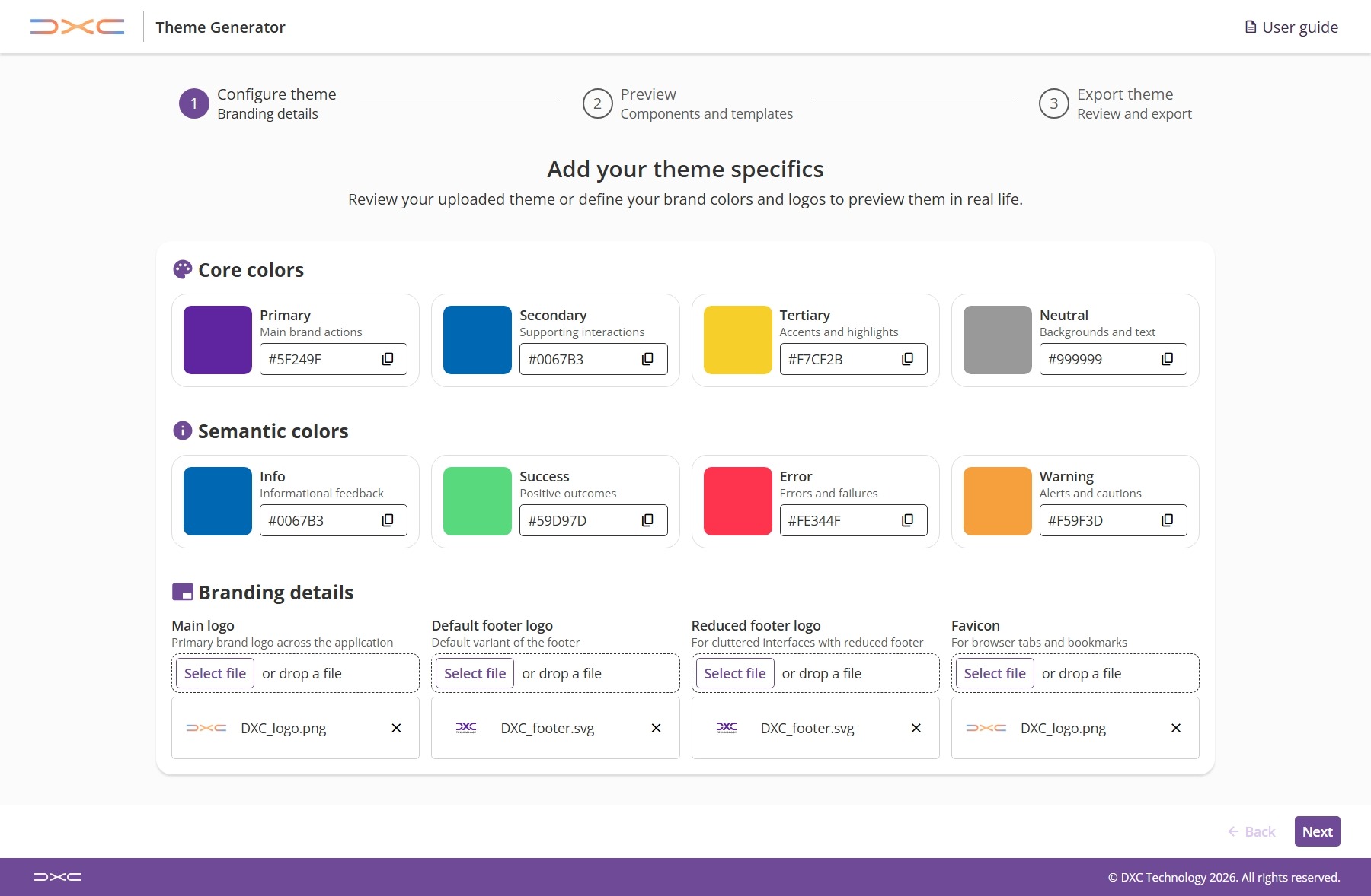
Start by setting the foundation of your brand.
You can select the desired values using the color picker or entering the specific hex values for your core colors (Primary, Secondary, Tertiary, and Neutral) along with your semantic colors (Info, Success, Warning, and Error). These values will be used to generate the list of tokens that can be seen applied in the next step. These will be the base colors used to generate the rest of the tokens, so you can get a good idea of how your theme will look by just setting these few values. You can always go back and tweak them if you want to see how a different shade of a specific color looks in the preview step.
Brand logos can be uploaded to see how they appear within our application layout components and a favicon can also be uploaded. The main logo will be assigned to the Header (or the Sidenav if the Header is not available). The footer logo is divided into two (default and reduced footer) one for each mode of the footer, and the final slot is reserved for the favicon.
Note: Since we do not host these images, they are for visualization purposes only. They help to see the theme in context, but they will not be included in the exported theme file or the theme configuration.
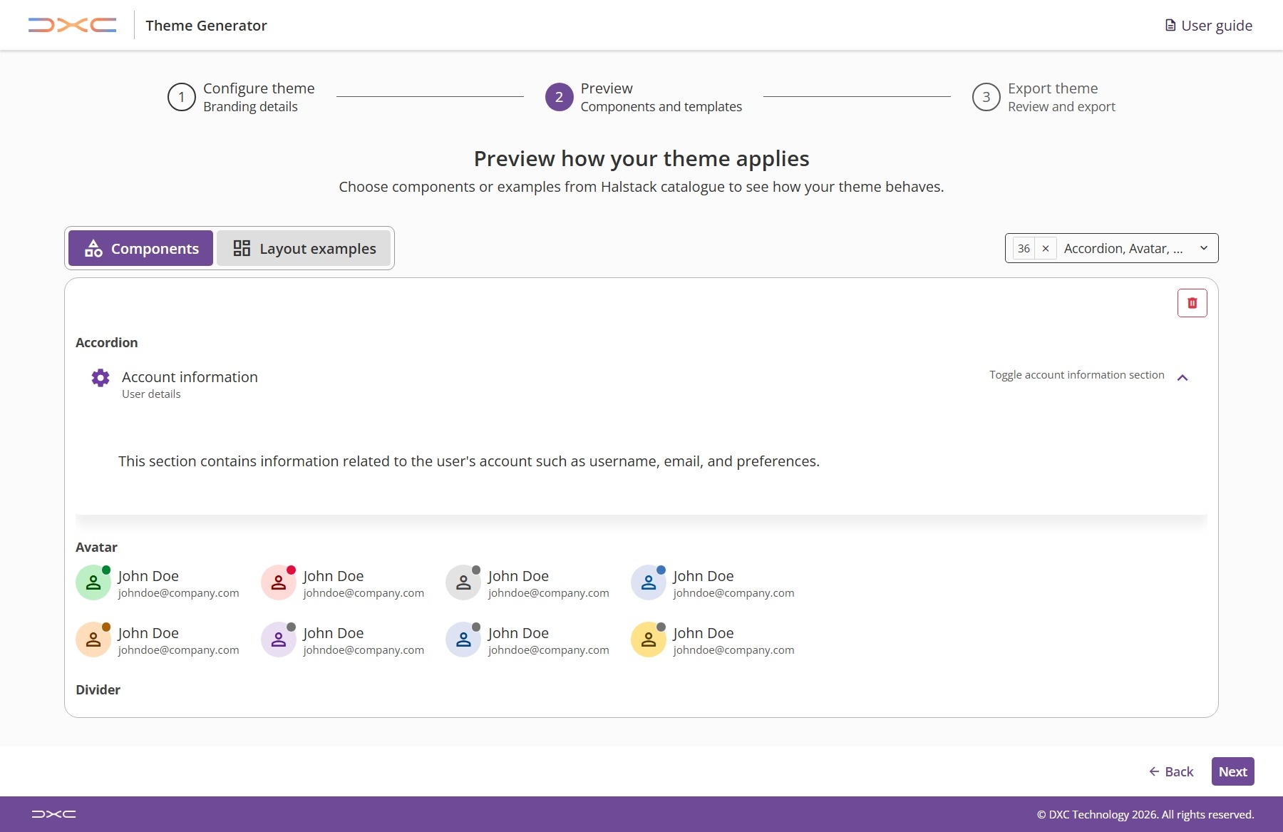
Once colors are set, you can move to the next step to see your theme in action. By applying the newly generated tokens to real components and layouts, you will get a clear sense of the look and feel of the chosen colors and logos in a live environment.
Remember that at any point of the process if a color doesn't look quite right in a specific layout, you can jump back to the previous step at any time to tweak your core or semantic color values.
In this mode, you can add individual components to the preview area to see how your specific tokens—such as primary button colors or semantic alerts—behave in isolation. Use the selection menu to pick the specific elements you want to inspect.
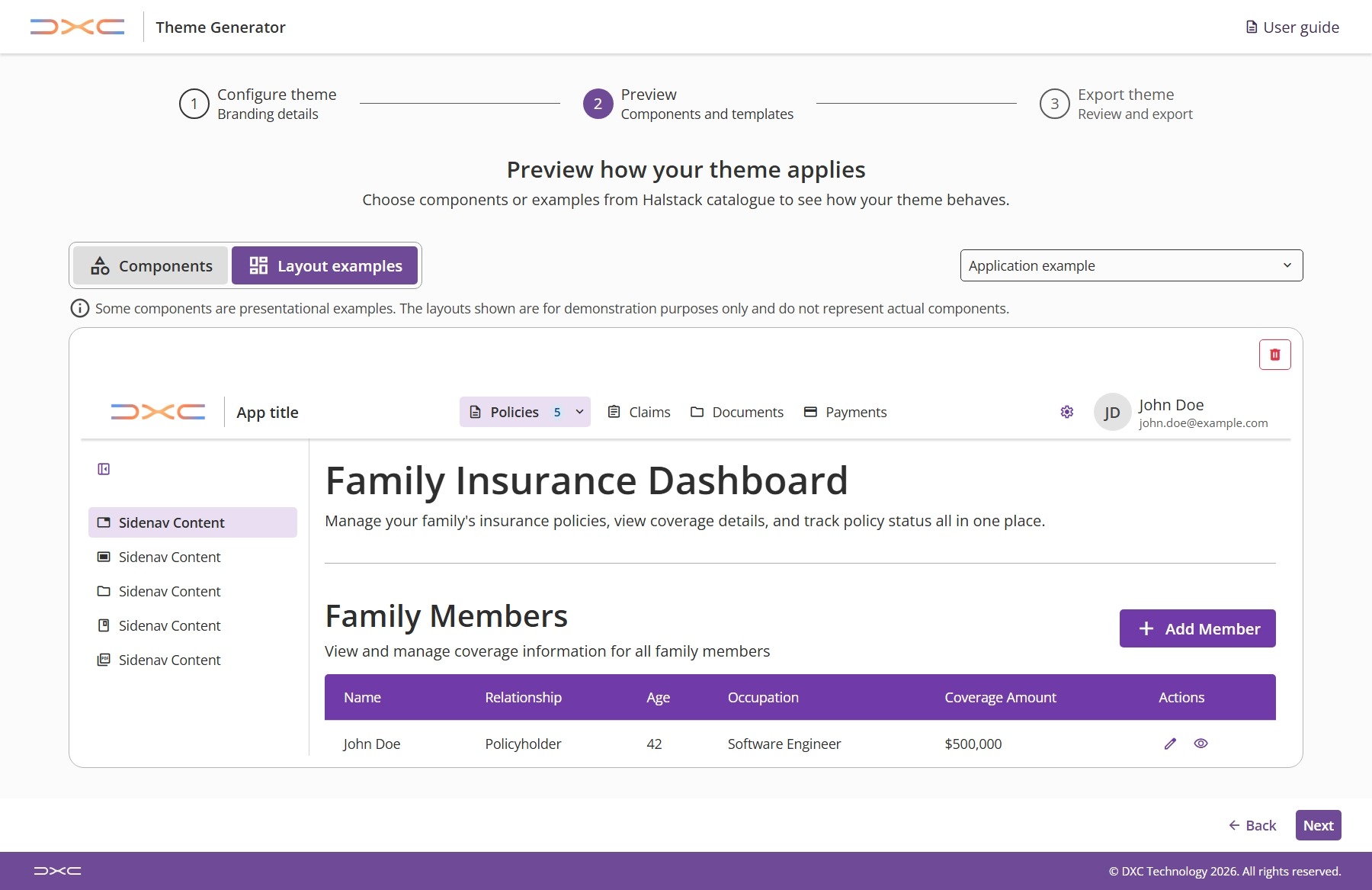
This mode allows you to see how your theme looks when applied to different layout options. You can see how the components look in different contexts and get a better sense of the overall feel of your theme. You can switch between the available layouts to see how your theme looks in each of them.
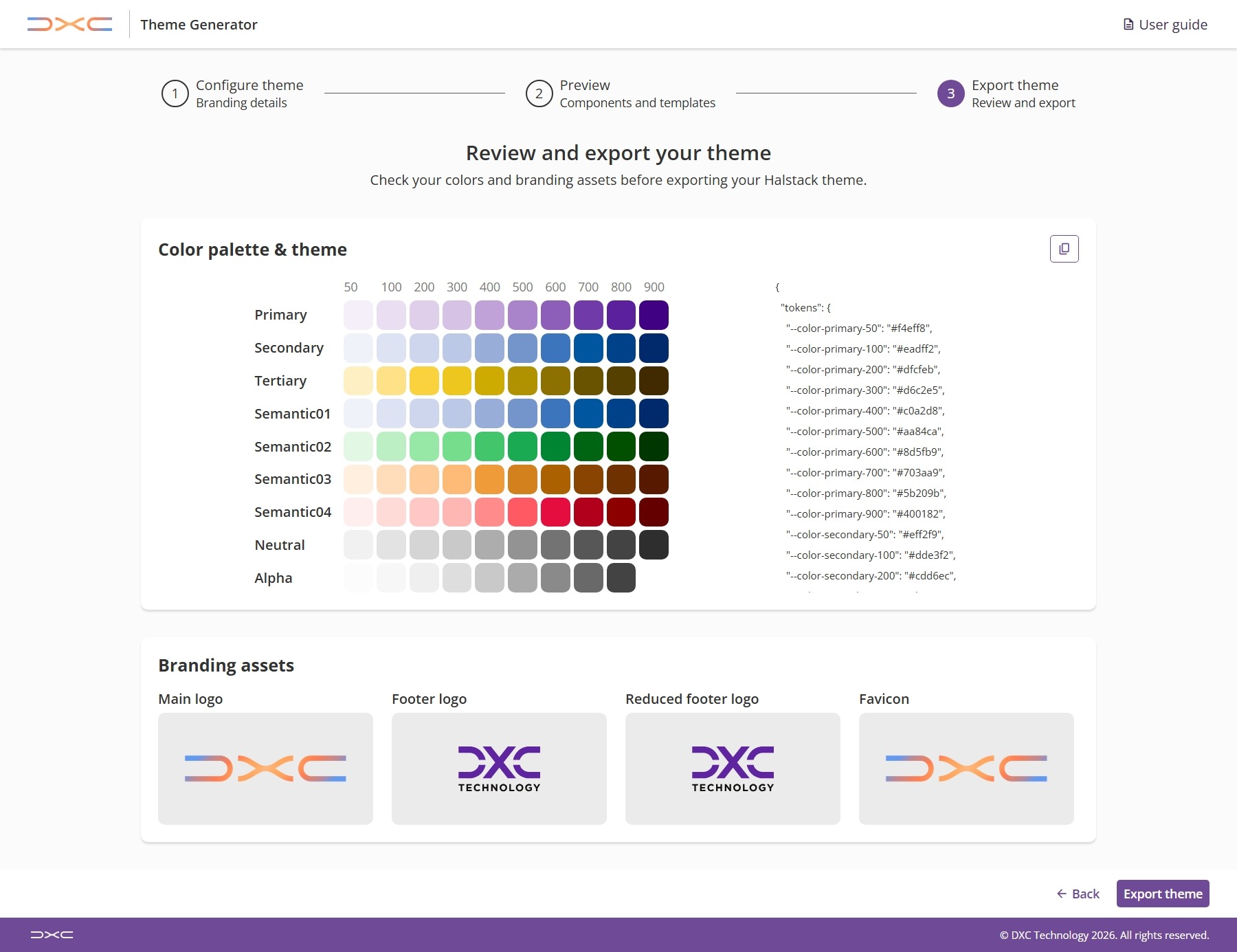
In the third and last step, you can perform a final review of your configuration.
This step displays a full list of the generated tokens so you can take a final look and review them. They can be copied directly to the clipboard or exported as a file. If you need to make a change after you've exported, you can still go back and keep tweaking the configurations.